Equipment

Finally Cancelling Photoshop - New Processing Workflow - No Adobe

dumping adobe

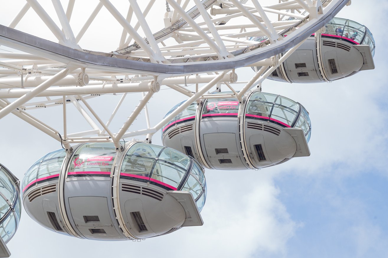
London Eye shot with a Leica M10 and 90mm Summicron M Lens processed entirely without the use of Photoshop

After more than twenty five years of continuously buying versions and subscriptions from Adobe, I have finally cancelled my subscription. The recent mid 2024 debacle over Adobe’s new terms and conditions with all that that implied for the present and future users, finally sent me over the edge. That’s all I’m going to say about it - at least for now!.

Actually it isn’t the first time I’ve rethought my use of Photoshop. Several years ago I did a careful study of the alternatives, which at that time included Capture One and DxO’s mainstream offerings, but then I felt there was too much lacking in their products to cover all my use cases, which include Street, Landscape, Wedding, Portrait and Astro photography genres. It was actually a discussion in my drone pilots’ chat group that triggered this latest review and various members suggested quite a range of relative newcomer providers. Well, I say newcomers; it just turned out I hadn’t been paying attention! I’m not going to rehearse all the tests I did on all the possibilities - that would be mind numbingly boring!

how to replace photoshop with an equivalent or better

It’s probably best if I just give you the gist and the final situation. After a survey of the numerous available options, I made the decision that the software did not necessarily have to offer any AI support; indeed I wanted to ensure that its functionality should provide all the necessary manual tools that I had become used to for processing each of my different genre’s work. Also, the software had to provide a one-time purchase license choice, the provider of which should have been developing the software for a substantial number of years. I did not consider free software. It’s surprising the range of tools necessary to cover a wide range of photography types. You don’t realise that until you go looking for equivalent functionality from other providers! I narrowed my choice to ON1 Photo Raw 2024.5 and Affinity Photo 2 but later included DxO’s PureRaw 4 for initial processing of RAW files in particular circumstances.

I went through a series of basic tests using images from each genre that I had previously processed in Photoshop where each test provided particular challenges. These were regular images which needed specific functionality to complete the work to the same or higher standard than in Photoshop i.e tools that were the equal of Photoshop or better as I had by then noticed that both the chosen applications had improved on Photoshop in several areas - AI functionality excluded. This was particularly obvious in improved workflows. Obviously the developers had recognised both the need and the opportunity to improve things if they were to attract long term Photoshop users.

I spent several weeks doing these tests and discovered quit a bit has changed since I last did this sort of survey several years ago. All to the good. There is no doubt that there are probably a half dozen genuine alternatives to Photoshop that would cover 85%-95% of general photographers’ needs and those choices would reflect personal taste and preferred workflow as much as functionality requirements. I also took on a cooked food product photography project for a client while doing the tests and, surprisingly, fully post processed the selected deliverables using these two applications.

my final choices

For myself, I found that ON1 Photo Raw 2024.5 and Affinity Photo 2 made a pretty nearly perfect pairing, covering everything I need and then some, including in ON!’s case some very useful and effective AI supported tools. There is no AI driven functionality in Affinity Photo 2 but it has a much wider range of manual tools that ON1, which suited the more challenging images in my tests. If I absolutely HAD to choose only one application I would most likely go with Affinity Photo 2 as it’s the closest to a typical Photoshop tool set, structure and workflow.

I have to say that both these applications were easy to learn and apply - maybe because I have plenty of experience in post processing, but I think that is a point worth making. There are also many, many tutorials available to help new users, both from the developers and on YouTube, so the learning curve was not that difficult to navigate.

some examples - photoshop vs alternatives

Leica M10 - RAW image processed in Photoshop. Highlight recovery was the challenge.

Same source image as above but slightly different crop. Image processed in ON1 Photo 2024.5

Obviously, the more recent image is a slightly different set of processing choices, which for me has resulted in a better final image, but that’s not the point. I was able to produce the same or better with this image than in my earlier example. So that meant I was at no disadvantage by not using Photoshop.

A detail of the original RAW file from a portrait session Leica SL2 with 90mm Summicron at f2.8

Same image processed in ON1 using all manual tools

Once again, the point is that I was able to complete the work in ON1 using only the manual tools available.

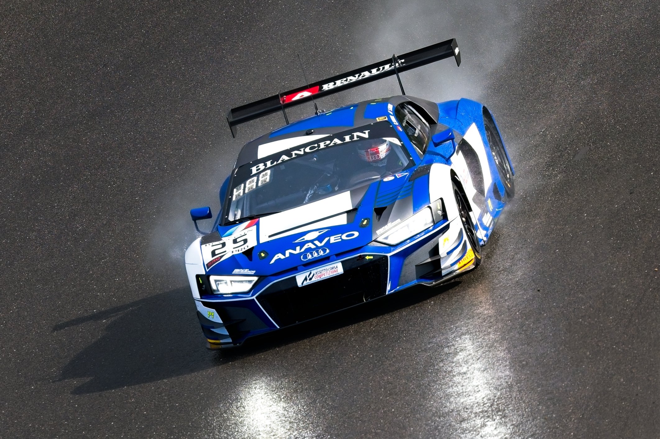
Last Race of the Day at Brands Hatch - original shot using Nikon D500 & 500mm lens at f5,6. Processed in Photoshop

Same source image, this time rotated - processed with ON! but rendering the RAW file through DxO PureRaw4 - an improved result

Once again I was able to achieve a similar result - the challenge here was keeping the energy of the shot & retaining the spray and headlight effects. Notice that the car interior is cleaner in this example. This is a case where PureRaw4 renders more useable data from a RAW file with far less noise, particularly in the shadows and highlights.

Is that Really Me!? - Street Photography, Leica SL1 with 180mm Leica R Lens @ f4 - Originally a Colour Image - Processed in Photoshop

Same colour source image first rendered in DxO's PureRaw4 (improved skin textures) then processed in ON1

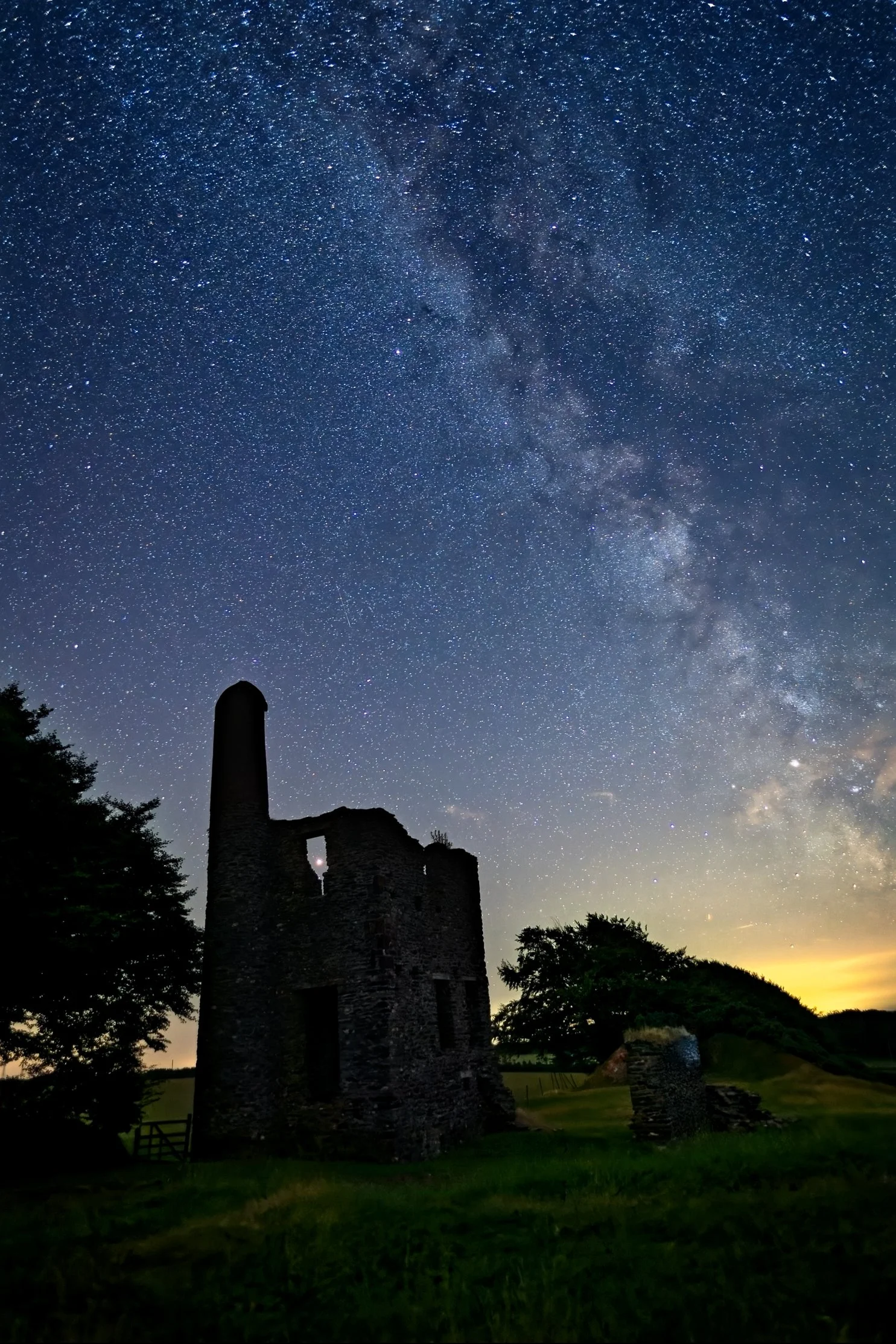
These are older Photoshop Astro images reprocessed in PureRaw4 and then ON1 - no point in showing the PS Version!

Nikon D5 single shot Image.rendered from RAW file by DxO's PureRaw4 - much improved shadow detail and noise profile. Rendered in ON1

Once again PureRaw4 rendered from RAW, then processed in ON1 - far superior to my earlier version in Photoshop

Single shot Nikon D500 with Nikon 500mm lens  & X2 equiv. 1500mm lens - Rendered from RAW with PureRaw4 then Affinity Photo 2

This shot is a far superior result compared with my Photoshop version. There is a great Astro workflow in Affinity Photo 2>

I did many other tests comparing results and eventually I was persuaded that dumping Photoshop was finally a workable option. I was confident enough that I decided to use this new approach on a client project photographing food products for a ‘fast food’ truck business. These were all preliminary shots of dishes that were being developed and we had decided to use a light box for simplicity and space saving reasons as we were working in a small kitchen. So here is two examples of the test shots:

20 Shot Nikon Z8 and 50mm lens, Rendered in PureRaw4 then focus merged in Affinity Photo 2

Notice how the box has been reshaped and cleaned up as has the lining paper. The Empanadas have fully 'beautified' in Affinity Photo 2

20 shot Salchipapa RAW images rendered in PureRaw4 then focus merged in Affinity Photo 2. The lightbox access panel edges show too

The finished image; box reshaped and beautified; chips, sausage and crackling beautified all in Affinity Photo 2

conclusions

Finally, there is no longer a need to keep paying Adobe a never ending subscription for its Photoshop and Lightroom applications. The tests I conducted, although not all shown here, convinced me that my new workflow will be built on Affinity Photo 2 and ON1 Photo Raw 2024.5 with the occasional use of DxO’s PureRaw4 renderer when the absolute best is required in the first stages of processing. Folks, try this for yourselves - you’ll be agreeably surprised at how well these applications can do the job, sometimes even better than Photoshop!

If you’ve enjoyed, been entertained by, or found this article useful, please take a moment to hit the like button below. I really appreciate you stopping by and the like button is the best way for me to know that I am providing useful information.
Street Photography with Olympus OM-D E-M1 Mark II

e-m1 mark ii - a huge upgrade from the e-m5 mark ii?

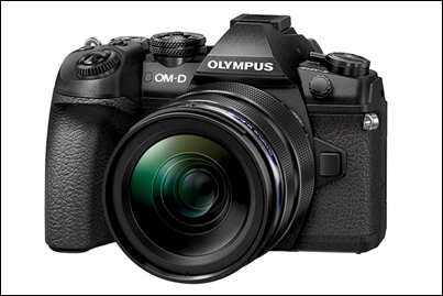
Olympus OM-D E-M1 Mark II.jpg

In an earlier post I described my experiences shooting Street Photography with the OM-D E-M5 Mark II and gave many examples of the projects I shot with it over about a two year period. I still have that camera and, of course, the lenses I invested in for those projects. Coming from the Sony A7, my first mirrorless camera, I can honestly say that working with the E-M5 Mk II was a genuine revelation.

So, in this review of my subsequent upgrade to the E-M1ii, I will avoid rehearsing the specifications and technical differences between the two camera and I'll concentrate on my practical experiences with the newer, flagship model.

Read the earlier post for details of my earlier changeover from the Sony A7 to the E-M5ii. As I said in that post, I found the E-M5ii to be an ideal camera for Street Photography, being small, light, fast in operation and silent - everything you could want to be able to make images inconspicuously working the streets of London. The autofocus was quite a surprise too - very fast to lock on to the subject and very accurate, probably because of the number of focus points and the benefit of both contrast and phase detect autofocus technology. Perfect for fast response Street work.

During those projects I also attended several workshops with photographers who were using the E-M1 Mark I and I saw first hand the advantages they were claiming for the E-M1 over the E-M5 . At that time though, the E-M1 was expected to be superseded by the Mark II version, so, although I was keen to try an E-M1,  I was very happy to continue exploring the E-M5ii. In some ways, it was the better camera, having been released early in 2015 sporting Olympus's latest technology, whereas the E-M1 was first introduced as their flagship model in September 2013. It was to be almost three and a half years before the E-M1 Mark II was actually available from suppliers! But worth the wait!

So, it was in February 2017 I was finally able to get my hands on the upgraded E-M1 Mark II. All my 'photobuddies' were expecting a minor upgrade, but we were all surprised at the actual difference in performance, rather than just the specification changes.

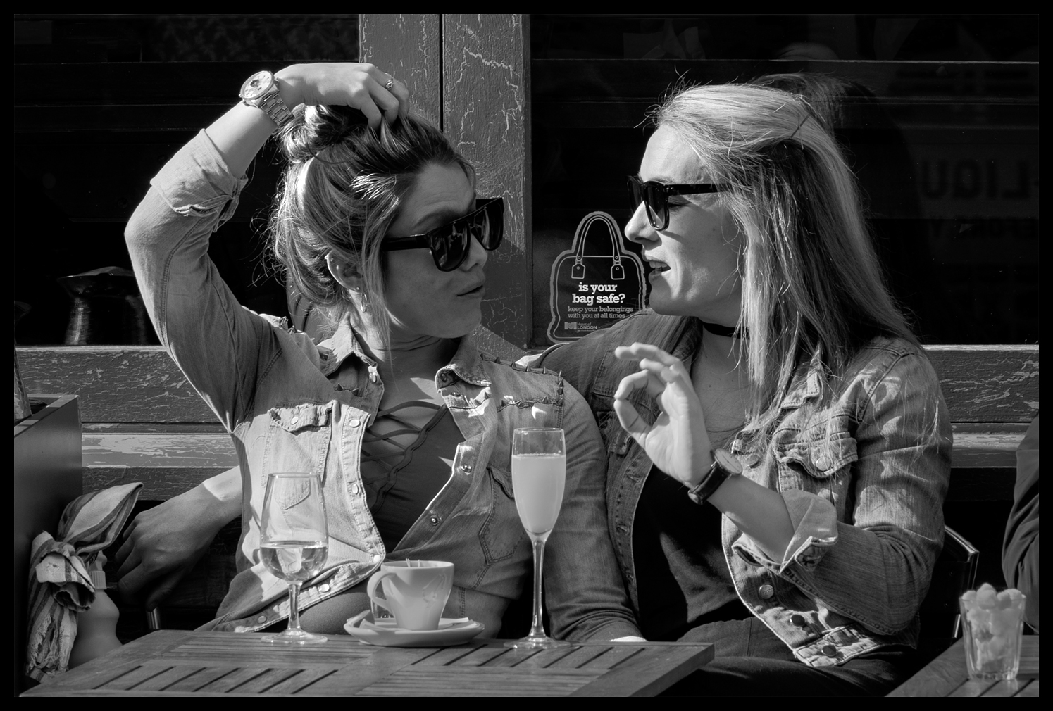
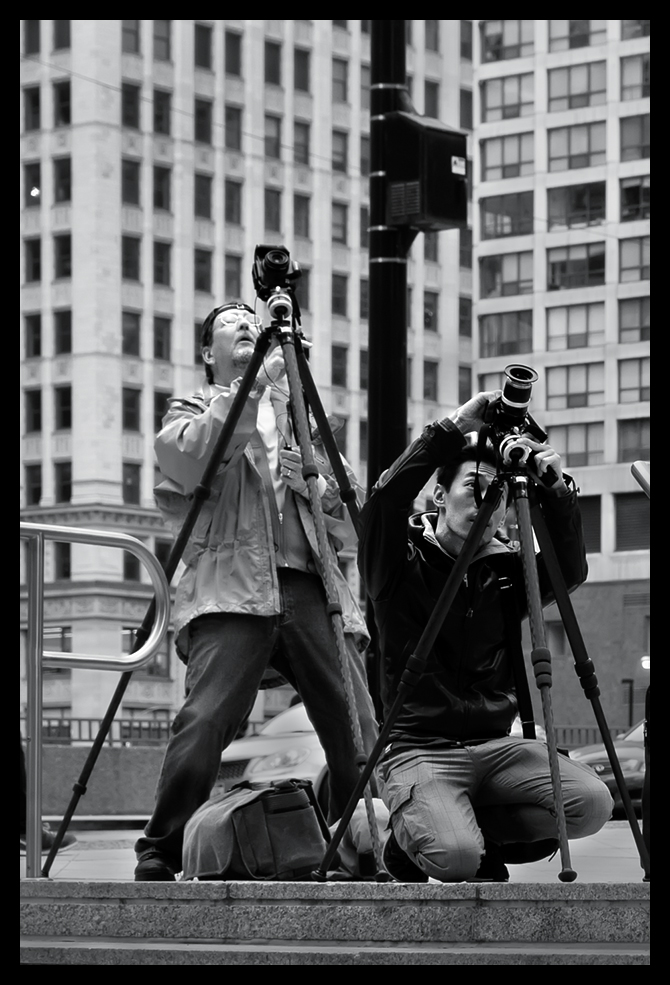
Is your Bag Safe? - Olympus OM-D E-M1ii, 12-100mm f4 at f5.6, 1/250s, ISO 200

Is your Bag Safe? - Olympus OM-D E-M1ii, 12-100mm f4 at f5.6, 1/250s, ISO 200

One much hoped for change in the upgrade was for improvements in Dynamic Range from the new 20Mp sensor and in particular a practical improvement in how the camera deals with and renders highlights. The E-M5ii was really tricky in that respect, easily 'losing' highlight detail during capture and often exhibiting a precipitous, 'cliff edged' tonal gradation behaviour at the top of the exposure curve, so, you had to very carefully expose to the right in capture, constantly checking the histogram, and then be cautious in post processing to not lose the highlight detail that had survived thus far.

What about the E-M1ii then? Well, the numbers don't quite tell the real story but I can say, in practice, that the E-M1ii is definitely able to deal with these challenges more effectively than the E-M5ii. The image above was taken in very strong sunlight with deep shadow detail and I think the E-M1ii has handled the skin highlights very well, preserving a smooth tonal gradation in the girl's forearm and producing a quality result, and even in the sharp transitions from bright to mid-tones in the girl on the right's face.

DxOMark Dynamic Range Olympus OM-Ds.png

Given the frustration I'd encountered with the E-M5ii, especially in post processing, and leaving aside the twenty five percent increase in sensor resolution, it was mostly this aspect of the camera body and sensor upgrade I was really primarily interested in. In terms of the raw numbers, DxOMark's lab testing of the E-M1ii shows a small but significant enough increase in overall dynamic range versus the E-M5ii; between a half and one whole stop, depending upon ISO setting, as shown in the graph on the right here (courtesy of DxOMark Image Labs):-

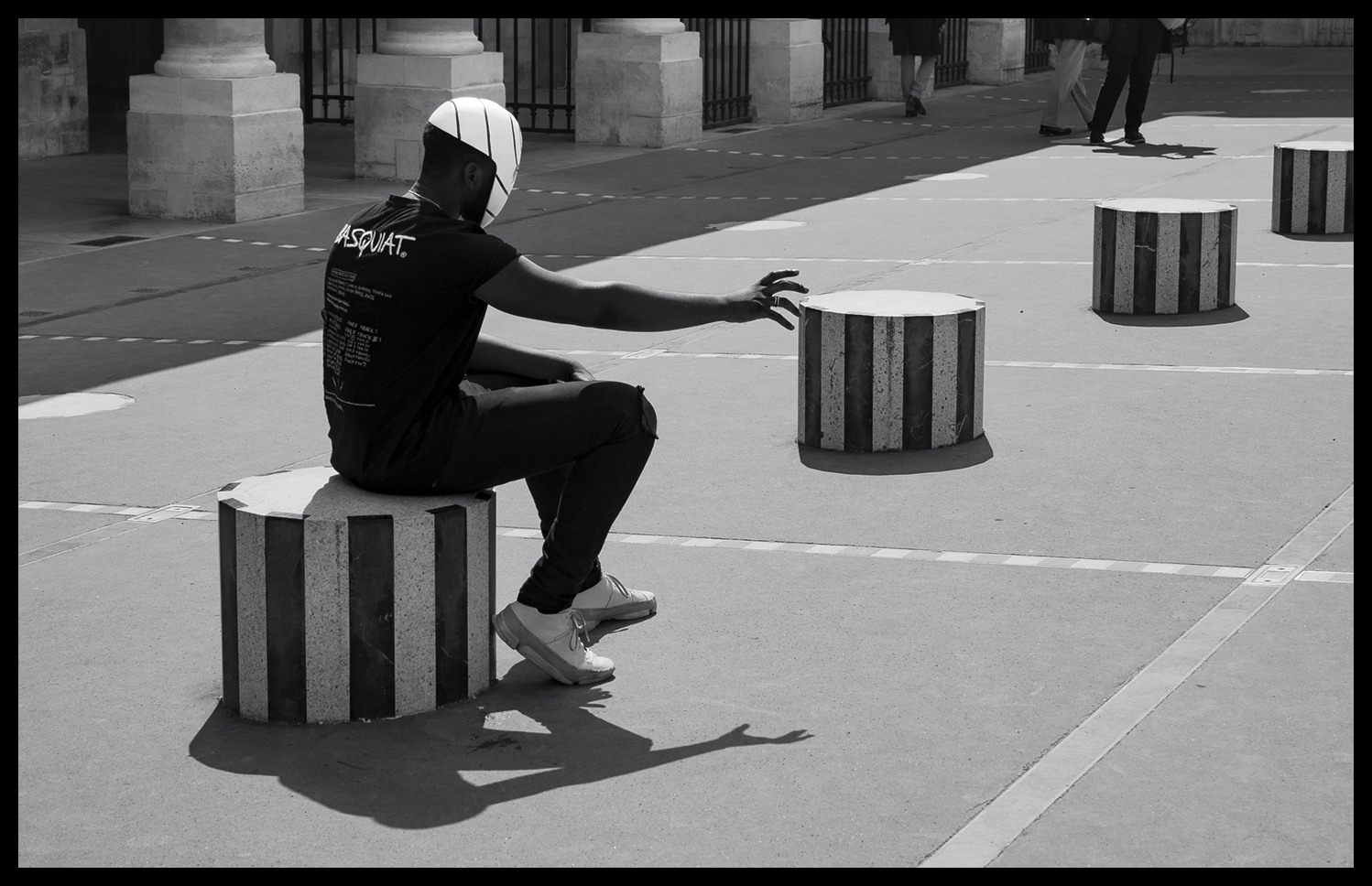
The shot above was taken in London's Covent Garden area, but this one below was taken in Paris later in the year and is another good example of how well the E-M1ii handles highlights. I don't think I could have used this grabbed shot if it had been taken on the E-M5ii - there simply would not have been time to check all the parameters before firing the shutter:

Spooky Dancer - Olympus OM-D E-M1ii, 12-100mm f4 at f5.6, 1/400s, ISO 200

Spooky Dancer - Olympus OM-D E-M1ii, 12-100mm f4 at f5.6, 1/400s, ISO 200

So, while we're on the subject of Paris Street Photography, I was lucky enough to attend two of Valerie Jardin's Paris workshops in 2017. She has a very easy going style of hosting her workshops, preferring to be out walking the streets than spending hours pouring over technique. She begins her workshops with a slideshow review of her own work - to inspire and demonstrate the possibilities in Street Photography, and, but for the last session reviewing attendees selected images on the final day, the rest of the time you are pounding the streets trying to keep up with her. I can recommend it!

Here are some more images from those days spent shooting in Paris:

OutReach - Olympus OM-D E-M1ii, 12-100mm f4 at f5.6, 1/800s, ISO 200

OutReach - Olympus OM-D E-M1ii, 12-100mm f4 at f5.6, 1/800s, ISO 200

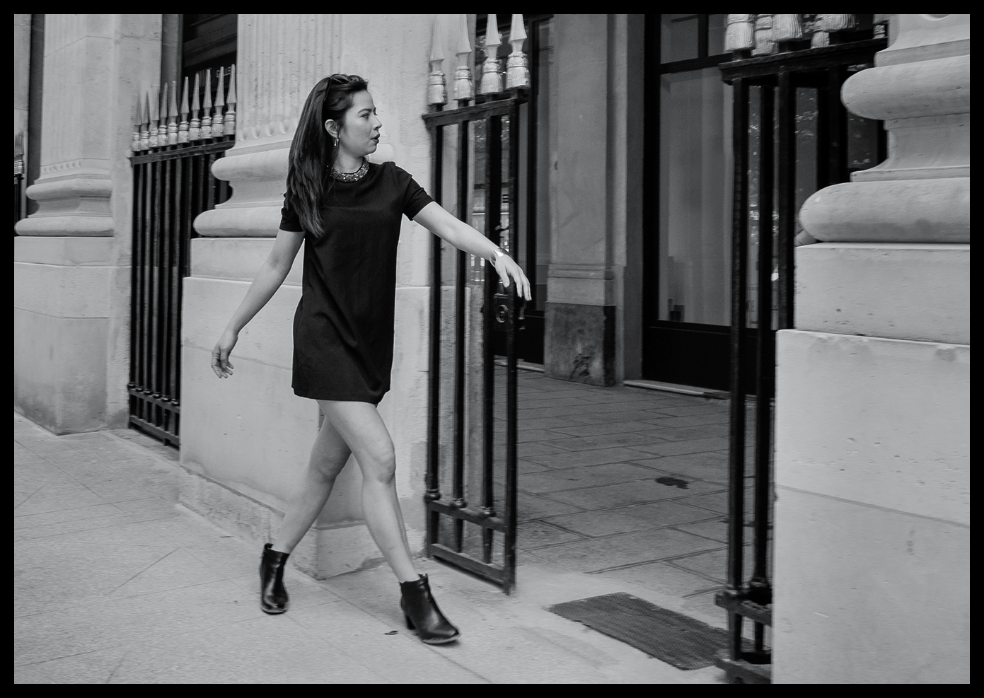
Struttin' 'er Stuff - Olympus OM-D E-M1ii, 12-100mm f4 at f5.6, 1/100s, ISO 200

Struttin' 'er Stuff - Olympus OM-D E-M1ii, 12-100mm f4 at f5.6, 1/100s, ISO 200

Hair Lines - Olympus OM-D E-M1ii, 12-100mm f4 at f5.6, 1/800s, ISO 200

Hair Lines - Olympus OM-D E-M1ii, 12-100mm f4 at f5.6, 1/800s, ISO 200

In Sympathy - Olympus OM-D E-M1ii, 12-100mm f4 at f5.6, 1/5000s, ISO 800

In Sympathy - Olympus OM-D E-M1ii, 12-100mm f4 at f5.6, 1/5000s, ISO 800

Girls Aloud - Olympus OM-D E-M1ii, 12-100mm f4 at f5.6, 1/1250s, ISO 800

Girls Aloud - Olympus OM-D E-M1ii, 12-100mm f4 at f5.6, 1/1250s, ISO 800

I've often wanted to try my hand at capturing a unused street scene with multiple characters and still get some sense of compositional order and a focal point, so I was quietly pleased with the attempt shown above. It's not easy to manoeuvre inconspicuously around such a large group of excited ladies, who clearly are having the time of their lives, all dressed up, constantly on the move and, quite obviously, raring to go to the party!

f.....What!!? - Olympus OM-D E-M1ii, 12-100mm f4 at f5.6, 1/10s, ISO 200

f.....What!!? - Olympus OM-D E-M1ii, 12-100mm f4 at f5.6, 1/10s, ISO 200

This image above shows quite a change of pace and demonstrates another strength of the E-M1ii that of its image stabilisation, both in-body and in-lens. This was hand-held shot taken at 1/10th sec using the long zoom and yet pretty nearly perfectly stable. I was impressed; yet again.

The image below is probably going to remain one of my all-time favourites. It was taken just a few yards from the image above. I noticed the scene out of the corner of my eye, raised the camera to shoot, fired the shutter release and a fraction of a second later, he was gone! Her expression says it all.

The Proposition - Olympus OM-D E-M1ii, 12-100mm f4 at f5.6, 1/160s, ISO 200

The Proposition - Olympus OM-D E-M1ii, 12-100mm f4 at f5.6, 1/160s, ISO 200

Final Offer - Olympus OM-D E-M1ii, 12-100mm f4 at f5.6, 1/100s, ISO 200

Final Offer - Olympus OM-D E-M1ii, 12-100mm f4 at f5.6, 1/100s, ISO 200

Smokin' Connection - Olympus OM-D E-M1ii, 12-100mm f4 at f5.6, 1/200s, ISO 200

Smokin' Connection - Olympus OM-D E-M1ii, 12-100mm f4 at f5.6, 1/200s, ISO 200

The Chase - Olympus OM-D E-M1ii, 12-100mm f4 at f5.6, 1/250s, ISO 800

The Chase - Olympus OM-D E-M1ii, 12-100mm f4 at f5.6, 1/250s, ISO 800

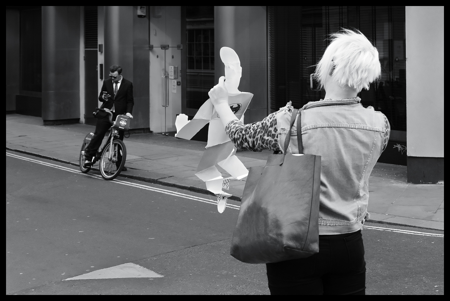
Finally, for the last few examples, I'm returning to my favourite capital city - London. It's just a quirky as Paris, of that there is no doubt, but there are times when I come across scenes that just defy explanation:

Paper Boy - Olympus OM-D E-M1ii, 12-100mm f4 at f4, 1/125s, ISO 200

Paper Boy - Olympus OM-D E-M1ii, 12-100mm f4 at f4, 1/125s, ISO 200

Just to demonstrate, once again, the improvement the E-M1ii offers when dealing with challenging lighting:

Forkin Sun - Olympus OM-D E-M1ii, 12-100mm f4 at f10, 1/400s, ISO 200

Forkin Sun - Olympus OM-D E-M1ii, 12-100mm f4 at f10, 1/400s, ISO 200

And finally, a touch of humour and our beloved quirky Britishness:

Jumping for Joy - Olympus OM-D E-M1ii, 12-100mm f4 at f4, 1/125s, ISO 200

Jumping for Joy - Olympus OM-D E-M1ii, 12-100mm f4 at f4, 1/125s, ISO 200

conclusions

I could not be more pleased with upgrade from my Olympus OM-D E-M5ii to the new Olympus E-M1ii. It has given me a tool that provides for any shooting situation I am likely to encounter working in Street Photography. The new sensor, uprated resolution, rapid autofocus with contrast and phase detection, superb stabilisation, increased dynamic range. lower noise, better performance in highlight roll-off and, just as importantly, superb handling in the field.

Absolutely Highly Recommended.

New Adobe Camera RAW Monochrome Profiles

converting images to monochrome in adobe camera raw 10.3

There are many ways to create black and white images from colour RAW files and, over the years, having graduated from the analogue dark room, I've used most techniques and third party conversion plug-ins; rejected many and eventually focussed on the basic methods in Photoshop and Camera Raw. Now, Adobe has made available an update in Camera Raw and Lightroom that provides a very wide range of colour and monochrome profiles (and enabled the use of LUTs by third parties) as an alternative approach.

For those photographers that prefer to work in monochrome there are 17 new choices of black and white profiles to try out. My first impressions are that they are quite useful as starting points, offering a broad range of conversion from fairly flat tonal gradations through to very contrasty results. Here's what you see when you drill into the Profile Browser in Camera Raw - from left to right - open the browser, select B&W and then scroll down through the 17 new options:

The new Monochrome Profiles in Adobe Camera Raw Update 10.3

The new Monochrome Profiles in Adobe Camera Raw Update 10.3

When you select a profile, you can preview it in Camera Raw, and of course these profiles also  work in Lightroom.
The 17 options provided offer a wide range of tonal gradation, from faorly even toned all the way through to quite contrasty conversions. Here's B&W 01 on my slected image:

Adobe Camera Raw 10.3 - Monochrome Profile 01

Adobe Camera Raw 10.3 - Monochrome Profile 01

The new capabilities don't stop there though. In the screen shot above you can see that there's a slider that allows you to vary the amount of the conversion that's applied to the image, which helps you 'blend' to taste.

However, even more importantly, you get to this new starting point without adjusting any of the standard sliders in Camera Raw. This means that you still have all the other adjustments available to you after this profile is applied - so you can apply all the standard sliders and adjustments until you reach a point where the image looks the way you want. This includes using the standard colour sliders on the black and white conversion tab in Camera Raw as well as graduated filters and adjustment brush 'layers' to further refine the image.

I think this is a major step forward for monochrome (or colour) workers, in that you now have a broader choice of starting points in your initial rendering and yet still retain all your favourite adjustments to fine tune the resultant image. Of course, for those that want to produce high quality black and white images without too much effort, just adopting your selected profile will get you there in one step!

One of my favourite ways to begin a monochrome conversion is to use the DxO FilmPack Elite V5 plug-in profiles. Two of my favourites from DxO are the Agfa Scala 200x and the Ilford FP4 Plus 125 profiles, the former being a darker conversion but with a broad range of tonality, and particularly good on skin tones, the latter being more even and brighter overall.

I use these two and DxO's Kodak Tri-X 400 profile fairly often, depending on the tonality of the initial RAW conversion. These hark back to my old film days and were favourite film choices at the time. As in the case of the Camera Raw profiles you can adjust the final image post conversion in the FilmPack application, which I do, and then export the result to Photoshop for my final editing.

Monochrome Conversion Using DxO FilmPack 5   Left: Agfa Scala 200x   Right: Ilford FP4 Plus 125 Profile

Monochrome Conversion Using DxO FilmPack 5   Left: Agfa Scala 200x   Right: Ilford FP4 Plus 125 Profile

These new profiles from Adobe do however provide some excellent starting points as an alternative, which is particularly welcome capabilities while still in the ACR environment and can therefore contribute to a faster workflow when you consider you can do almost anything now in Camera Raw alone.

Given that potential, I'll be looking very closely into working with these profiles and comparing them with my current choices. I've reproduced the first 12 of the monochrome profiles below, for comparison, as the rather small thumbnails in Camera Raw don't make it easy to clearly see the differences. The remaining profiles are the fairly standard emulations that would result if you used a blue, green, yellow, orange or red lens mounted filter, which I have not reproduced here.

Adobe Camera Raw Monochrome Profiles 1-3

Adobe Camera Raw Monochrome Profiles 1-3

Adobe Camera Raw Monochrome Profiles 4-6

Adobe Camera Raw Monochrome Profiles 4-6

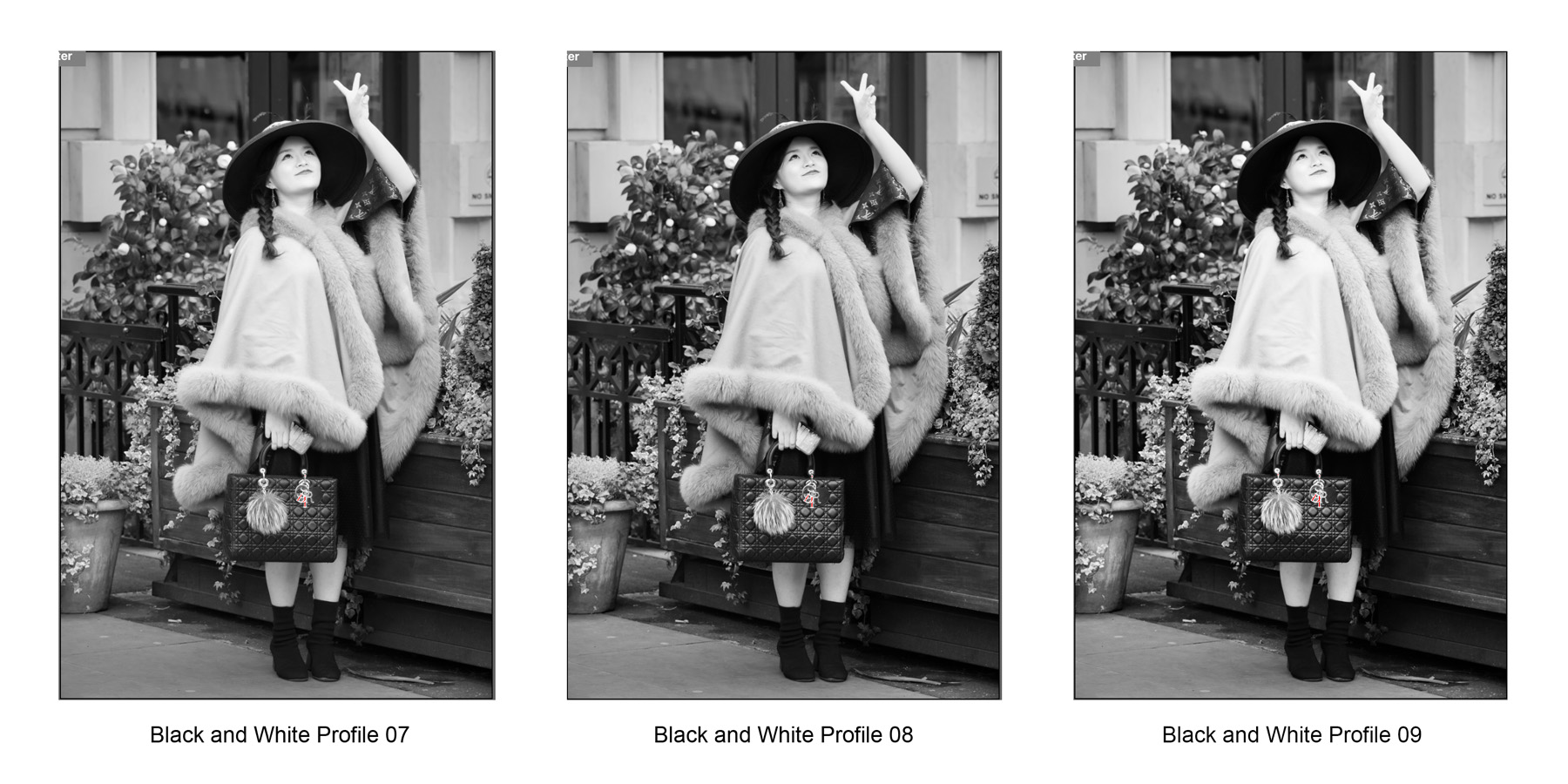
Adobe Camera Raw Monochrome Profiles 7-9

Adobe Camera Raw Monochrome Profiles 7-9

Adobe Camera Raw Monochrome Profiles 10-12

Adobe Camera Raw Monochrome Profiles 10-12

When comparing the various options I would recommend looking separately at the woman's cape in the foreground, her handbag. her face and forearm, the underside of her hat, her dress and boots, the wooden fence, the greenery in the background and the shade of the rear wall, comparing each element at a time across the whole set before selecting your favourite profiles.

example using DxO versus ACR monochrome profiles

The image below is a very significant crop from the Leica SL image in this comparison article. It was taken hand held in London's Covent Garden using a Leica SL mirrorless camera with a Leica 180mm F2.8 Elmarit R lens via an R-M plus M-L paired adapter. It's a remarkably sharp image and shows the quality of the camera and venerable 1997 lens combination. It was my first outing with the lens which had just arrived from a German Leica dealer who specialises in previously loved equipment. The image was rendered initially in ACR then exported to Photoshop where I used the DxO Agfa Scala 200x profile and modified the rendering before passing it back to Photoshop for some additional localised dodging and burning, curve and a final levels adjustment. This is my usual workflow:

Leica SL - Cropped Image from Leica SL and Leica 180mm f2.8 R Lens - DxO Agfa Scala 200x based

Leica SL - Cropped Image from Leica SL and Leica 180mm f2.8 R Lens - DxO Agfa Scala 200x based

Below is the version rendered in Adobe Camera Raw using the B&W No10 profile, adjusting the red, yellow and orange sliders on the black and white conversion tab and some local adjustment brush burning in of the distracting bright flower heads in the background. Then the image was opened in Photoshop for final curve and levels adjustments.

Leica SL - Cropped Image from Leica SL and Leica 180mm f2.8 R Lens - ACR B&W No10 based

Leica SL - Cropped Image from Leica SL and Leica 180mm f2.8 R Lens - ACR B&W No10 based

I think the differences in outcomes are relatively subtle and I would be happy with either final rendering.
One interesting result was that when I saved the ACR B&W No10 profile version as a jpeg file, Photoshop reported that it created a 1.7Mb file at a maximum quality versus the DxO based rendering which required only 1.1Mb. The implication is that the ACR version possesses more tonal information than the DxO one, although I couldn't see the diference on my monitor. Hmmm - food for thought

conclusions

Having spent only a short time with this new ACR update, I felt compelled to compare outcomes using my standard references. Overall, my initial impressions are that the ACR B&W profile 01 is pretty close to DxO's Ilford FP4 Plus 125 in tonal character and the ACR B&W profile 10 is very similar to DxO's Agfa Scala 200x, being very broad and tonally even, with particularly nice skin tones. The B&W No10 renders lighter overall than the DxO conversion but that is easily remedied with an uplift in exposure afterwards.

I will probably find other comparable profiles, to create more or less contrasty results on occasion, but when you consider how many additional adjustments you can make using the standard sliders on top of this one-click starting point there's certainly plenty of scope in these new facilities, and there's always the chance to import third party profiles to add to the 17 new choices.

Summarising, I was able to create almost the same quality of rendering I normally produce using these new monochrome profiles together the additonal adjustments available in ACR. This led to a shorter, less complicated workflow, saving time and effort. Recommended.

Street Photography with Nikon D750

working london's soho with a nikon d750

My street life photography work often takes me through London's Soho district. Of course in the 1960s that area was famous for a somewhat different reason, but today it's very much a tourist and restaurant area. There's always something going on that might yield interesting images, and for quite a time last year I was using a Nikon D750 to capture snippets of London Life.

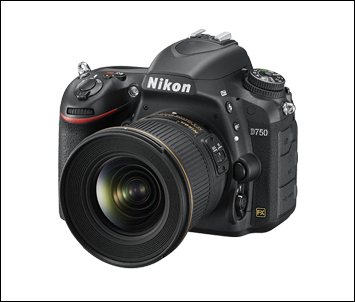
Nikon D750 Camera.png

The Nikon D750 fits in the Nikon range between the D610 and, now, the D850. Offering a full frame 35mm, 24mp sensor, with only a uni-directional anti-moire, anti-aliasing filter and an excellent auto-focus system, it produces images that are very comparable with Nikon's pro level D810 - giving especially clean images at up to about ISO 3200 with a very useable dynamic range of over 14 stops at ISO 100. This only falls to 11 stops at ISO 1600, with minimal impact on image quality according to my tests, which, for me, all adds up to a great street photography camera if you don't mind using a DSLR sized body and lenses. It makes a great partner for the f1.8 prime lenses.

Being relatively lightweight, with that level of image quality, it's no wonder the Nikon D750 has become very popular with wedding photographers, both as a primary and as a second body camera. I like the way the RAW files take post processing and, in particular, the way that highlights roll off to white, enabling you to keep more graduation in the brightest highlights - no doubt due to the extended 14 stop dynamic range at base ISO. In the street, moving from shot to shot, the body itself feels great in the hand, sporting a relatively deep grip, which helps the handling when using longer, heavier lenses. It's a little thinner in the body than earlier models and the use of carbon fibre has made the body light enough to carry for a full day's shooting. The D750 also offers a tilting screen for framing that occasional, discreet, waist level shot.

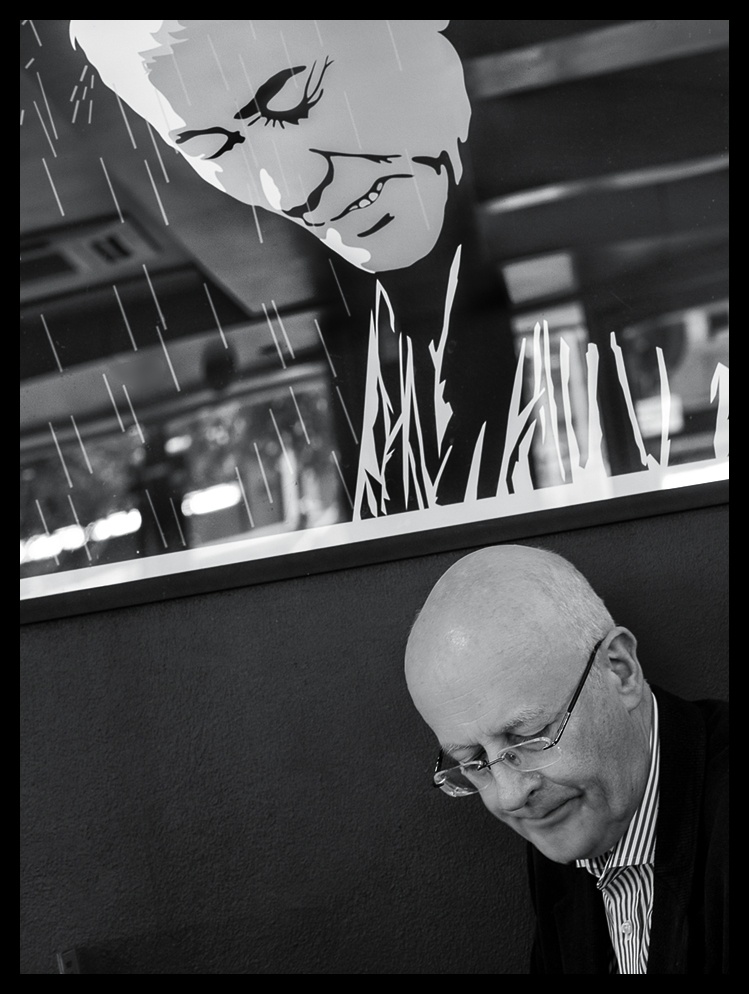
So, enough of specifications - time for some images. I'm aware of the arguments against using 'other artists' creative endeavours as a backdrop to unremarkeable,passing people; and if the result is mundane or un-engaging, I agree, where's the spark? But, now and again, since the poster or advert is in the public space, as a part of the environment we inhabit every day, such backdrops can make an impact and contribute to the visual theatre of city life in particular. Hence, now and again, my eye is caught by the interplay of actor and scenery, such as this shot below. I really enjoyed the net effect of the composition - an ordinary billboard on it's own, yet the actor somehow creates more of a 'scene' for us to think about.

Really? - Nikon 24-120mm f5.6 1/320sec ISO 1100

Really? - Nikon 24-120mm f5.6 1/320sec ISO 1100

Further on, in an alley we won't mention, there are a number of small shops and surprisingly, a Barbers. This chap looks as if he really is the Demon Barber. Shot through glass in very low light conditions.

Just Relax - Nikon 24-120mm f5.6 1/20sec ISO 1600

Just Relax - Nikon 24-120mm f5.6 1/20sec ISO 1600

Emerging on to a side street I caught this scene. Watching this fellow for a while, it dawned on me that the dog's expression and body language summarised the whole story and the indifferent gaze of the onlooker in the background reinforced the feeling that the owner was, once again, whining on about the same old stuff. Patience is a virtue.

Heard It All Before - Zeiss Milvus 85mm f5.6 1/1000 ISO 5600 (-2/3 EV Ooops)

Heard It All Before - Zeiss Milvus 85mm f5.6 1/1000 ISO 5600 (-2/3 EV Ooops)

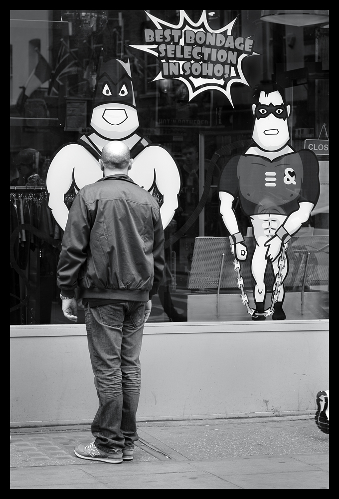
Then, not too far  away, in the area still somewhat famous for interesting shopfronts, I came across a chap who was clearly riveted to the spot. I was just thinking - I wonder what's going through his mind - right now?

What Is He Thinking!? - Nikon 80mm f5.6 1/320sec ISO 450

What Is He Thinking!? - Nikon 80mm f5.6 1/320sec ISO 450

Just off Compton Street there's a pub where regulars sit outside in the street, especially on Sundays. I caught sight of these two gents engaged in 'conversation' but you can see that one was rather more assertive than the other in his 'Sunday Sermon'. The story is quite obviously told by the expression on their faces and the position of their feet. The chap on the right seems to be suffering under the onslaught - deep in thought, or just tired of hearing the same old tirade?

Soho Sunday Sermons - Nikon 24-120mm f5.6 1/250sec ISO 1600

Soho Sunday Sermons - Nikon 24-120mm f5.6 1/250sec ISO 1600

You know that feeling when you're walking down a street and you catch something out of the corner of your eye which doesn't immediately register but you know you just missed something important? Well, that happened here. Shop window mannequins have always fascinated me, but I've not been able to capture one that really sold a story before. This one stopped me in my tracks. It looks like some slinky Super Hero lurking in the shadows ready to pounce! I couldn't resist the shot.

MonoGirl - Nikon 24-120mm f5.6 1/125sec ISO 1600

MonoGirl - Nikon 24-120mm f5.6 1/125sec ISO 1600

Every now and then you stop for a moment and think - there's a bit of a visual joke here, if only ....... and before you know it the picture is completed by pure chance. Bust(ling) Home seemed such an obvious title for this shot!

Bust(ling) Home - Nikon 80mm f5.6 1/320sec ISO 800

Bust(ling) Home - Nikon 80mm f5.6 1/320sec ISO 800

Finally, the last image; to 'bow out' on. This just tickled my sense of humour and it shows yet another example of the 'what if' photographers' rule; 'what if I wait here patiently?'. Maybe someone will come out of the stage door. I wonder what could happen?

Final Bow - Nikon 24-120mm f5.6 1/200sec ISO 1600

Final Bow - Nikon 24-120mm f5.6 1/200sec ISO 1600

I have thoroughly enjoyed using the Nikon D750. The images it produces are just gorgeous and at 24 megapixels the film sizes are just right for Street Photography. The rendering from the sensor is excellent and the RAW files take post processing very well with deep shadow detail and nicely rolled off highlights. You can't go wrong with this camera, and of course, right now, the Nikon D750 is at a relatively bargain price. Highly Recommended.

London Street Photography with a Nikon D5500

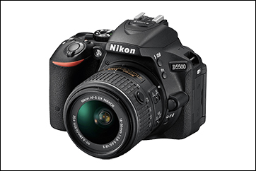
The Nikon D5500 is something of an unsung bargain in the Nikon DX camera lineup. The Amateur Photographer magazine gave it a pretty good review when it came out, praising it's relatively quick  autofocus system, great colour rendition and high quality, 24 megapixel DX APS-C sized sensor with no low pass filter and a rendering engine that produces gently rolled off highlights to give surprisingly good images of over 12 stops dynamic range at ISO 100.

For me though, this camera was all about the fully articulated screen (making it easy to get sneaky street shots in confined spaces) the surprisingly good rendering, the light weight, small body size and the excellent handling characteristics, all of which added up to a great street camera that could use many of my existing lenses. It's light weight, compared to my stable of full frame Nikon DSLRs, also made it very attractive, particularly with an excellent 35mm DX lens bought to accompany the 55-200mm zoom lens I acquired when I bought the camera.

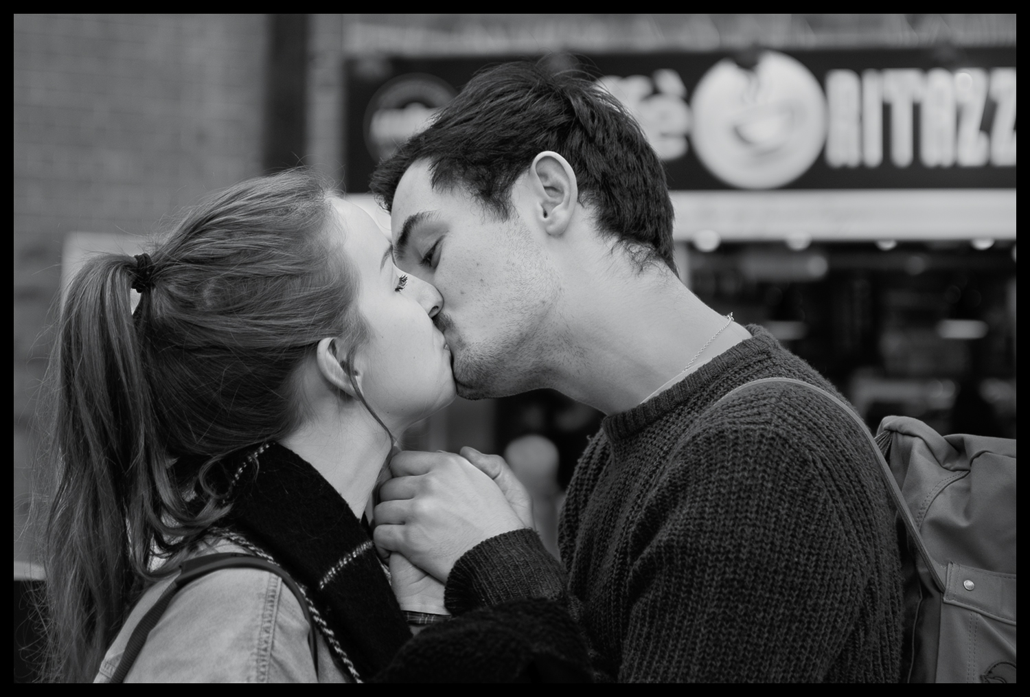
With this relatively tiny kit to hand, I spent many a happy day walking my various routes through London streets and capturing many a good 'moment' to remember. Like this 'Last Kiss' image, which is significantly cropped from the full frame, but still looks really good given it was one of the very first grab shots I took on my initial outing with it in Victoria Railway Station. Caught as they said their final goodbyes - love this shot!

The Last Kiss - 35mm f1.8 1/100sec ISO 125

The Last Kiss - 35mm f1.8 1/100sec ISO 125

Here's the full frame, which shows just how good this little camera / lens combination is ...

The Last Kiss - 35mm f1.8 1/100sec ISO 125 - Full Frame

The Last Kiss - 35mm f1.8 1/100sec ISO 125 - Full Frame

While still on the theme of goodbyes - here's a hug she won't forget in a hurry .....

Until Next Time - 35mm f2 1/100sec ISO 100

Until Next Time - 35mm f2 1/100sec ISO 100

And quite possibly my favourite image from that Victoria session was this wonderful Vicar, who seems to have the patience of a Saint as he was stood alone on that spot for ages - Waiting for God(oh)!

Waiting for God(oh) - 35mm f1.8 1/100sec ISO 110

Waiting for God(oh) - 35mm f1.8 1/100sec ISO 110

Some time later I was sitting in the Photographers Gallery cafe looking out at the street opposite and I noticed this in a window just above street level .........

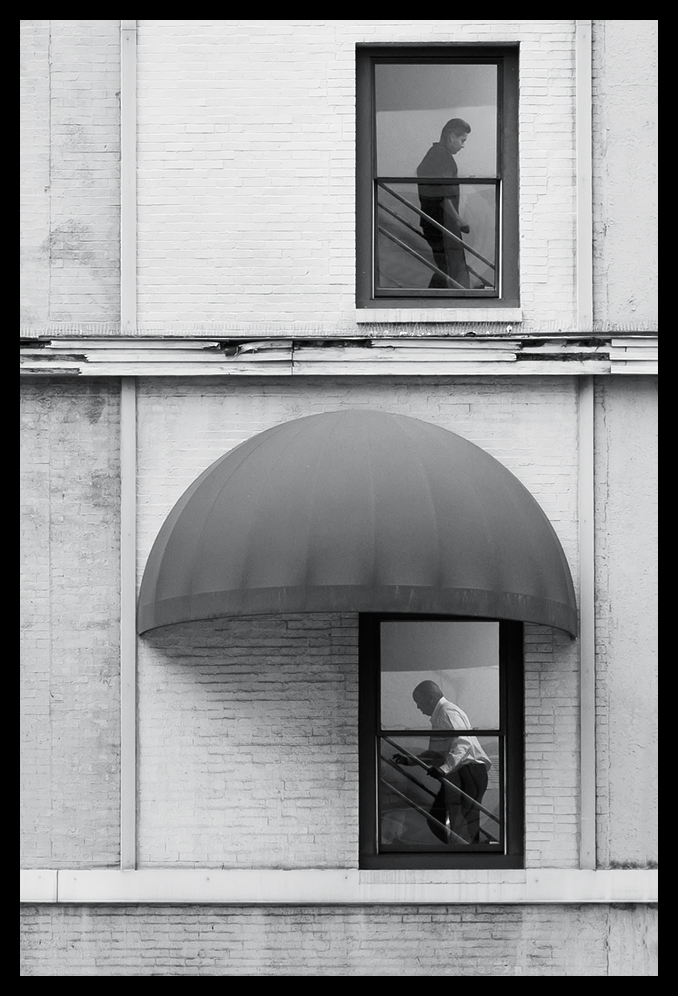
A Window on Time - 55-200mm f4.5 1/80sec ISO 800

A Window on Time - 55-200mm f4.5 1/80sec ISO 800

Walking back through Seven Dials later that day I came across a scene that I thought might have potential, so I stood prepared on the opposite side of the road and waited for what I hoped would happen. Sure enough, if you wait long enough, you are often rewarded!.....

Hair Loss - Sigma 18-35mm f4.5 1/80sec ISO 800

Hair Loss - Sigma 18-35mm f4.5 1/80sec ISO 800

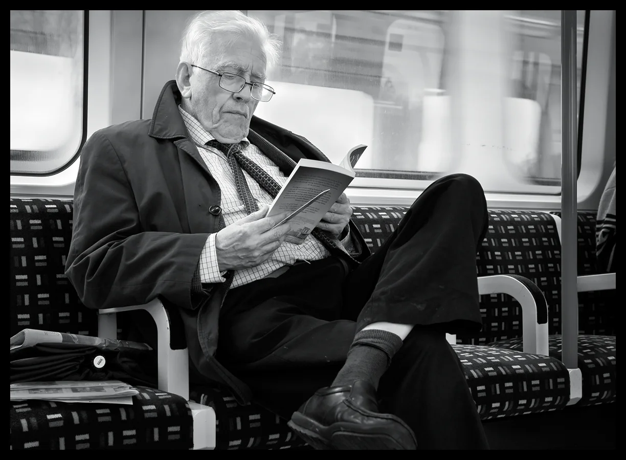
Travelling back down to London by train the following week, I was thinking about the number of people who had their heads buried in their phones and iPads. Even families with kids all had their electronic distractions, so it was rather a pleasure to see the gent opposite me with his attention firmly absorbed by a rather more traditional iBook ........

No Batteries Required - Sigma 18-35mm f5.6 1/125 sec ISO 800

No Batteries Required - Sigma 18-35mm f5.6 1/125 sec ISO 800

Got to love the shadow detail in that image.

My next trip down to Soho yielded some rather amusing shots. I love the timing of this one, which raises a possible question - in passing?

Harmony - Sigma 18-35mm f5 1/100sec ISO 800

Harmony - Sigma 18-35mm f5 1/100sec ISO 800

Then walking in the back streets, behind Leicester Square, I chanced upon these two characters ....

Silvered Selfie - Nikon 24-120mm f5.6 1/80sec ISO 1600

Silvered Selfie - Nikon 24-120mm f5.6 1/80sec ISO 1600

Parental Guidance? - Nikon 24-120mm f4 1/160sec ISO 1600

Parental Guidance? - Nikon 24-120mm f4 1/160sec ISO 1600

Walking through Covent Garden a few weeks after taking the image above, I was standing opposite some of the stores in the inner section of the old market and I caught sight of these two security men. Their facial expressions and body language fascinated me. As you can see, they look bored stiff, indifferent, yet watchful, but seeing nothing, as they wait for their shift to finish. Given they were standing directly in front of the store's entrance I can only imagine how mean potential customers decided not to attempt entry. Heaven knows how much potential business these two frightened off!

Dior Forever - Nikon 24-120mm f4 1/320sec ISO 2200

Dior Forever - Nikon 24-120mm f4 1/320sec ISO 2200

On another walkabout, taking my usual route from Oxford Street through the back lanes and into Soho; as I came through one of the alleys into Compton Street, I noticed out of the corner of my eye, an extravagantly dressed chap walking behind me just as he moved to pass me on the pavement. Thinking I could spin around, with camera ready, to grab a shot, I did just that. Quick as a flash, he changed direction and turned to face me at exactly the same moment, and, Boom! He was standing directly facing me, ready, posed, with a big smile and a 'Thumbs Up'! He'd guessed exactly what I was going to do and was ready for me before I even turned around!

Result! - Sigma 18-35mm f2.2 1/200sec ISO800

Result! - Sigma 18-35mm f2.2 1/200sec ISO800

While en-route in the pouring rain from Oxford Circus to Soho, my usual stamping ground for StreetLife work, I suddenly noticed the reflections in the pavement puddles as I had my head down avoiding the drips from overhead buildings, and this image caught my eye. It has a mysterious quality to it which I thought was worth including here and it looks as if it might have been taken many, many years ago.

Inflection - Nikon 24-120mm f4 1/320sec ISO 2500

Inflection - Nikon 24-120mm f4 1/320sec ISO 2500

Finally, it's not often I take images of cars these days but this one really took my attention and the D5500 has made a cracking job of rendering the tones in the lights and the bodywork - a little stretch from Street Photography perhaps, but a very rewarding shot nevertheless.

Street Porsche - Nikon 24-120mm f5.6 1/320sec ISO 360

Street Porsche - Nikon 24-120mm f5.6 1/320sec ISO 360

Well, I think you can see from these images, that I have been very happy with the time I've spent using the Nikon D5500 on StreetLife projects. I'm particularly pleased with the image quality this camera can produce and how easily those images take post processing.

For the price of this camera, you really can't go wrong if what you are looking for is a relatively inexpensive, light weight, but very capable camera for Street Photography or for general family and travel shooting. The lightweight stock zoom kit lens is more than adequate for general use and the inexpensive DX 55-200mm is a surprisingly good lightweight and small power zoom to accompany it. I would also recommend the new 35mm DX lens to go with this camera body, as it's capable of producing some really crisp images, especially as the D5500 has no anti-aliasing filter on the sensor, which means you'll get as crisp and image as possible from this 24 megapixel gem!

Street Photography with Olympus OM-D E-M5 Mark II

a fast and accurate street camera

I've had over a year now with the Olympus O-MD E-M5 Mark II. I acquired it, together with a series of Olympus and Panasonic lenses, on the advice of Ming Thein, during a Photography MasterClass in Prague last year. This article reviews my experiences and some of the images shot on various Street Photography projects during that year.

Mid Morning Paper Break

Mid Morning Paper Break

Exit Sony A7 and A7s - Enter Olympus O-MD

I had shown up to the MasterClass in Prague with my then latest experiment in lightweight street camera gear; a bevy of Sony A7 and A7s related equipment, having used it in a Street project in Havana a few months earlier. I had been on a quest to find a lightweight but full frame sensor alternative to my Nikon DSLRs. At the time though the Sony A7 series cameras were coming under heavy fire for producing less than ideal images due to file compression artifacts and shutter shock issues, but I had felt the A7 and the A7s might nevertheless still be a good choice for Street work.

For their first outing, in the slow moving pace of the Cuban capital, the Sonys had seemed to work quite well, but in just a few days of using them in the bustle of Prague, I had become increasily frustrated with them - way too slow for rapid Street photography and the long zoom was still as bulky as the equivalent Nikon lens!

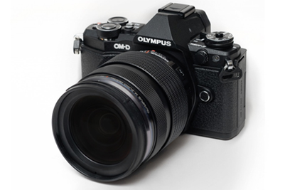
Olympus O-MD E-M5 Mark II Micro Four Thirds Camera

During the workshop, Ming advised investing in micro four thirds equipment as an alternative, which was, to him, already proven as a very lightweight, small, fast, responsive format and better suited to my needs. I took his advice and researched the format that evening and the very next day acquired the newly released Olympus O-MD E-M5 Mark II and a set of lenses.

Now, this article is definitely not a deep dive review of either the format or of the camera. There are several really in-depth reviews in the usual places; two of which I can recommend: The DPReview article here, and the CameraLabs review here. There, you will find all the necessary technical details, if you're that way inclined, which of course, I am!

For me, the most important features the E-M5II has to offer a Street Photographer are the following:

  • small, unobtrusive, lightweight camera body
  • fast, very accurate autofocus
  • silent shutter operation for stealth work
  • small, lightweight but excellent quality lenses
  • in-body stabilisation, good for low light interior work
  • fully articulating screen
  • high resolution EVF with focussing aids

There is, however, one thing to remember about this camera; if you have large hands or fingers, you may find the body too small to use comfortably. Not so for me. I bought the optional grip and battery case, which made all the difference to the balance and handling - particularly when using the 40-150mm zoom lens.

olympus e-m5ii images - street photography shoots from around the world

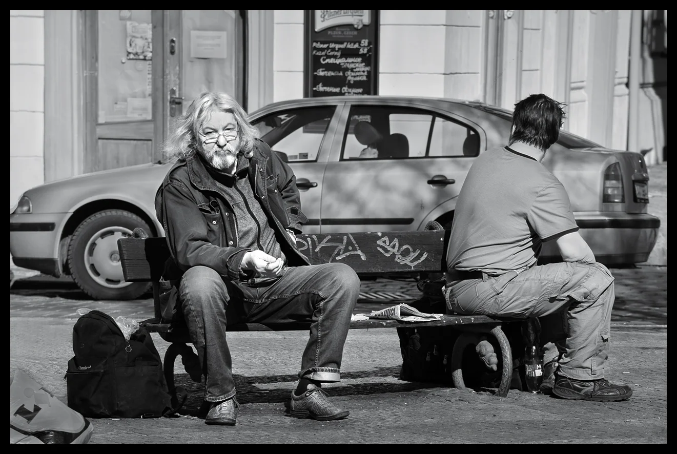
I've used the camera now on several projects in Prague, Chicago, San Fransisco and London and I've found it to be an excellent Street Photography camera. Here are some examples from the Prague shoot:

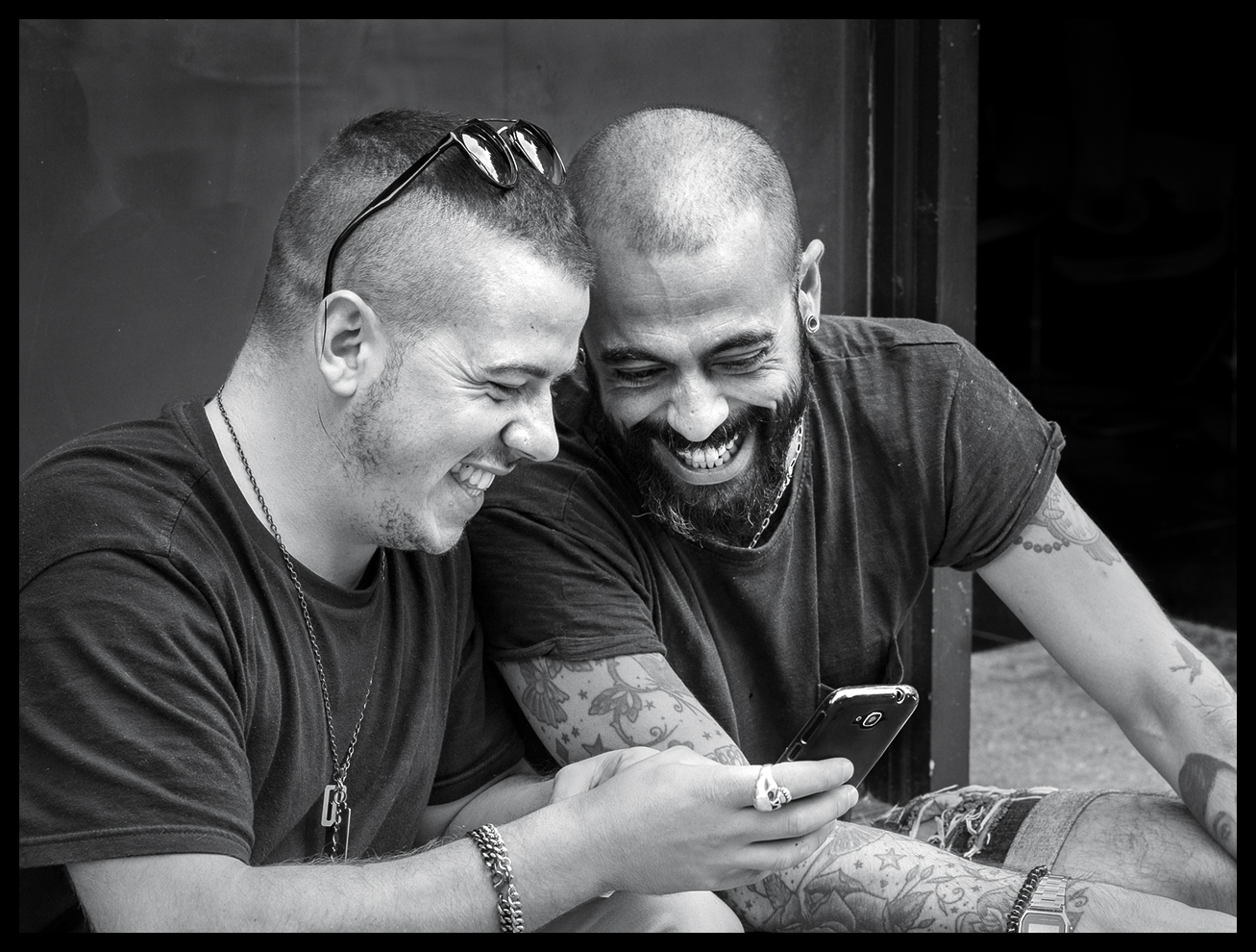
Happiness Shared

Happiness Shared

Metal Men

Metal Men

Kafka's Shoe

Kafka's Shoe

The Thinker

The Thinker

In the Chicago MasterClass later that year, I shot some fun images with the E-M5 II:

Focal Point

Focal Point

Ups and Downs

Ups and Downs

Even in very, very low light, the E-M5 II does a great job of handling slow shutter speeds and high ISO work

Midnight Marilyn

Midnight Marilyn

I used the gear extensively in many London Street shoots throughout the last year. Here are some of the highlights:

Hello Boys

Hello Boys

Mirror Image

Mirror Image

Hare Krishna Whisper

Hare Krishna Whisper

Great Expectations

Great Expectations

Harmony in Humour

Harmony in Humour

Finally, a few shots from a Street shoot in San Fransisco recently:

Stylish Glance

Stylish Glance

Beautiful Minds

Beautiful Minds

Otterly Proud!

Otterly Proud!

conclusions

All in all, a pretty tough test for a Micro Four Thirds format camera - under a wide range of lighting conditions and situations; almost all requiring speed and responsiveness in order to get the shot. After a solid year of project work I give the Olympus and Panasonic gear a genuine thumbs up. Given it's limitations - in terms of ultimate dynamic range and highlight handling, which can sometimes be a challenge to avoid clipping - the Olympus O-MD E-M5 II and its attendant lenses are a first class Street Photography 'no-brainer'. And, now that we are on the verge of the 2016 Photokina announcements, the expectation of a new O-MD E-M1 Mark II is on the horizon, which will, I'm sure, also prove to be a real winner for those that want to upgrade to this system and its fabulous range of high quality lenses.


Zeiss Sonnar 85mm f2 ZM Lens Review with Leica M9

M9-with-Zeiss-85mm-ZM-Sonnar

This is a revised and extended version of my Zeiss 85mm Sonnar lens review article which was originally published on Steve Huff's very popular photography blog in December 2010. I've included more images and new technical content gained from further research on the lens and also added some full size image download options for those who would like to review selected images at full size.

Over the past few months I've transitioned from Nikon DSLRs to the Leica M9 for almost all of my ‘candid’ photography, reserving my Nikon D3 and long telephoto lenses for the sport and racing photography I still do in the summer. Even after three months, I am still somewhat surprised by what can be achieved with the Leica M9. There is just something very special about the images it can produce together with Leica's superb optics. In these early months I've been working predominantly with Leica's superb 24mm and 50mm Summilux ASPH lenses and also with some wonderful Zeiss 35mm and 50mm optics.

More recently, I've been adding lenses, and I'd read that, due to it's narrow angle range-finding system, a rangefinder camera has technical limitations on the longest focal length lens it can accurately focus. Despite Leica and others offering 135mm lenses, several writers suggest the practical limit to be 90mm, and having got very used to my Nikon telephoto lenses in the past, I felt I needed a longer throw lens for those ‘can’t quite get close enough’ shots or for more effectively isolating subjects from their background and foreground.

I did quite a lot of homework on the choices from 75mm to 90mm, reading whatever I could find on the usual forums and websites, but was still not entirely sure what I should go for. There is a very insightful debate on this very question in this Leica forum post. Then, my excellent local Leica dealer Robert White’s Stuart Culley, while apologising for the generally poor availability of Leica 90mm lens stock, suggested a Zeiss f/2.0 85mm Sonnar as another option; particularly good, he thought, for portraits and full length people shots. That resonated, particularly because of some excellent images I'd seen at the end of Steve Huff’s article on the Leica 75mm Summicron, shot on the Zeiss, in a comparison to the Leica.

This suggestion set me off on another search for comparative reviews. I found Erwin Puts' review of a selection of short telephoto lenses, including the Zeiss 85mm Sonnar, here; but, alas, supported by very few images. However, Sean Reid's subscription site, Reid Reviews, also has excellent, illustrated reviews on all relevant Voigtlander, Zeiss and Leica choices.

For those enthusiasts interested in the development of the Sonnar lens design there is an excellent, though brief, article on it's historical evolution by Frank Mechelhoff here, and a little on Wikipedia, here.

Steve Huff and other writers have been impressed with the Zeiss and so, when I needed to make a final decision for a forthcoming trip, I decided on the Zeiss. When it finally arrived, I made some quick test shots to get to know it and was quietly impressed with the way it draws, its colour and just the overall quality of the imagery. Then I took it with me to Venice for a couple of days and these are my first impressions of the combination. First, the initial test shots.

L1000740-Mini-Zeiss-85mm-Sonnar.jpg

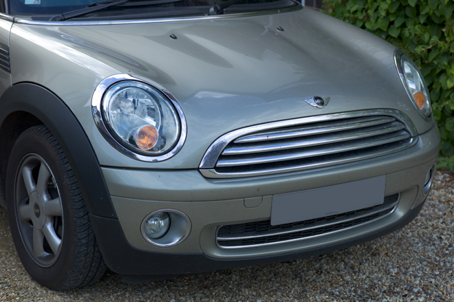
Yes, I know - is this a boring shot or what? Well, this was the very first image from the lens and I kept it in because of the superb, subtle tones in the car's hood and bright metalwork. This colour is difficult to capture, but the full size non-jpeg version, processed, is stunning. It's a simple, nondescript image but it signposts the lens's capabilities. I was encouraged.

leica-m9-zeiss-zm-85mm-sonnar-lens-review-fence-contra-jour

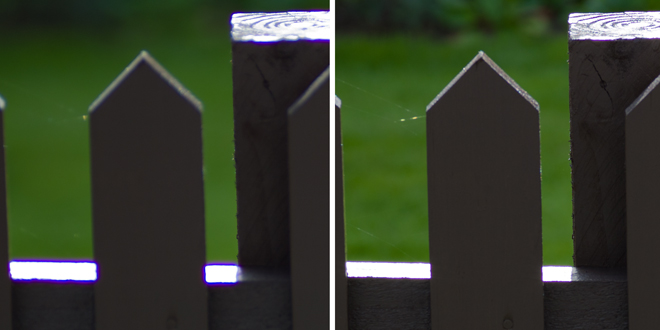
However, when I took some contra-jour images to see how it would cope with flare, I was somewhat surprised by the colour fringing on the burnt out highlights in some of the test images. Here you can see, on the left above, a 100 percent centre crop from an image taken at f/2.8 versus that on the right at f5.6. You can see purple fringing around the very high contrast edges until the lens is stopped down past f2.8, as it is on the right. Hmmm.

contra-jour-example-zeiss-85mm-zm-sonnar-test

As you can see above, this fringing is more exaggerated when you inadvertently overexpose the image at very wide apertures, as I did above, while experimenting with the bracketing of exposures. Ooops. Well, after this first test shoot, and even though I had contributed to the effect myself by overexposing some images, I was keen to understand more about it, so I revisited the articles I'd previously read to see if others had found the same. Yup, in his 90mm RF Lenses test on the M8, Sean Reid noted the same issue on his pre-production sample, finding more Chromatic Aberration than he expected at apertures greater than f4. Also, in his test on the ZF version of the same design his test shots show similar aberration levels on images from wide open to f4. For those interested, there is a great article on Chromatic Aberration at Paul van Walree's site here.

After doing more research on this issue, with a wide range of sources, I learned that lateral Chromatic Aberration is more common than you would think, and it's often seen on relatively fast lenses when used at or near their maximum apertures at very high contrast edges. Witness the same purple fringing on even the fabulous $11,000 Leica 50mm Noctilux-M ASPH lens in Thorsten Overgaard's review here, which also needs to be stopped down to avoid the same effects in very contrasty lighting. This post at the Leica Forum also contains an extensive discussion and images on this whole issue. In another Leica forum post here there is a very extensive discussion on the issue in relation to the Leica 50mm f/0.95 Noctilux which explores its causes, the practical remedies and the realities and compromises in very fast lens design and Erwin Puts' article here illustrates it in context with further explanation.

From these and other sources it also seems that sensor 'bloom' effects may exacerbate purple fringing where the highlight boundary is very overexposed and out of sharp focus, which is what I did. The remedy is, if you detect the fringing in a preview, stop down slightly so that the various wavelengths of light come to focus within the depth of field and thus reduce the artifact. Capture One, the RAW converter, is said to be able to remove the artifact in the conversion workflow. However, a simple Cardinal Rule is - I know, it's the obvious one - don't overexpose at very high contrast edges.
Somewhat refreshed by all this background research, I finally ended up re-reading Sean's closing remarks in his much later comparative test of 90mm Leica. Zeiss and Voigtlander lenses, where he also re-tests a production Sonnar, he concludes;... 'it's really impossible to ignore the exceptional performance of the Zeiss 85/2.0 Sonnar. This is a first rate optic.... (it) may, in terms of technical performance, be the best telephoto lens I have yet tested.'. CA was still visible with the production sample, but not excessive. Phew!

When you look at the technical details from Zeiss on this lens you can see some remarkable claims. For instance, the MTF charts for the lens are outstanding:-

zeiss-85mm-f2-zm-sonnar-lens-mtf-charts

On the right hand chart above you can see that the MTF for the 40 line pairs/mm (the lowest pair of solid and dashed lines representing high frequency data, micro contrast and apparent sharpness) are up at the 80% level for much of the field - this represents potentially excellent sharpness and an excellent ability to accurately record fine detail by the time the lens is stopped down to f/4.0. The highest pair of lines for 10 line pairs/mm (low frequency image details and general image contrast) are at the 95% level which suggests superb contrast across the frame at f/4.0. The left hand chart is almost as good at f2/0, still excellent contrast across the frame, but with slightly less ability in fine detailing towards the corners. There are some very helpful articles on MTF by Klaus Schroiff on Photozone here and by Bob Atkins starting here. There is also a useful article by Bob Atkins on testing lens sharpness and resolution here.

So, I was comforted enough to carry on testing, and with renewed enthusiasm aided by a gorgeous sunny day, I set off into the village to get the shots below.

leica-m9-zeiss-zm-85mm-sonnar-lens-review-halton-cottage

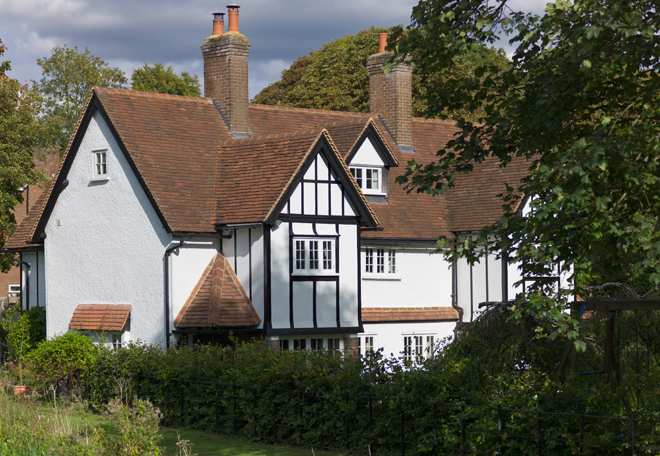
Here you can see what can be achieved with the lens when the exposure is spot on. This is an old, very photogenic cottage in my village. The detail in the building and its roof makes it very useful as a test subject - particularly in bright sunlight together with some deeper shadows under the nearby trees. I just liked the way the Sonnar draws it - and those lovely colours. The image was shot in RAW and minimally converted in ACR. No contrast adjustments or sharpening were done. Click on the image above to download and view the Jpeg version at 100%, which was saved at quality 10 (5.4Mb).

leica-m9-zeiss-zm-85mm-sonnar-lens-review-halton-cottage-100pct-details

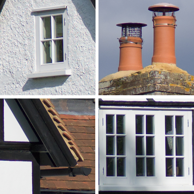
Here are some 100 percent crops from around the centre and edges of the same image - again, all unsharpened and unprocessed except the bare minimum of conversion in ACR. Although this is reputed to be a high contrast lens, all these details are beautifully drawn and they stand out without the need for adding excessive contrast in post processing. The chimney detail crop reveals how beautifully the lens renders the subtle tones in the eathernware pots - great colours again - and if you're concerned about how it captures detail at the edges, check out the fine wire mesh at the top of the right hand chimney pot.

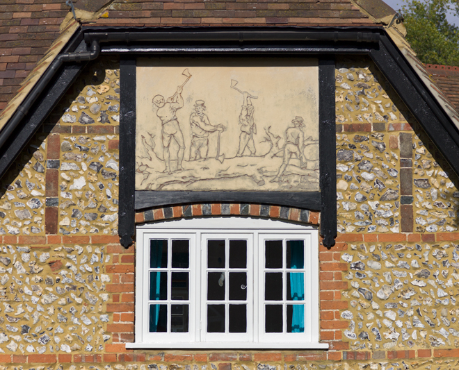
Walking a bit further down the lane, I shot the image below. It's shows an example of a dying craft called 'Pargetting'. This is done by lime plastering a section of wall, or as here a decorative panel, and then drawing into the wet plaster to illustrate a rural scene. It's a technique that was used on many village and civic buildings from the Late Tudor period (1500s to 1600s) right up to the early 1920s. Here you can see local farm workers felling and trimming a tree. Anyway, the image helps to show how the lens captures the textures without having to emphasize them with contrast adjustments.

There is also no trace of the aberrations I detected earlier. The high contrast edges around the windows in the shot below show that all is well when you get the exposure right. No sharpening has been applied to the image.

leica-m9-zeiss-zm-85mm-sonnar-lens-review-cottage-pargetting

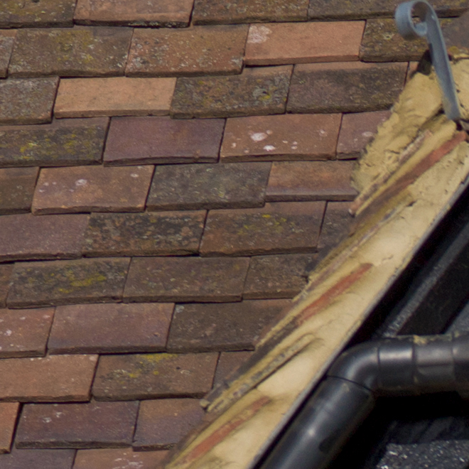
Here is a 100 percent crop detail from the upper left of the image. No contrast adjustments or sharpening were added. Great colours in the roof tiles.

leica-m9-zeiss-zm-85mm-sonnar-lens-review-roof-100pct-detail

Below is a 100 percent crop detail straight from the RAW file from the centre of the image. No contrast adjustments or sharpening were added. Great rendition of the flint wall details too, and again, no trace of chromatic aberrations on the high contrast edges.

leica-m9-zeiss-zm-85mm-sonnar-lens-review-pargetting-centre-100pct-detail

So, with that modest, but successful test behind me, I was ready for the real trip - an all too brief, two day vacation in Venice!

venice - a leica and zeiss paradise

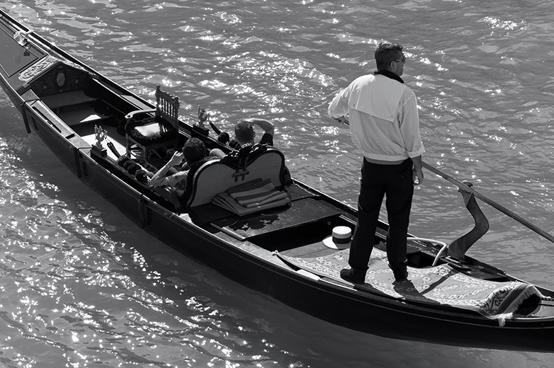
This image (below) was my first shot from the balcony of our hotel. It's only about a third of the frame, from the centre - 85mm focal length doesn't really isolate everything at this distance. It was shot at f4.0 at 1/1000th sec at ISO 160 - handheld. I was just trying to get used to the framing at this sort of distance, and framing your shot is a bit of a challenge with this lens. If composition is critical, to use as much of the frame as possible, then you're going to have to practice quite a bit before you get what you were hoping for first time. Even if you dial in an appropriate lens code, you still get the 90mm framelines and they are different enough from the real view that critical composition is quite tricky. I need to practice more, obviously.

If you look closely, you can still see some chromatic aberration on the left shoulder of the gondolier and you can just detect the purple fringing on the near horizontal surface of his shirt, but it's not too bad.

leica-m9-zeiss-zm-85mm-sonnar-lens-review-first-shot

Look at the detail though - even at this modest sized picture you can still see the potential of this lens - finely drawn lines, nice colour and wonderfully subtle tonal gradations. Very nice, and the way it picks up the variety of tones and the translucency of the water, under the gondola and by the oar in the bottom left corner, is also excellent. Again, minimal processing and no sharpening.

Focus was quite tricky - I'm still getting used to it, but I really don't see why Ken Rockwell had quite so much trouble focusing this lens, as he claims, in his otherwise very positive review.

Lots of people have commented on this lens being an ideal portrait lens, including Zeiss themselves. I think I'm right in remembering that they say that, because of deliberately uncorrected spherical aberrations inherent in their design, the lens gives beautiful renderings of slightly soft portraits and so lends itself directly to that kind of work. Well, actually, I was hoping that it might be capable of a greater range of subject matter than that. I think these shots suggest that's very possible. Well then, how about some group shots?

leica-m9-zeiss-zm-85mm-sonnar-lens-review-taking-a-punt

This one is also only half the frame, from the left edge to the centre, so the standing gondolier is imaged on the extreme edge of the lens coverage - beautiful. The lower gondola is at the extreme bottom of the frame - check out the detail in the girl's hair and the beautiful skin tones in her arms. The red haired chap in the bottom right hand corner has a printed T shirt on that is nicely rendered too. The gondola decoration, bottom left, and the water droplets are finely captured as well. Click on the image above to download and view a jpeg version at 100%.

Unexpectedly, I really like this shot because of the 'X' composition of the people, the 'chaos' of detail and its overall sense of humour. Wherever you start looking at the picture, your eye is constantly drawn back in by the many lines of interest in the image. They really look like they were having such great fun! Shot at f/8.0 at 1/350th at ISO 160, handheld.

While I was busy concentrating on the shot above, I could hear someone below me, out of frame, singing the 'Just One Cornetto' Walls advertising campaign song to the tune of 'O Solo Mio'. When I glanced down from the balcony there was this crazy guy singing his head off, in mock Italian, with his arms flung wildly apart at the crescendo of the song. A quick refocus and, pop, I got him. Of course my composition was off, so this crop is from one corner of the frame but, I like it. Not exactly posed, but he got my attention! I like the way all the heads lined up and the way the others are trying to ignore the noisy one; the guy in the grey T shirt is, I think, wishing he were somewhere else. Shot at f/5.6, 1/350th at ISO 160.

leica-m9-zeiss-zm-85mm-sonnar-lens-review-just-one-cornetto

Next up was a walk around the Fish and Vegetable Market and here are a couple of shots using the lens at close up range, handheld, in very poor artificial light. Here are some red and green chillies shot at f/11.0, 1/45th at ISO 160. I made no contrast adjustments, nor did I add any sharpening.

leica-m9-zeiss-zm-85mm-sonnar-lens-review-chillies

This shot, is disgusting. These are some kind of eel, no idea which, but skinned the way they are and such an awkward and subtle colour to capture in the crazy lighting, I think it's a creditable result from the lens. Again shot at close quarters at f/4.0, 1/45th at ISO 160. No sharpening or contrast adjustments - straight off the camera with minimum work in ACR.

leica-m9-zeiss-zm-85mm-sonnar-lens-review-palomes

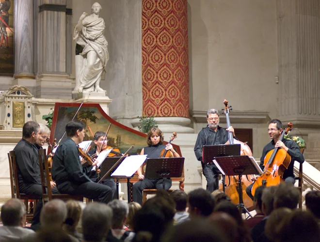
Having been exhausted by trudging around a crowded Venice all day, I thought to catch some culture. So my wife and I took in a Vivaldi chamber music concert at a local Chapel that evening. Naturally, I made myself a bit of a nuisance in the interval by periodically popping up and down out of my seat, like a Jack-in-a-Box, to try a get a shot of the artists before they began the second part of the evening. As they were retuning their instruments, I managed this shot at f/2.0, 1/60th at ISO 1250 - handheld. Not a bad result at ISO 1250! The keen eyed among you will notice the aberrations again at the edge of the music's maxed out highlight in the centre of the image. Ah well. Check out the lovely colours in the marble in the background upper left and the rendering of the Cellos on the right.

leica-m9-zeiss-zm-85mm-sonnar-lens-review-venice-concert

The following day, I tried again, and while my wife was trying out her new LX5, I experimented with some extreme backlit shots. This is one of my favourites. I can tell you that the upper 25% of this scene was completely washed out in the camera's default jpeg. I kept it in, with the minimum of work in ACR to recover the highlights, to show you just what this lens is capable of in such conditions. The shot has its own grace and atmosphere, capturing the very spirit of the Venitian moment. Once again, check out the details in the distance and the way the scene is drawn - very, very nice stuff. Taken at f/5.6, 1/500th at ISO 160; no sharpening etc.

leica-m9-zeiss-zm-85mm-sonnar-lens-review-canal-bridge

Just to make the point a little more obviously, here are some 100 percent crops from the same image - straight from the camera.

leica-m9-zeiss-zm-85mm-sonnar-lens-review-canal-bridge-100pct-details

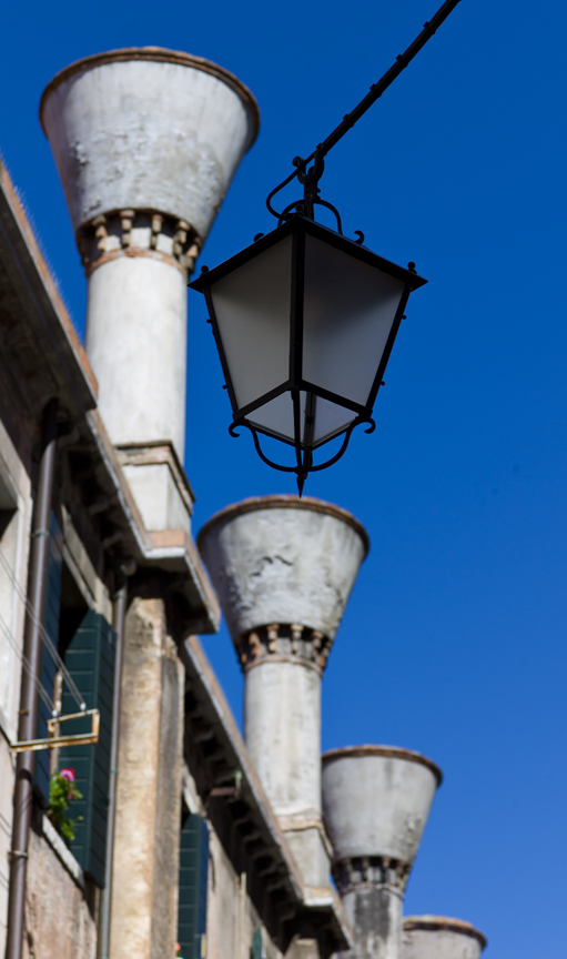
A little further along, I came across one of those surprise juxtapositions which catches your eye and you then spend the next ten minutes working out how to lay on the ground to get just the right angle to compose everything into the best geometric relationship while passers by step nervously over your prone body; hence this shot. I like the way the chimneys are out of focus but recognisable and the overhanging lamp is tack sharp in contrast. Image shot at f/5.6, 1/1000th at ISO 160 - handheld, on my belly in the dirt! Fabulous blue sky gradations.

leica-m9-zeiss-zm-85mm-sonnar-lens-review-chimneys

As we returned to the hotel, looking across the Grand Canal, I noticed a beautiful, almost completely grey building facade with wonderful detailing caught in acute lighting, greatly emphasizing the texture of its stonework. Hence this shot. Taken at f/5.6, 1/3000th at ISO 160 (loads of light), handheld, with no sharpening or contrast adjustments, its shows what this lens can do right across the frame - it's even caught a flying gull mid-flight on the upward wing beat - perfectly! If you can't see it in the main image take a look at the 100 percent crops below. All straight from the camera.

leica-m9-zeiss-zm-85mm-sonnar-lens-review-fabulous-facade
leica-m9-zeiss-zm-85mm-sonnar-lens-review-facade-100pct-details

And now for the humorous moment! This is a hilarious example of exasperated Italian temperament. The gate sign, so my wife tells me, which we just happened to walk past, says - ENOUGH! Stop with the Dog Shit! We are Furious! I'm not sure what the Arabic says below it, but I can guess. Couldn't resist the image, and you can see how the lens has made a first class job of rendering it at close quarters. Taken at f/5.6, 1/180th at ISO 160 - handheld. This shot supports Erwin Puts' conclusion that the Sonnar excels at close distances.

leica-m9-zeiss-zm-85mm-sonnar-lens-review-basta-furiosi

And here is a 100 percent crop from the centre of the image, again, straight from the camera.

leica-m9-zeiss-zm-85mm-sonnar-lens-review-furiosi-100pct-detail

So as not to concentrate my efforts entirely on buildings and group shots, I took a few people images. Here is an example from quite a distance, handheld, in mostly shaded lighting. It's only twenty percent of the frame, but the man is very nicely rendered - pity about the dog's head being overexposed. Shot at f/6.7, 1/180th, ISO 160, no sharpening, but white balance and exposure adjusted.

zeiss-85mm-zm-sonnar-leica-m9-test-all-aboard

I also managed to catch this lady, with her very swish sun brolly, while she was posing for her friend. This was shot at f8.0, 1/125th at ISO 160 and is only 25% of the frame. The white balance and exposure was corrected, but no sharpening was added. Very smooth subtle colours and the umbrella is just beautifully drawn.

zeiss-85mm-sonnar-leica-m9-test-brolly-up

Finally, some monochrome images, the first of which is a contra-jour shot of four gondoliers edging down a narrow canal towards the light. Since most of my work is expressed in monochrome these days, I thought I ought to just put a couple in among this unfamiliar orgy of colour. I just love the way these images are drawn - simple as that. Maybe it's just me, but those subtle tones translate through to monochrome exceptionally well.
leica-m9-zeiss-zm-85mm-sonnar-lens-review-four-gondoliers

Here is another contra-jour shot, again from my balcony, taken at f4, 1/1500th at ISO 160, PP'd in ACR, CS5 and Silver Efex Pro. Click on the image below to download and view a Jpeg version at 100% (5Mb).

zeiss-85mm-zm-sonnar-leica-m9-test-venice-single-gondolier

conclusions

The comparative size and weight of this lens is substantial. On the camera, however, it feels good with a reassuring balance. Some writers have commented on its unusual conical shape, but if you look through the viewfinder you can see that its shape very effectively reduces the lens's intrusion into the frame (without the hood) when composing - a good thing. Fortunately, because it employs internal focusing, the lens does not extend much when focusing between its closest working distance and infinity, which helps the handling. Colours from the lens are very good, sometimes subtle and muted and at other times pleasingly warm and 'forward'. Resolution and micro contrast is high. The rendering of tonal gradations is superb.

I think, without a shadow of doubt, that this lens is a genuine winner. Although my work is almost exclusively monochrome these days, this lens has a habit of reminding you that colour has it's own intrinsic photographic value and that it can seduce the eye with its own subtle rendering of scenes where colour is a major pictorial element of the overall image. It has a 'personality' - softer rendering when completely wide open, but rapidly rendering pin sharp, contrasty images as you stop down past F/2.8 and is wonderful at F/5.6. Couple this with beautifully subtle colour when it's appropriate and it's ability to record very fine details and I don't think you could be disappointed with this lens.

Of course, it's not a budget lens alternative to a comparable Leica lens and so it has to stand in that company as an equal performer but with a different 'character'. I think it achieves that with plenty to spare.

Incidentally, you'll of course have noticed that I deliberately didn't shoot any portraits. Ha! I hear you say - it's a portrait lens. Well, that's because I'm now working on the next step, which is how to use the lens as creatively as I can. Having satisfied myself that the Sonnar is a keeper, my challenge now is to see what can be achieved creatively - and I shall begin with a portrait or two. Hmmm.


Billingham Hadley Pro Camera Bag Review

Billingham Hadley Pro Camera Bag

Having made the decision to add a Leica M9 Rangefinder camera to my options when travelling, I spent a great deal of time looking for a camera bag that would allow me to carry my gear comfortably and safely. One of the issues I face when on the move is the amount of technology I have to carry in connection with my work. It includes two laptops and several disk drives, chargers and cables, so my Tumi roller laptop case is packed to the hilt already. This means that I carry another hold-all kind of bag with my other stuff in it, so I cannot add a separate camera bag and get through check-in without having to consolidate all this into two carry-ons.

I needed something that would hold my rangefinder and two or three lenses that would collapse into nothing when necessary, or which could consolidate itself into my other bags until I arrived at my destination, when it would become a purpose made camera bag again. Yes, I know it's complicated, but it's no joke when you are trying to get so much gear from one place to another on airplanes without breaking it or your own back carrying it all. I looked at several options from Lowepro and Crumpler, but without success.

Then I remembered that I had a couple of very old Billingham bags that I'd bought many years ago which carried my 35mm SLR Film bodies and lenses onto field trips before the days of purpose designed photographic backpacks. I pressed one into service, but soon found that its design was not going to do what I needed. It was too bulky, front to back, which meant that the heavy gear was being carried further away from my body and 'pulling' outwards to make things very uncomfortable after only a short time. Wearing the bag while attempting to take shots was very awkward; so that wasn't the answer. It did remind me to check out Billingham's site though and follow up at a local camera store, where I found just the thing! A Hadley Pro bag.

The video review shows how well it meets my needs. It's thin - only about four inches thick. It's long enough to take a camera and four lenses. It's light enough to sit on the shoulder without 'pulling' itself off while shooting images in the street. Everything can easily be reached and its inner padded compartment can be pulled out and quickly popped into another bag while going through airports until you can put it back into the outer bag. Brilliant. Highly Recommended and four and a half out of five for value and design.

The only improvement I could think of was that a non-slip shoulder pad should have been included in the price, but these 'accessories' are obtainable from Billingham directly, at extra cost.