Monochrome Images

Thorsten Overgaard - A Masterclass in Leica Street and Portrait Photography

Thorsten Overgaard is quite a character. Remarkably straightforward in his views on photography, he is direct and refreshingly uncomplicated when it comes to putting his point across, particularly about the art of portraiture. His catch phrase sums it all up in one, single sentiment........ 'everyone wants to look young, intelligent and sexy ..... and if you don't make the client look good, in their eyes, it doesn't matter how good the lighting is or how sharp the images are, they will never be used or published'. A sobering thought for any aspiring portrait photographer.

overgaard - the man

Thorsten Overgaard - London Photography Masterclass

Thorsten Overgaard - London Photography Masterclass

Born in Aarhus in Denmark in 1965, his early career was spent in developing and publishing hand drawn Comics. That experience led him into editing a Danish magazine, Blitz, and subsequently into the world of advertising. Then, after developing early online businesses, he used his many talents to create his own consulting company, later turning his hand to freelance writing and taking portraits for feature articles in high quality magazines. By 2006 he was concentrating more on photography, specialising in more portrait work for international magazines and eventually for actresses and celebrities such as Seal, Kelly Preston, Anne Archer and for Bill Clinton and members of the Danish Royal Family.

Today, he is one of the most well known, and perhaps also one of the most controversial photographers associated with the world of Leica and one of the first names you encounter online when researching Leica cameras and lenses.

On his website, he has published an extensive series of ebooks, articles and reviews on the art and craft of photography and, in particular, his experiences of using Leica equipment as a working photographer. He has in that process, it would seem, acquired a reputation as a highly successful self-publicist, which, in certain Leica based forums, has led to significant criticism. Despite that, he has succeeded in attracting a sizeable online following. In recent years, he has also been running an extensive series of photography workshops, based in locations all around the globe - usually one or two a week for most months of the year, except July and August. That's where I caught up with him, and his wife, singer and songwriter, Joy Villa; on the London Photography and Portrait Masterclass.

Before I get into detail though, let me first declare that I am a great fan of 'collective experience' workshops. Over the years, I've had the good fortune to enjoy workshops and masterclasses with a number of prominent photographers, some specialising in Landscape, some in Street and now in Portraiture. These sessions have been led by people such as David Ward (Landscape - Scottish Highlands), Mark Littlejohn (Landscape - Cumbria), Eric Kim (Street), Ming Thein (General Photography and Street), Valerie Jardin (Street), Matt Stuart (Street), Richard Kalvar (Street) and now Thorsten Overgaard (Street and Portraiture), so I have a fairly broad range of experience of how workshops compare.

the london photography workshop

The structure of Thorsten's workshops is broadly consistent with that of others I've attended, in that he offers more of a conversational approach rather than formal teaching sessions. Where his differ though, is that Thorsten's dialogues on his approach and recommendations are, in the main, delivered while actually walking the streets, with the group, looking for potential shots or while enjoying the fairly frequent coffee breaks which accompany the walkabout sessions. I have to say, I rather preferred that, as the discussions on lens choice, camera settings, use of available lighting, alternative framing and composition happen while actually engaged in shooting a scene, so they're most relevant at the point of use, and you get to ask questions about the approach while working on the actual shot.

It was a refreshing change. Other tutors typically prefer a group review of their own work as a kick-off to their workshops, followed by working sessions where you are pretty much left to your own efforts, sometimes accompanied by the tutor, sometimes not, with the workshop finishing up with a collective review of a three to five image selection of your and your fellow students efforts. I'm happy to say that Thorsten distinguishes his approach from others'. in that he spends the entire workshop with you as a group, from start to finish, spending time helping individuals whenever they need it, and as the need arises.

The first of the the three day workshop began with coffee at the Charlotte Street Hotel - a meet and greet for the participants and an opportunity for Thorsten to introduce everyone to the program, to review each person's skill level and to set up their cameras for the coming street session. Shortly after that we hit the streets around the hotel looking for photo opportunities and following Thorsten's explanations of the kind of light he was looking for.

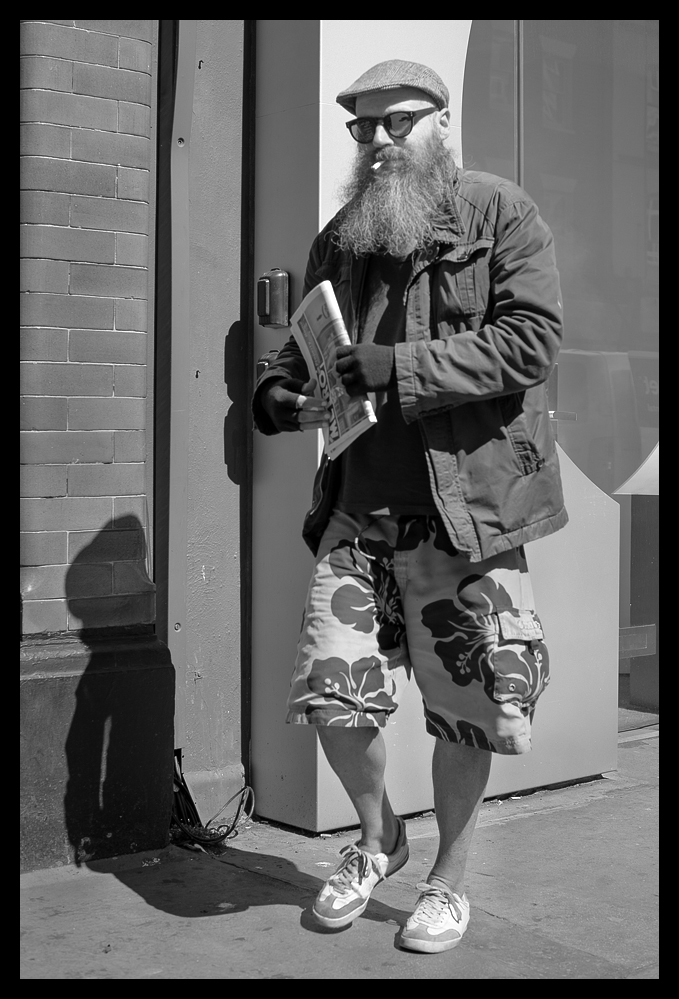
While he was talking to the group I noticed this character out of the corner of my eye. He had just stopped to light his cigarette and was walking towards us. I caught him glancing sideways at us, wondering what this shifty looking bunch of photographers were up to.

Thorsten Overgaard's Photography Workshop - Cool Shorts - Leica SL

Thorsten Overgaard's Photography Workshop - Cool Shorts - Leica SL

On our way up to Fitzroy Gardens, I grabbed this shot of this little chap being taken for his 'walkies' - rather reluctantly?

Reluctant Walkies - Leica SL

Reluctant Walkies - Leica SL

..... and this shot of a couple of construction workers taking a moment's rest after a long shift.

Long Day! - Leica SL

Long Day! - Leica SL

We continued our walkabout until we reached Fitzroy Garden Square, where Thorsten took the opportunity to show a couple of my fellow participants how to change viewpoint and get right down to it. Love that snazzy jacket of his!

Thorsten Overgaard Showing How its Done in Fitzroy Garden Square - Leica SL

Thorsten Overgaard Showing How its Done in Fitzroy Garden Square - Leica SL

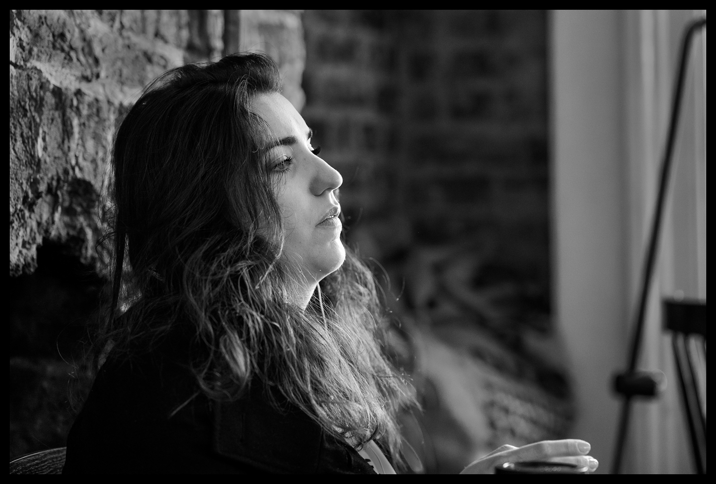
Shortly after that we found Mile 27 - a coffee cafe with some great window light, so we all piled in to see if we could get any window lit shots of customers. I'm was quite pleased with the two shots I managed to get, although they're candid portraits capturing quite different moods.

Thorsten Overgaard's Photography Workshop - Mile 27 Coffee Break - Leica SL

Thorsten Overgaard's Photography Workshop - Mile 27 Coffee Break - Leica SL

Musing on Life at the Mile 27 Coffee House - Leica SL

Musing on Life at the Mile 27 Coffee House - Leica SL

While we were listening to Thorsten's explanation of how to capture interior window lit shots, I managed to grab a sneaky portrait shot of Craig, a fellow Leica M10 shooter from LA.

Craig 'Chuck' Norris - Learning about Window Light - Leica SL

Craig 'Chuck' Norris - Learning about Window Light - Leica SL

The rest of the first day was spent in like fashion, walking through the streets of West London, stopping occasionally for Thorsten to make suggestions of how to find the best light, compose various alternative shots, help some people to correct their camera settings and provide alternate interpretations of the pictorial opportunity.

At the end of the first day, Thorsten directed us to bring our laptops for the following morning's session so we could process the shots we had taken on the first day. So, very comfortably holed up in the Soho Hotel in Richmond Mews, the second day began with Thorsten discussing the use of Lightroom as a good image editing environment, but perhaps more importantly, an excellent image cataloguing system which does its best to help you store, rate, tag and identify large numbers of images so you can quickly find them again in the future. He spent quite some time on the benefits of storing your images this way and discussed the best way of setting up a Lightroom system and how to use the rating and tagging system to best advantage. For those that didn't have it already, Thorsten also provided a copy of his latest Lightroom Survival Kit so that people could study it further, after the workshop.

We spent the afternoon at the hotel working on processing our images from the first day, the objective being to ingest all our shots into Lightroom, curate them down to the best three images, then process the three selected shots so we could share best efforts among the group at the end of the session. Thorsten provided guidance on image processing to all who needed it and hosted the late afternoon review of everyone's work, offering advice and commentary on all the finished images.

Hot Tip - Leica SL

Hot Tip - Leica SL

The final day of the workshop began with another walkabout morning session. This time the emphasis was on describing and searching for the best light for street portraits. Curiously, the best light is not what you would immediately think of, in that the last thing you want is bright, highly directional sunlight straight onto a subject's face. This causes unwanted harsh shadows that are very difficult to deal with and unmanageable differences in the amount of light that hits the face in the bright spots versus the darker shadow areas. What's needed is a more even, soft light, which flatters the subject and softens the lines and 'ageing' the camera would otherwise record in harsher sunlight.

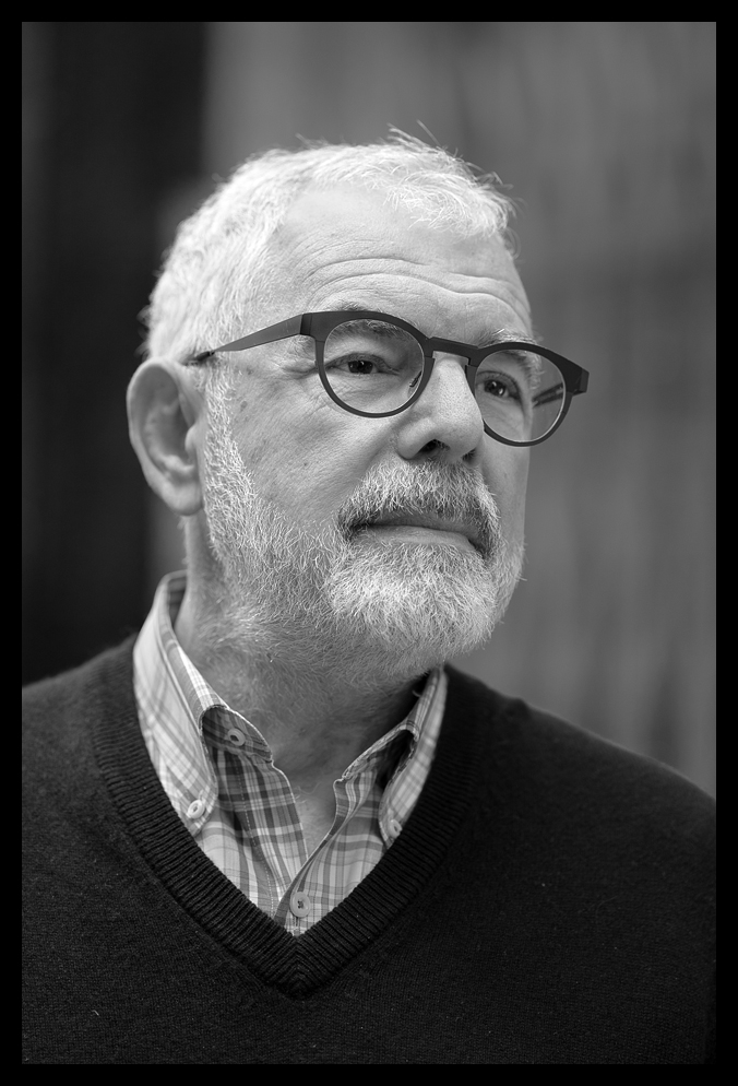
Below you can see the result of a little experiment; The portrait was shot in very even light, straight on into the camera. It was shot with a Leica SL fitted with a Leitz 80mm f1.4 Summilux R Lens> The lens dates from the mid 90s - it was used wide open at f1.4 and you can see it's characteristically flattering treatment of the subject and the creamy bokeh it gives.

I also edited the image in Photoshop to remove the harshest lines and blemishes to peel off a few 'years' - in keeping with the spirit of the treatment. The image below that was taken with the same Leica SL, but fitted this time with the very latest Leica 90mm f2 Summicron SL lens shot at f2.2. Naturally, there are differences, but it shows that choice of lens and post processing can make for an entirely different result, depending on the kind of treatment you're looking to produce.

Looking Stoic but with Compassion - Leica SL with 80mm Summilux R Lens

Looking Stoic but with Compassion - Leica SL with 80mm Summilux R Lens

Peter Cook Looking Majestic - Leica SL with Leica 90mm F2 Summicron SL Lens

Peter Cook Looking Majestic - Leica SL with Leica 90mm F2 Summicron SL Lens

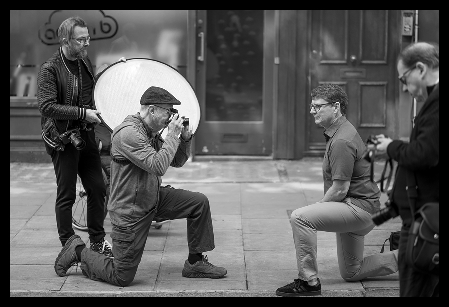
Thorsten spent a lot of time talking us through how to find the best natural lighting, using the back of his hands to show how differently the hand looks when you change its angle to the light, revealing more or less texture and lines in the skin depending upon how acute the lighting angle is. He then showed everyone how to set their camera's exposure and white balance for best results using a light meter and grey card, and how to use a soft diffuser to reflect and fill in shadows with additional light to even out the exposure while retaining some 'character' and modelling in the subject's face.

Modelling for the Team - Leica SL

Modelling for the Team - Leica SL

This session wasn't all about the lighting though. Thorsten spent the rest of the session directing the model (using the course participants, in turn, to model for the others) and talking through how to put the subject at ease and also how to position and direct their pose and expression, while still concentrating on composition and viewpoint to get the best shot.

Thorsten explaining the Finer Points - Leica SL

Thorsten explaining the Finer Points - Leica SL

The last afternoon was spent in the Soho Hotel again, importing, rating, curating and processing the images from the morning session, followed by a last group review of everyone's best portraits of the day.

the portrait workshop

For those who participated on the main workshop, the portrait masterclass is a two day extension, but it's also possible for participants to join the workshop as a stand alone course. The two day course offers a deeper dive into the outline provided on the third day of the main photography workshop, so there is a little repetition, but that's a good thing, in that you have a chance to cover some of the scenarios twice and that helps to reinforce your understanding.

The first of the two days began in a similar way. First we met at the Charlotte Street Hotel to introduce the new participants and to drop off our laptops. After coffee, we searched for suitable light in the local streets and took turns as models for the other course members when it was their turn to photograph the 'model'. Thorsten again gave instruction on camera settings; the best way to read light levels on the subject's face (with a Sekonic incident light meter) and showed the best way to measure and set a camera's white balance using a grey card reading. He spent a long time discussing and demonstrating how to find the soft lighting source described above and how to use a collapsible, multi-surface reflector / diffuser to fill in shadow detail and reduce contrast while retaining as much modelling in the subject's face as appropriate for their skin type and facial features.

Thorsten Overgaard Discussing the Best Lighting for Portraits - Leica SL

Thorsten Overgaard Discussing the Best Lighting for Portraits - Leica SL

Thorsten thinks of a portrait, not as just a picture, but as more of an intimate conversation - but without words. He says that once you have the technical aspects covered, making a great portrait is mostly about how comfortable and 'present' the subject feels and how relaxed and natural their expression. You're are trying to get to a point where the subject looks confident and approachable, comfortable and engaging or at least, engaged and in the moment.

Thorsten acknowledges that while subjects can look awkward and distant at the beginning of a session, if you direct them with confidence while you build the relationship, for each shot there will be at least one, albeit brief, moment when the person 'opens up' - and that's when you have to take the photo. Of course, you have to be able to recognise that moment and that's where the practice comes in. The more portraits you shoot, the better you get at recognising that moment. You're not trying to represent that person as merely an art object, but as a character with 'life' and 'personality'.

Being the subject for the other photographers is an eye-opener as well. When you pose for your associates, you can see where they might be going wrong. They can be reluctant to direct you at the beginning, preferring to adjust their position rather than direct your position, pose, expression and direction of gaze - all of which contribute to the final look. To help you with all of this Thorsten distills his advice into straightforward, instructional tips that just make sense. He shows you, guides you, even positions you, the model and the lighting until the 'magic' begins to happen. It is most certainly an art.

The image below was taken of me by Craig 'Chuck' Norris, a fellow student on the workshop, while i was taking my turn as the subject. He took this as a colour shot with his Leica M10 and a Leica 50mm f2 ASPH lens. He very kindly sent me the RAW file for this image and I did the monochrome conversion and final processing. I think he did a great job with the shot, and it's one I've already used, with Craig's permission of course.

Learning To Be The Subject - A Rare Moment In Front of the Lens - Leica M10

Learning To Be The Subject - A Rare Moment In Front of the Lens - Leica M10

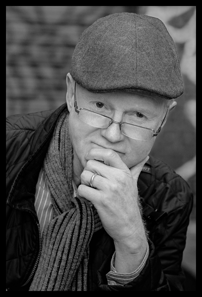
In the final session I could see Thorsten's advice producing great results. All the participants were beginning to apply his advice and you could see the change in everyone's set of three final images, which were presented to the group in the last session. My favourites were the three images below, where I think I managed to capture more of the 'character' of the subject, rather than just a literal snapshot, but you would be the best judge of that! My thanks go out to Hugo for his enormous patience and to especially to Joy for her very professional modelling.

Hugo Rodriguez de Miguel - Deep in Thought - Leica SL

Hugo Rodriguez de Miguel - Deep in Thought - Leica SL

Hugo Rodriguez de Miguel - Calmly Relaxed - Leica SL

Hugo Rodriguez de Miguel - Calmly Relaxed - Leica SL

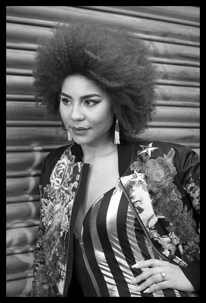
Finally, probably my favourite shot of the entire workshop - a street portrait of Joy Villa, Thorsten's wife. I chose to shoot her with the Leica SL fitted with the twenty five year old famous Leitz 80mm f1.4 Summilux R Lens. The example I showed above presents a much softer overall look when set wide open, but this time I used an f5.6 aperture and was agreeably surprised at how sharp this venerable lens is when stopped down.

'Princess' Joy Villa - Leica SL fitted with Leitz 80mm f1.4 Summilux R Lens at f5.6

'Princess' Joy Villa - Leica SL fitted with Leitz 80mm f1.4 Summilux R Lens at f5.6

So, according to Thorsten then, how do you know a good portrait when you see one? Well, he says the best guide is that if it's really 'good', the person will use it - on LinkedIn, Facebook,  Instagram etc and maybe even have it printed for their family, home or office. He reminds us that a portrait is not just a technical exercise - it's an important personal document - for that person, in the service of that person and it's something they will be proud of. Who could argue with that?

Update - I posted a link to this article on a well known Leica based forum and encountered a significant amount of criticism related to Thorsten's other marketing activities and other aspects of his life choices. I have to say I was shocked at some of the contributor's comments, not all of which were worthy additions to the discussion. There was lively debate on the pricing of his workshops and some made the comment that they could have made better use of the money. I made no comment on Thorsten's prices or on the perceived value for money he offers. However, you should be able to tell from the tone of this article that I enjoyed the 'experience' of both workshops. As always, your mileage may vary.

If you like what you've read in this article, please take a moment to click the 'Like' button below.
Street Photography with Olympus OM-D E-M1 Mark II

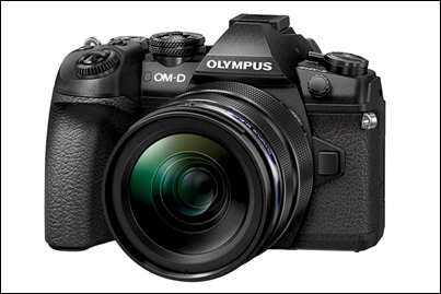
e-m1 mark ii - a huge upgrade from the e-m5 mark ii?

Olympus OM-D E-M1 Mark II.jpg

In an earlier post I described my experiences shooting Street Photography with the OM-D E-M5 Mark II and gave many examples of the projects I shot with it over about a two year period. I still have that camera and, of course, the lenses I invested in for those projects. Coming from the Sony A7, my first mirrorless camera, I can honestly say that working with the E-M5 Mk II was a genuine revelation.

So, in this review of my subsequent upgrade to the E-M1ii, I will avoid rehearsing the specifications and technical differences between the two camera and I'll concentrate on my practical experiences with the newer, flagship model.

Read the earlier post for details of my earlier changeover from the Sony A7 to the E-M5ii. As I said in that post, I found the E-M5ii to be an ideal camera for Street Photography, being small, light, fast in operation and silent - everything you could want to be able to make images inconspicuously working the streets of London. The autofocus was quite a surprise too - very fast to lock on to the subject and very accurate, probably because of the number of focus points and the benefit of both contrast and phase detect autofocus technology. Perfect for fast response Street work.

During those projects I also attended several workshops with photographers who were using the E-M1 Mark I and I saw first hand the advantages they were claiming for the E-M1 over the E-M5 . At that time though, the E-M1 was expected to be superseded by the Mark II version, so, although I was keen to try an E-M1,  I was very happy to continue exploring the E-M5ii. In some ways, it was the better camera, having been released early in 2015 sporting Olympus's latest technology, whereas the E-M1 was first introduced as their flagship model in September 2013. It was to be almost three and a half years before the E-M1 Mark II was actually available from suppliers! But worth the wait!

So, it was in February 2017 I was finally able to get my hands on the upgraded E-M1 Mark II. All my 'photobuddies' were expecting a minor upgrade, but we were all surprised at the actual difference in performance, rather than just the specification changes.

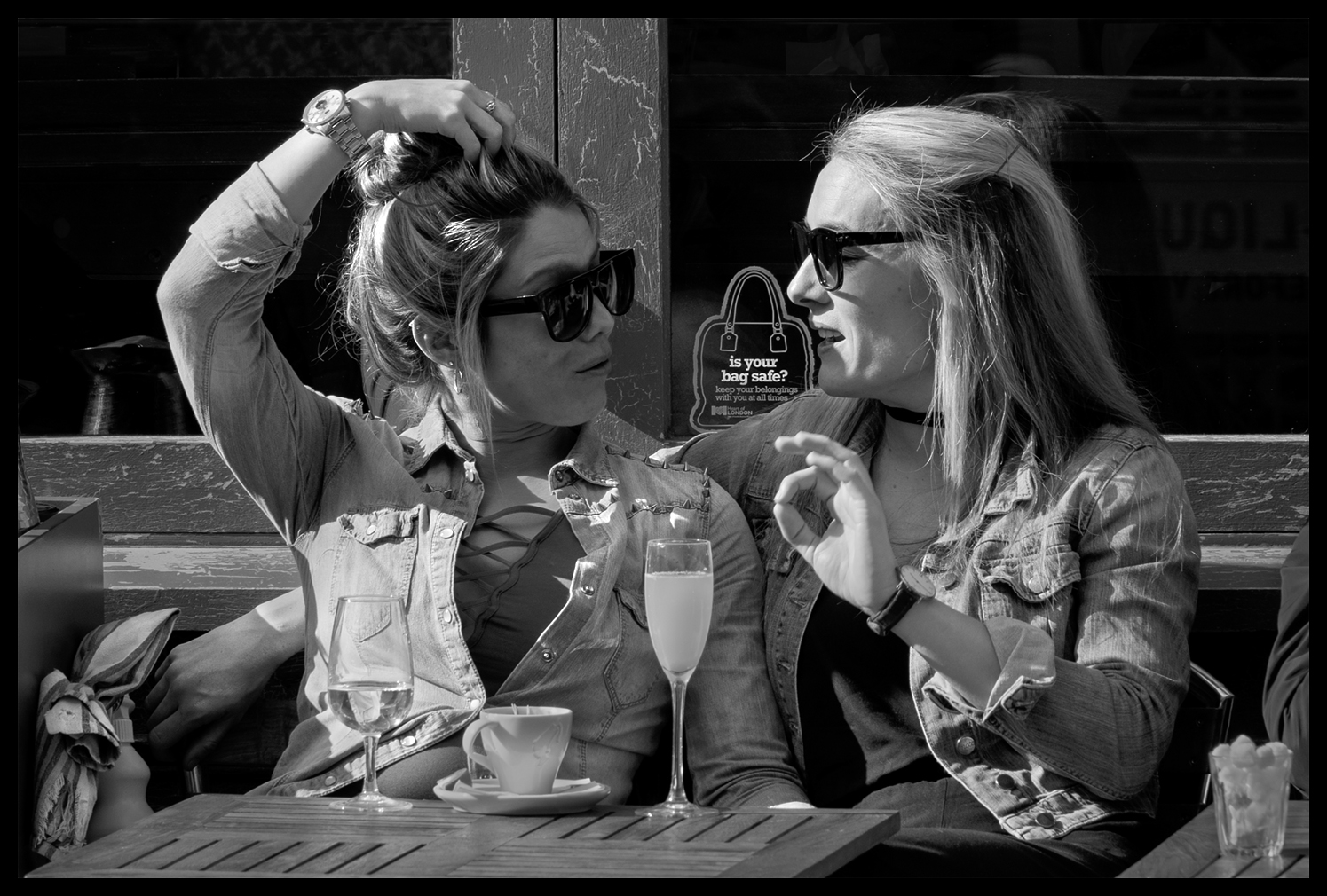
Is your Bag Safe? - Olympus OM-D E-M1ii, 12-100mm f4 at f5.6, 1/250s, ISO 200

Is your Bag Safe? - Olympus OM-D E-M1ii, 12-100mm f4 at f5.6, 1/250s, ISO 200

One much hoped for change in the upgrade was for improvements in Dynamic Range from the new 20Mp sensor and in particular a practical improvement in how the camera deals with and renders highlights. The E-M5ii was really tricky in that respect, easily 'losing' highlight detail during capture and often exhibiting a precipitous, 'cliff edged' tonal gradation behaviour at the top of the exposure curve, so, you had to very carefully expose to the right in capture, constantly checking the histogram, and then be cautious in post processing to not lose the highlight detail that had survived thus far.

What about the E-M1ii then? Well, the numbers don't quite tell the real story but I can say, in practice, that the E-M1ii is definitely able to deal with these challenges more effectively than the E-M5ii. The image above was taken in very strong sunlight with deep shadow detail and I think the E-M1ii has handled the skin highlights very well, preserving a smooth tonal gradation in the girl's forearm and producing a quality result, and even in the sharp transitions from bright to mid-tones in the girl on the right's face.

DxOMark Dynamic Range Olympus OM-Ds.png

Given the frustration I'd encountered with the E-M5ii, especially in post processing, and leaving aside the twenty five percent increase in sensor resolution, it was mostly this aspect of the camera body and sensor upgrade I was really primarily interested in. In terms of the raw numbers, DxOMark's lab testing of the E-M1ii shows a small but significant enough increase in overall dynamic range versus the E-M5ii; between a half and one whole stop, depending upon ISO setting, as shown in the graph on the right here (courtesy of DxOMark Image Labs):-

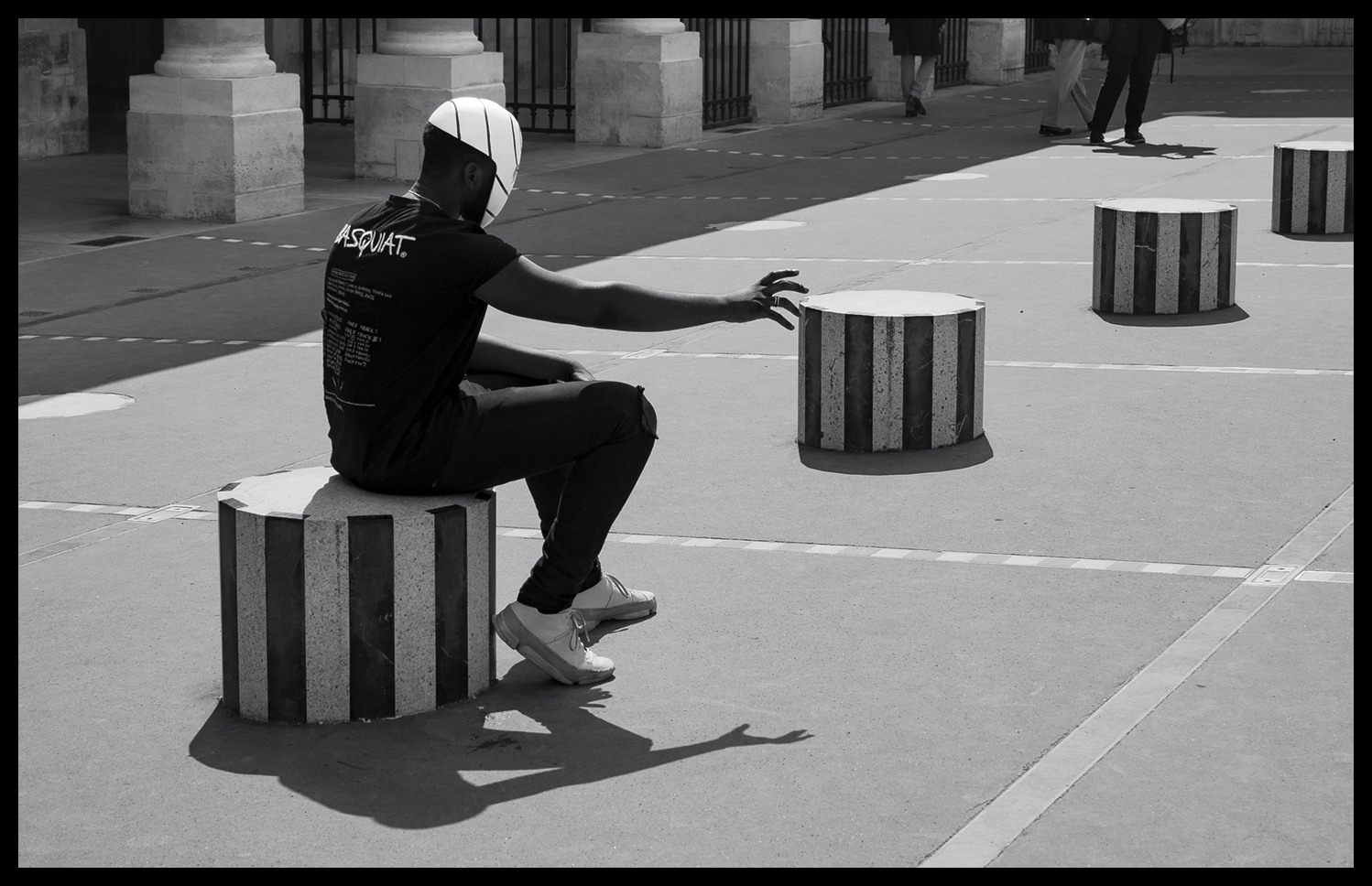
The shot above was taken in London's Covent Garden area, but this one below was taken in Paris later in the year and is another good example of how well the E-M1ii handles highlights. I don't think I could have used this grabbed shot if it had been taken on the E-M5ii - there simply would not have been time to check all the parameters before firing the shutter:

Spooky Dancer - Olympus OM-D E-M1ii, 12-100mm f4 at f5.6, 1/400s, ISO 200

Spooky Dancer - Olympus OM-D E-M1ii, 12-100mm f4 at f5.6, 1/400s, ISO 200

So, while we're on the subject of Paris Street Photography, I was lucky enough to attend two of Valerie Jardin's Paris workshops in 2017. She has a very easy going style of hosting her workshops, preferring to be out walking the streets than spending hours pouring over technique. She begins her workshops with a slideshow review of her own work - to inspire and demonstrate the possibilities in Street Photography, and, but for the last session reviewing attendees selected images on the final day, the rest of the time you are pounding the streets trying to keep up with her. I can recommend it!

Here are some more images from those days spent shooting in Paris:

OutReach - Olympus OM-D E-M1ii, 12-100mm f4 at f5.6, 1/800s, ISO 200

OutReach - Olympus OM-D E-M1ii, 12-100mm f4 at f5.6, 1/800s, ISO 200

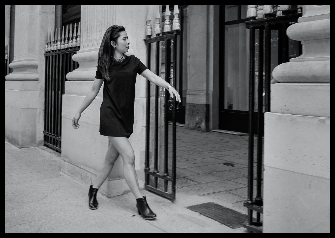
Struttin' 'er Stuff - Olympus OM-D E-M1ii, 12-100mm f4 at f5.6, 1/100s, ISO 200

Struttin' 'er Stuff - Olympus OM-D E-M1ii, 12-100mm f4 at f5.6, 1/100s, ISO 200

Hair Lines - Olympus OM-D E-M1ii, 12-100mm f4 at f5.6, 1/800s, ISO 200

Hair Lines - Olympus OM-D E-M1ii, 12-100mm f4 at f5.6, 1/800s, ISO 200

In Sympathy - Olympus OM-D E-M1ii, 12-100mm f4 at f5.6, 1/5000s, ISO 800

In Sympathy - Olympus OM-D E-M1ii, 12-100mm f4 at f5.6, 1/5000s, ISO 800

Girls Aloud - Olympus OM-D E-M1ii, 12-100mm f4 at f5.6, 1/1250s, ISO 800

Girls Aloud - Olympus OM-D E-M1ii, 12-100mm f4 at f5.6, 1/1250s, ISO 800

I've often wanted to try my hand at capturing a unused street scene with multiple characters and still get some sense of compositional order and a focal point, so I was quietly pleased with the attempt shown above. It's not easy to manoeuvre inconspicuously around such a large group of excited ladies, who clearly are having the time of their lives, all dressed up, constantly on the move and, quite obviously, raring to go to the party!

f.....What!!? - Olympus OM-D E-M1ii, 12-100mm f4 at f5.6, 1/10s, ISO 200

f.....What!!? - Olympus OM-D E-M1ii, 12-100mm f4 at f5.6, 1/10s, ISO 200

This image above shows quite a change of pace and demonstrates another strength of the E-M1ii that of its image stabilisation, both in-body and in-lens. This was hand-held shot taken at 1/10th sec using the long zoom and yet pretty nearly perfectly stable. I was impressed; yet again.

The image below is probably going to remain one of my all-time favourites. It was taken just a few yards from the image above. I noticed the scene out of the corner of my eye, raised the camera to shoot, fired the shutter release and a fraction of a second later, he was gone! Her expression says it all.

The Proposition - Olympus OM-D E-M1ii, 12-100mm f4 at f5.6, 1/160s, ISO 200

The Proposition - Olympus OM-D E-M1ii, 12-100mm f4 at f5.6, 1/160s, ISO 200

Final Offer - Olympus OM-D E-M1ii, 12-100mm f4 at f5.6, 1/100s, ISO 200

Final Offer - Olympus OM-D E-M1ii, 12-100mm f4 at f5.6, 1/100s, ISO 200

Smokin' Connection - Olympus OM-D E-M1ii, 12-100mm f4 at f5.6, 1/200s, ISO 200

Smokin' Connection - Olympus OM-D E-M1ii, 12-100mm f4 at f5.6, 1/200s, ISO 200

The Chase - Olympus OM-D E-M1ii, 12-100mm f4 at f5.6, 1/250s, ISO 800

The Chase - Olympus OM-D E-M1ii, 12-100mm f4 at f5.6, 1/250s, ISO 800

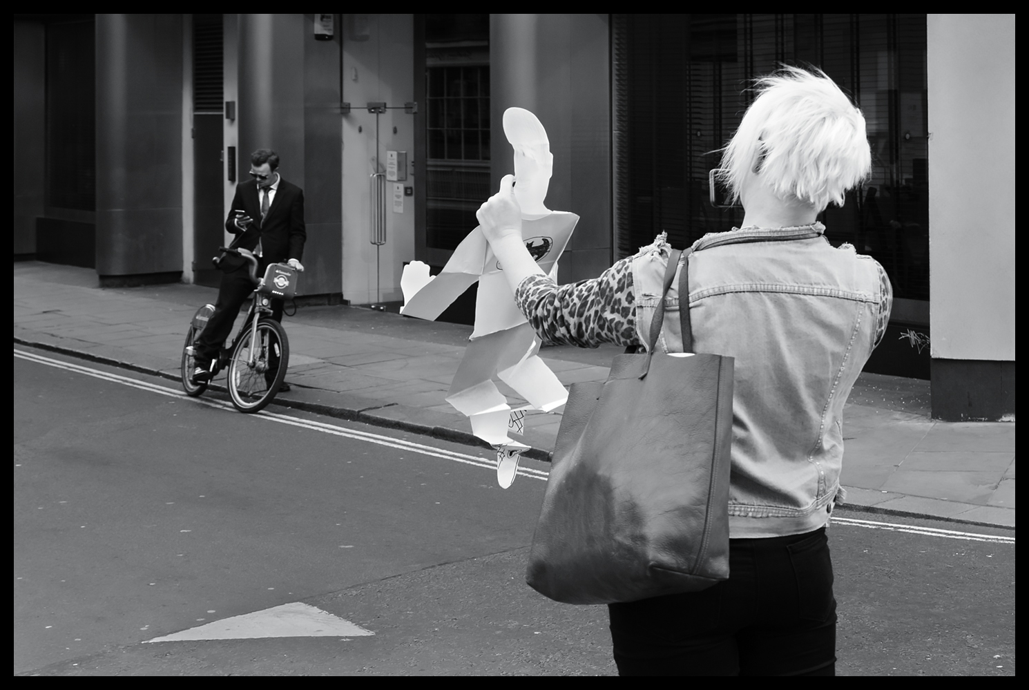
Finally, for the last few examples, I'm returning to my favourite capital city - London. It's just a quirky as Paris, of that there is no doubt, but there are times when I come across scenes that just defy explanation:

Paper Boy - Olympus OM-D E-M1ii, 12-100mm f4 at f4, 1/125s, ISO 200

Paper Boy - Olympus OM-D E-M1ii, 12-100mm f4 at f4, 1/125s, ISO 200

Just to demonstrate, once again, the improvement the E-M1ii offers when dealing with challenging lighting:

Forkin Sun - Olympus OM-D E-M1ii, 12-100mm f4 at f10, 1/400s, ISO 200

Forkin Sun - Olympus OM-D E-M1ii, 12-100mm f4 at f10, 1/400s, ISO 200

And finally, a touch of humour and our beloved quirky Britishness:

Jumping for Joy - Olympus OM-D E-M1ii, 12-100mm f4 at f4, 1/125s, ISO 200

Jumping for Joy - Olympus OM-D E-M1ii, 12-100mm f4 at f4, 1/125s, ISO 200

conclusions

I could not be more pleased with upgrade from my Olympus OM-D E-M5ii to the new Olympus E-M1ii. It has given me a tool that provides for any shooting situation I am likely to encounter working in Street Photography. The new sensor, uprated resolution, rapid autofocus with contrast and phase detection, superb stabilisation, increased dynamic range. lower noise, better performance in highlight roll-off and, just as importantly, superb handling in the field.

Absolutely Highly Recommended.

New Adobe Camera RAW Monochrome Profiles

converting images to monochrome in adobe camera raw 10.3

There are many ways to create black and white images from colour RAW files and, over the years, having graduated from the analogue dark room, I've used most techniques and third party conversion plug-ins; rejected many and eventually focussed on the basic methods in Photoshop and Camera Raw. Now, Adobe has made available an update in Camera Raw and Lightroom that provides a very wide range of colour and monochrome profiles (and enabled the use of LUTs by third parties) as an alternative approach.

For those photographers that prefer to work in monochrome there are 17 new choices of black and white profiles to try out. My first impressions are that they are quite useful as starting points, offering a broad range of conversion from fairly flat tonal gradations through to very contrasty results. Here's what you see when you drill into the Profile Browser in Camera Raw - from left to right - open the browser, select B&W and then scroll down through the 17 new options:

The new Monochrome Profiles in Adobe Camera Raw Update 10.3

The new Monochrome Profiles in Adobe Camera Raw Update 10.3

When you select a profile, you can preview it in Camera Raw, and of course these profiles also  work in Lightroom.
The 17 options provided offer a wide range of tonal gradation, from faorly even toned all the way through to quite contrasty conversions. Here's B&W 01 on my slected image:

Adobe Camera Raw 10.3 - Monochrome Profile 01

Adobe Camera Raw 10.3 - Monochrome Profile 01

The new capabilities don't stop there though. In the screen shot above you can see that there's a slider that allows you to vary the amount of the conversion that's applied to the image, which helps you 'blend' to taste.

However, even more importantly, you get to this new starting point without adjusting any of the standard sliders in Camera Raw. This means that you still have all the other adjustments available to you after this profile is applied - so you can apply all the standard sliders and adjustments until you reach a point where the image looks the way you want. This includes using the standard colour sliders on the black and white conversion tab in Camera Raw as well as graduated filters and adjustment brush 'layers' to further refine the image.

I think this is a major step forward for monochrome (or colour) workers, in that you now have a broader choice of starting points in your initial rendering and yet still retain all your favourite adjustments to fine tune the resultant image. Of course, for those that want to produce high quality black and white images without too much effort, just adopting your selected profile will get you there in one step!

One of my favourite ways to begin a monochrome conversion is to use the DxO FilmPack Elite V5 plug-in profiles. Two of my favourites from DxO are the Agfa Scala 200x and the Ilford FP4 Plus 125 profiles, the former being a darker conversion but with a broad range of tonality, and particularly good on skin tones, the latter being more even and brighter overall.

I use these two and DxO's Kodak Tri-X 400 profile fairly often, depending on the tonality of the initial RAW conversion. These hark back to my old film days and were favourite film choices at the time. As in the case of the Camera Raw profiles you can adjust the final image post conversion in the FilmPack application, which I do, and then export the result to Photoshop for my final editing.

Monochrome Conversion Using DxO FilmPack 5   Left: Agfa Scala 200x   Right: Ilford FP4 Plus 125 Profile

Monochrome Conversion Using DxO FilmPack 5   Left: Agfa Scala 200x   Right: Ilford FP4 Plus 125 Profile

These new profiles from Adobe do however provide some excellent starting points as an alternative, which is particularly welcome capabilities while still in the ACR environment and can therefore contribute to a faster workflow when you consider you can do almost anything now in Camera Raw alone.

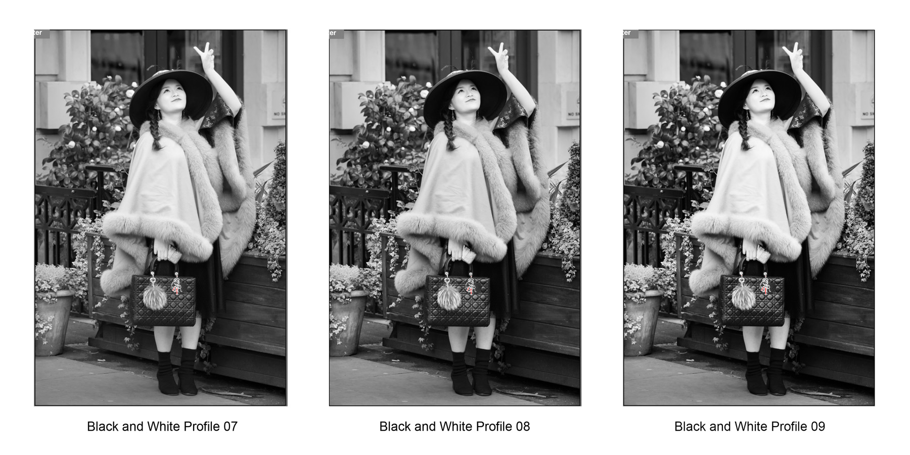
Given that potential, I'll be looking very closely into working with these profiles and comparing them with my current choices. I've reproduced the first 12 of the monochrome profiles below, for comparison, as the rather small thumbnails in Camera Raw don't make it easy to clearly see the differences. The remaining profiles are the fairly standard emulations that would result if you used a blue, green, yellow, orange or red lens mounted filter, which I have not reproduced here.

Adobe Camera Raw Monochrome Profiles 1-3

Adobe Camera Raw Monochrome Profiles 1-3

Adobe Camera Raw Monochrome Profiles 4-6

Adobe Camera Raw Monochrome Profiles 4-6

Adobe Camera Raw Monochrome Profiles 7-9

Adobe Camera Raw Monochrome Profiles 7-9

Adobe Camera Raw Monochrome Profiles 10-12

Adobe Camera Raw Monochrome Profiles 10-12

When comparing the various options I would recommend looking separately at the woman's cape in the foreground, her handbag. her face and forearm, the underside of her hat, her dress and boots, the wooden fence, the greenery in the background and the shade of the rear wall, comparing each element at a time across the whole set before selecting your favourite profiles.

example using DxO versus ACR monochrome profiles

The image below is a very significant crop from the Leica SL image in this comparison article. It was taken hand held in London's Covent Garden using a Leica SL mirrorless camera with a Leica 180mm F2.8 Elmarit R lens via an R-M plus M-L paired adapter. It's a remarkably sharp image and shows the quality of the camera and venerable 1997 lens combination. It was my first outing with the lens which had just arrived from a German Leica dealer who specialises in previously loved equipment. The image was rendered initially in ACR then exported to Photoshop where I used the DxO Agfa Scala 200x profile and modified the rendering before passing it back to Photoshop for some additional localised dodging and burning, curve and a final levels adjustment. This is my usual workflow:

Leica SL - Cropped Image from Leica SL and Leica 180mm f2.8 R Lens - DxO Agfa Scala 200x based

Leica SL - Cropped Image from Leica SL and Leica 180mm f2.8 R Lens - DxO Agfa Scala 200x based

Below is the version rendered in Adobe Camera Raw using the B&W No10 profile, adjusting the red, yellow and orange sliders on the black and white conversion tab and some local adjustment brush burning in of the distracting bright flower heads in the background. Then the image was opened in Photoshop for final curve and levels adjustments.

Leica SL - Cropped Image from Leica SL and Leica 180mm f2.8 R Lens - ACR B&W No10 based

Leica SL - Cropped Image from Leica SL and Leica 180mm f2.8 R Lens - ACR B&W No10 based

I think the differences in outcomes are relatively subtle and I would be happy with either final rendering.
One interesting result was that when I saved the ACR B&W No10 profile version as a jpeg file, Photoshop reported that it created a 1.7Mb file at a maximum quality versus the DxO based rendering which required only 1.1Mb. The implication is that the ACR version possesses more tonal information than the DxO one, although I couldn't see the diference on my monitor. Hmmm - food for thought

conclusions

Having spent only a short time with this new ACR update, I felt compelled to compare outcomes using my standard references. Overall, my initial impressions are that the ACR B&W profile 01 is pretty close to DxO's Ilford FP4 Plus 125 in tonal character and the ACR B&W profile 10 is very similar to DxO's Agfa Scala 200x, being very broad and tonally even, with particularly nice skin tones. The B&W No10 renders lighter overall than the DxO conversion but that is easily remedied with an uplift in exposure afterwards.

I will probably find other comparable profiles, to create more or less contrasty results on occasion, but when you consider how many additional adjustments you can make using the standard sliders on top of this one-click starting point there's certainly plenty of scope in these new facilities, and there's always the chance to import third party profiles to add to the 17 new choices.

Summarising, I was able to create almost the same quality of rendering I normally produce using these new monochrome profiles together the additonal adjustments available in ACR. This led to a shorter, less complicated workflow, saving time and effort. Recommended.

Street Photography with Nikon D750

working london's soho with a nikon d750

My street life photography work often takes me through London's Soho district. Of course in the 1960s that area was famous for a somewhat different reason, but today it's very much a tourist and restaurant area. There's always something going on that might yield interesting images, and for quite a time last year I was using a Nikon D750 to capture snippets of London Life.

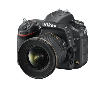
Nikon D750 Camera.png

The Nikon D750 fits in the Nikon range between the D610 and, now, the D850. Offering a full frame 35mm, 24mp sensor, with only a uni-directional anti-moire, anti-aliasing filter and an excellent auto-focus system, it produces images that are very comparable with Nikon's pro level D810 - giving especially clean images at up to about ISO 3200 with a very useable dynamic range of over 14 stops at ISO 100. This only falls to 11 stops at ISO 1600, with minimal impact on image quality according to my tests, which, for me, all adds up to a great street photography camera if you don't mind using a DSLR sized body and lenses. It makes a great partner for the f1.8 prime lenses.

Being relatively lightweight, with that level of image quality, it's no wonder the Nikon D750 has become very popular with wedding photographers, both as a primary and as a second body camera. I like the way the RAW files take post processing and, in particular, the way that highlights roll off to white, enabling you to keep more graduation in the brightest highlights - no doubt due to the extended 14 stop dynamic range at base ISO. In the street, moving from shot to shot, the body itself feels great in the hand, sporting a relatively deep grip, which helps the handling when using longer, heavier lenses. It's a little thinner in the body than earlier models and the use of carbon fibre has made the body light enough to carry for a full day's shooting. The D750 also offers a tilting screen for framing that occasional, discreet, waist level shot.

So, enough of specifications - time for some images. I'm aware of the arguments against using 'other artists' creative endeavours as a backdrop to unremarkeable,passing people; and if the result is mundane or un-engaging, I agree, where's the spark? But, now and again, since the poster or advert is in the public space, as a part of the environment we inhabit every day, such backdrops can make an impact and contribute to the visual theatre of city life in particular. Hence, now and again, my eye is caught by the interplay of actor and scenery, such as this shot below. I really enjoyed the net effect of the composition - an ordinary billboard on it's own, yet the actor somehow creates more of a 'scene' for us to think about.

Really? - Nikon 24-120mm f5.6 1/320sec ISO 1100

Really? - Nikon 24-120mm f5.6 1/320sec ISO 1100

Further on, in an alley we won't mention, there are a number of small shops and surprisingly, a Barbers. This chap looks as if he really is the Demon Barber. Shot through glass in very low light conditions.

Just Relax - Nikon 24-120mm f5.6 1/20sec ISO 1600

Just Relax - Nikon 24-120mm f5.6 1/20sec ISO 1600

Emerging on to a side street I caught this scene. Watching this fellow for a while, it dawned on me that the dog's expression and body language summarised the whole story and the indifferent gaze of the onlooker in the background reinforced the feeling that the owner was, once again, whining on about the same old stuff. Patience is a virtue.

Heard It All Before - Zeiss Milvus 85mm f5.6 1/1000 ISO 5600 (-2/3 EV Ooops)

Heard It All Before - Zeiss Milvus 85mm f5.6 1/1000 ISO 5600 (-2/3 EV Ooops)

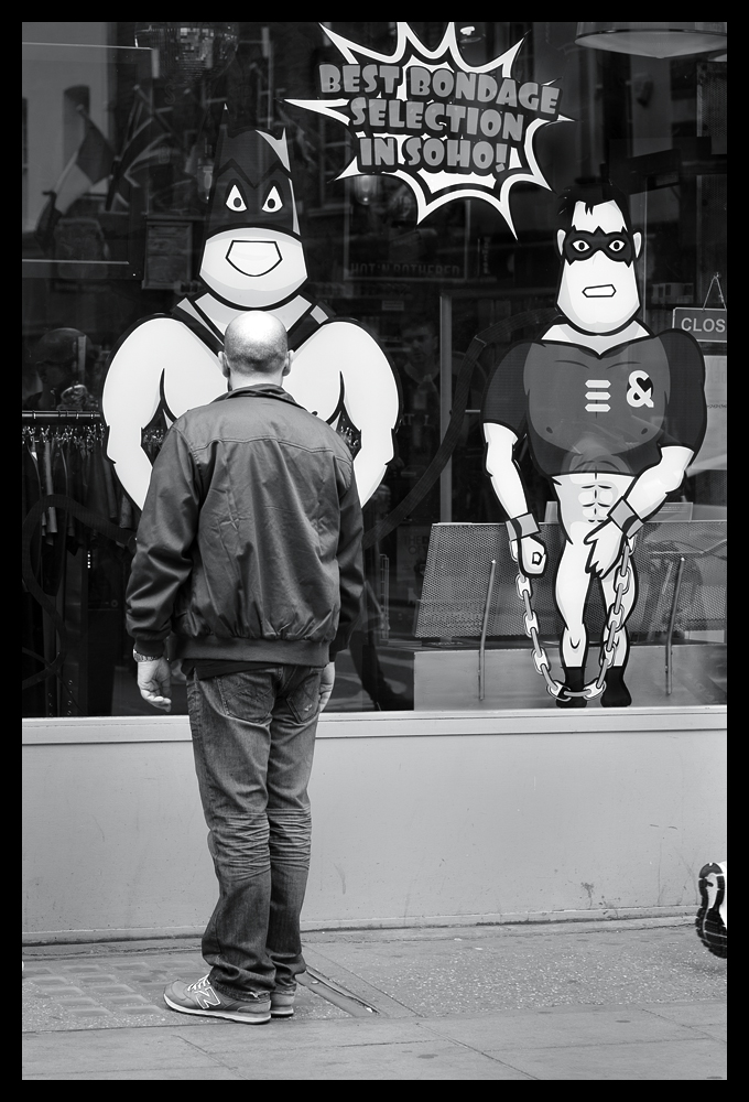
Then, not too far  away, in the area still somewhat famous for interesting shopfronts, I came across a chap who was clearly riveted to the spot. I was just thinking - I wonder what's going through his mind - right now?

What Is He Thinking!? - Nikon 80mm f5.6 1/320sec ISO 450

What Is He Thinking!? - Nikon 80mm f5.6 1/320sec ISO 450

Just off Compton Street there's a pub where regulars sit outside in the street, especially on Sundays. I caught sight of these two gents engaged in 'conversation' but you can see that one was rather more assertive than the other in his 'Sunday Sermon'. The story is quite obviously told by the expression on their faces and the position of their feet. The chap on the right seems to be suffering under the onslaught - deep in thought, or just tired of hearing the same old tirade?

Soho Sunday Sermons - Nikon 24-120mm f5.6 1/250sec ISO 1600

Soho Sunday Sermons - Nikon 24-120mm f5.6 1/250sec ISO 1600

You know that feeling when you're walking down a street and you catch something out of the corner of your eye which doesn't immediately register but you know you just missed something important? Well, that happened here. Shop window mannequins have always fascinated me, but I've not been able to capture one that really sold a story before. This one stopped me in my tracks. It looks like some slinky Super Hero lurking in the shadows ready to pounce! I couldn't resist the shot.

MonoGirl - Nikon 24-120mm f5.6 1/125sec ISO 1600

MonoGirl - Nikon 24-120mm f5.6 1/125sec ISO 1600

Every now and then you stop for a moment and think - there's a bit of a visual joke here, if only ....... and before you know it the picture is completed by pure chance. Bust(ling) Home seemed such an obvious title for this shot!

Bust(ling) Home - Nikon 80mm f5.6 1/320sec ISO 800

Bust(ling) Home - Nikon 80mm f5.6 1/320sec ISO 800

Finally, the last image; to 'bow out' on. This just tickled my sense of humour and it shows yet another example of the 'what if' photographers' rule; 'what if I wait here patiently?'. Maybe someone will come out of the stage door. I wonder what could happen?

Final Bow - Nikon 24-120mm f5.6 1/200sec ISO 1600

Final Bow - Nikon 24-120mm f5.6 1/200sec ISO 1600

I have thoroughly enjoyed using the Nikon D750. The images it produces are just gorgeous and at 24 megapixels the film sizes are just right for Street Photography. The rendering from the sensor is excellent and the RAW files take post processing very well with deep shadow detail and nicely rolled off highlights. You can't go wrong with this camera, and of course, right now, the Nikon D750 is at a relatively bargain price. Highly Recommended.

London Street Photography with a Nikon D5500

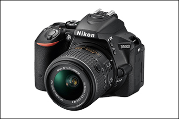
The Nikon D5500 is something of an unsung bargain in the Nikon DX camera lineup. The Amateur Photographer magazine gave it a pretty good review when it came out, praising it's relatively quick  autofocus system, great colour rendition and high quality, 24 megapixel DX APS-C sized sensor with no low pass filter and a rendering engine that produces gently rolled off highlights to give surprisingly good images of over 12 stops dynamic range at ISO 100.

For me though, this camera was all about the fully articulated screen (making it easy to get sneaky street shots in confined spaces) the surprisingly good rendering, the light weight, small body size and the excellent handling characteristics, all of which added up to a great street camera that could use many of my existing lenses. It's light weight, compared to my stable of full frame Nikon DSLRs, also made it very attractive, particularly with an excellent 35mm DX lens bought to accompany the 55-200mm zoom lens I acquired when I bought the camera.

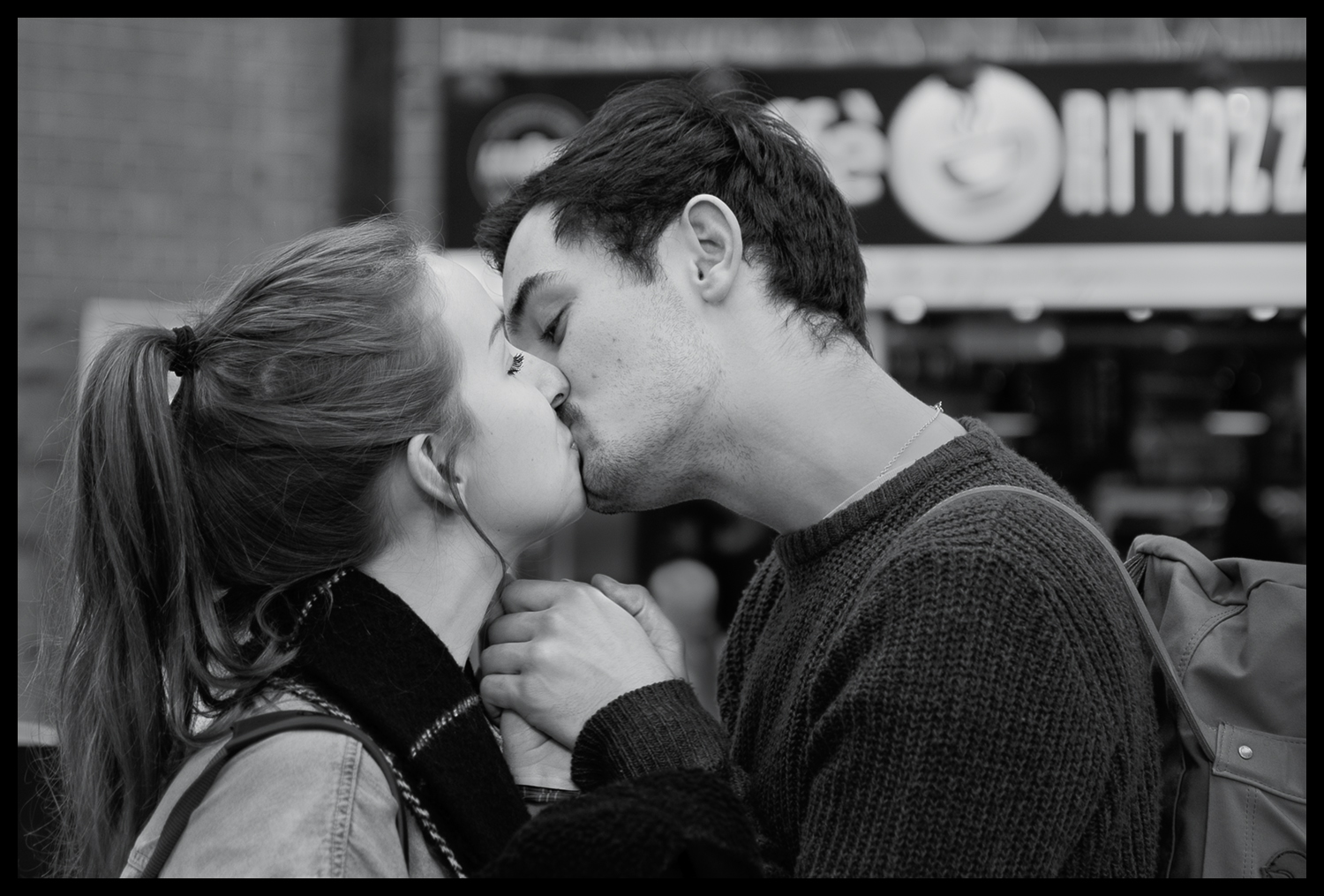
With this relatively tiny kit to hand, I spent many a happy day walking my various routes through London streets and capturing many a good 'moment' to remember. Like this 'Last Kiss' image, which is significantly cropped from the full frame, but still looks really good given it was one of the very first grab shots I took on my initial outing with it in Victoria Railway Station. Caught as they said their final goodbyes - love this shot!

The Last Kiss - 35mm f1.8 1/100sec ISO 125

The Last Kiss - 35mm f1.8 1/100sec ISO 125

Here's the full frame, which shows just how good this little camera / lens combination is ...

The Last Kiss - 35mm f1.8 1/100sec ISO 125 - Full Frame

The Last Kiss - 35mm f1.8 1/100sec ISO 125 - Full Frame

While still on the theme of goodbyes - here's a hug she won't forget in a hurry .....

Until Next Time - 35mm f2 1/100sec ISO 100

Until Next Time - 35mm f2 1/100sec ISO 100

And quite possibly my favourite image from that Victoria session was this wonderful Vicar, who seems to have the patience of a Saint as he was stood alone on that spot for ages - Waiting for God(oh)!

Waiting for God(oh) - 35mm f1.8 1/100sec ISO 110

Waiting for God(oh) - 35mm f1.8 1/100sec ISO 110

Some time later I was sitting in the Photographers Gallery cafe looking out at the street opposite and I noticed this in a window just above street level .........

A Window on Time - 55-200mm f4.5 1/80sec ISO 800

A Window on Time - 55-200mm f4.5 1/80sec ISO 800

Walking back through Seven Dials later that day I came across a scene that I thought might have potential, so I stood prepared on the opposite side of the road and waited for what I hoped would happen. Sure enough, if you wait long enough, you are often rewarded!.....

Hair Loss - Sigma 18-35mm f4.5 1/80sec ISO 800

Hair Loss - Sigma 18-35mm f4.5 1/80sec ISO 800

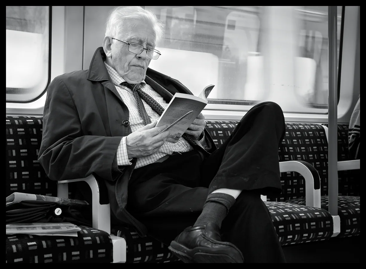
Travelling back down to London by train the following week, I was thinking about the number of people who had their heads buried in their phones and iPads. Even families with kids all had their electronic distractions, so it was rather a pleasure to see the gent opposite me with his attention firmly absorbed by a rather more traditional iBook ........

No Batteries Required - Sigma 18-35mm f5.6 1/125 sec ISO 800

No Batteries Required - Sigma 18-35mm f5.6 1/125 sec ISO 800

Got to love the shadow detail in that image.

My next trip down to Soho yielded some rather amusing shots. I love the timing of this one, which raises a possible question - in passing?

Harmony - Sigma 18-35mm f5 1/100sec ISO 800

Harmony - Sigma 18-35mm f5 1/100sec ISO 800

Then walking in the back streets, behind Leicester Square, I chanced upon these two characters ....

Silvered Selfie - Nikon 24-120mm f5.6 1/80sec ISO 1600

Silvered Selfie - Nikon 24-120mm f5.6 1/80sec ISO 1600

Parental Guidance? - Nikon 24-120mm f4 1/160sec ISO 1600

Parental Guidance? - Nikon 24-120mm f4 1/160sec ISO 1600

Walking through Covent Garden a few weeks after taking the image above, I was standing opposite some of the stores in the inner section of the old market and I caught sight of these two security men. Their facial expressions and body language fascinated me. As you can see, they look bored stiff, indifferent, yet watchful, but seeing nothing, as they wait for their shift to finish. Given they were standing directly in front of the store's entrance I can only imagine how mean potential customers decided not to attempt entry. Heaven knows how much potential business these two frightened off!

Dior Forever - Nikon 24-120mm f4 1/320sec ISO 2200

Dior Forever - Nikon 24-120mm f4 1/320sec ISO 2200

On another walkabout, taking my usual route from Oxford Street through the back lanes and into Soho; as I came through one of the alleys into Compton Street, I noticed out of the corner of my eye, an extravagantly dressed chap walking behind me just as he moved to pass me on the pavement. Thinking I could spin around, with camera ready, to grab a shot, I did just that. Quick as a flash, he changed direction and turned to face me at exactly the same moment, and, Boom! He was standing directly facing me, ready, posed, with a big smile and a 'Thumbs Up'! He'd guessed exactly what I was going to do and was ready for me before I even turned around!

Result! - Sigma 18-35mm f2.2 1/200sec ISO800

Result! - Sigma 18-35mm f2.2 1/200sec ISO800

While en-route in the pouring rain from Oxford Circus to Soho, my usual stamping ground for StreetLife work, I suddenly noticed the reflections in the pavement puddles as I had my head down avoiding the drips from overhead buildings, and this image caught my eye. It has a mysterious quality to it which I thought was worth including here and it looks as if it might have been taken many, many years ago.

Inflection - Nikon 24-120mm f4 1/320sec ISO 2500

Inflection - Nikon 24-120mm f4 1/320sec ISO 2500

Finally, it's not often I take images of cars these days but this one really took my attention and the D5500 has made a cracking job of rendering the tones in the lights and the bodywork - a little stretch from Street Photography perhaps, but a very rewarding shot nevertheless.

Street Porsche - Nikon 24-120mm f5.6 1/320sec ISO 360

Street Porsche - Nikon 24-120mm f5.6 1/320sec ISO 360

Well, I think you can see from these images, that I have been very happy with the time I've spent using the Nikon D5500 on StreetLife projects. I'm particularly pleased with the image quality this camera can produce and how easily those images take post processing.

For the price of this camera, you really can't go wrong if what you are looking for is a relatively inexpensive, light weight, but very capable camera for Street Photography or for general family and travel shooting. The lightweight stock zoom kit lens is more than adequate for general use and the inexpensive DX 55-200mm is a surprisingly good lightweight and small power zoom to accompany it. I would also recommend the new 35mm DX lens to go with this camera body, as it's capable of producing some really crisp images, especially as the D5500 has no anti-aliasing filter on the sensor, which means you'll get as crisp and image as possible from this 24 megapixel gem!

Poetry, Dance and Photography

poetry, dance and photography - aesthetic collisions?

You could argue that a specific 'language' lies at the heart of each of these art forms. They have their own special 'vocabulary' with which to express the inexpressible. Each in their own way form 'impressions' in our mind, encapsulating the essence of some distilled human experience, causing us to react emotionally or logically to the work.

Poetry uses the language of words, style and form;  Dance, the language of movement, style and form; Photography, the language of light, shade, geometry and composition. When looked at in that way then, it's easy to see their commonalities, in terms of their fundamentals and effects, rather than the differences in the methods and medium they employ; starkly obvious though they are.

And so it was, in an effort to visualise a famous work of one of my favourite poets, Ted Hughes, that I came upon the opportunity to do just that. I attended a Dance Photography Masterclass, held by Nicola Selby, where I was asked for my particular objectives for the sessions. Having made no plan, I was temporarily at a loss, until the idea of bringing to life one of Ted Hughes' poems struck me. The particular work was 'Crow'.

Crow is somewhat difficult to grasp, even when you've read it many times. It's often described as a reworking of the biblical Genesis story - with a great deal of 'twist'. And therein lies its fascination. To visualise it you would have to be very selective about which elements of the story to work with, in order to do it any justice - if that's the right word.

Nicola was game however, so I briefly described as best I could the general thrust and she was kind enough to suggest I work with Amy Eccleston, a dancer with both classical and modern dance training who was excellent at 'improvisation'.

Since the lighting was already set up for high key work, we decided to shoot two sessions, one high and one low-key session, covering a short sequence of improvisation with Amy following my 'direction', which consisted of me loudly reinterpreting the poet's words by shouting, at Amy, 'key' concepts abstracted from Hughes' lines while she worked hard to interpret the flow of ideas in her dance movements. I can only fully applaud Amy for the very considerable patience and professionalism and hard work she put into those sessions.

With Nicola's help we worked together to interpret the storyline, framework and language of the poem, interpreting those ideas emotionally and then expressing them physically in dance movements, and finally creating images to encapsulate the impact of the work in a strong, visual form.

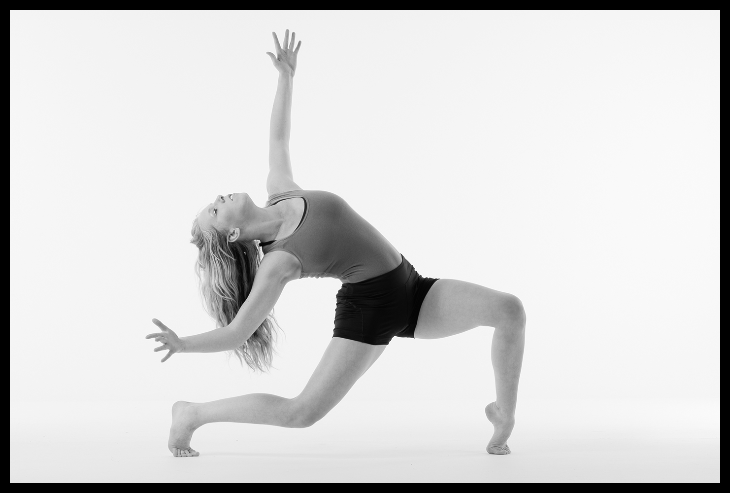
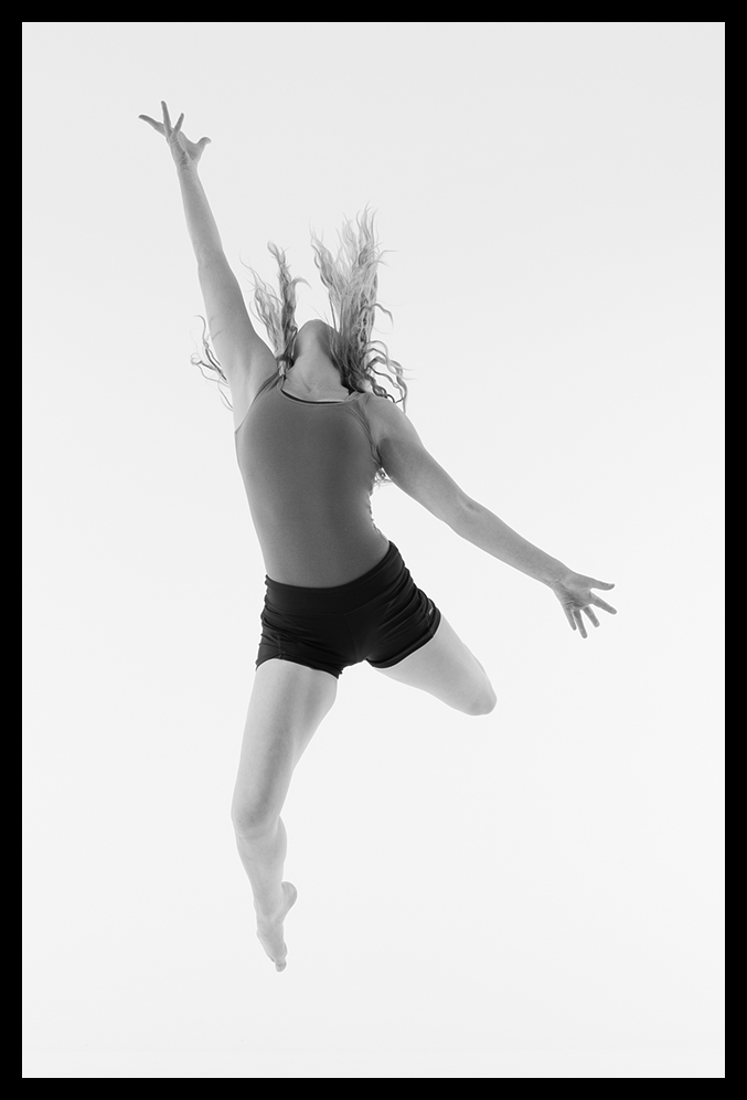
Far from 'aesthetic collisions' then, we found a continuum of artistic expression - from word to movement to image. Quite an experiment! Here are selected images from the initial high-key session:

Crow emerges from the Void - from God's Nightmare

Crow emerges from the Void - from God's Nightmare

 
transforming from shape to shape - Crow absorbs consciousness

transforming from shape to shape - Crow absorbs consciousness

 
reaching upward in fear - or is it loathing? - Crow realises its purpose

reaching upward in fear - or is it loathing? - Crow realises its purpose

 
Crow rises up, and gives life to God's Nightmare

Crow rises up, and gives life to God's Nightmare

 
realising its power - Crow descends upon Man - to wreak destruction

realising its power - Crow descends upon Man - to wreak destruction

This was a fascinating piece to explore. It was very clear at the end of the first session that a low-key treatment was more fitting, so we adopted that approach in the second session. Those images will follow a little later. For those interested in the technical aspects of the equipment we used -there were only two Broncolor lights; one main flash and focus box set high on the left of the studio at 45%, aimed downward towards the dancer and one fill light set high on the right.

The camera was a Hasselblad H4D-31 fitted with a Hasselblad HC-80 lens set at f3.0. Nicola Selby's Studio can be found here, and she is also represented on Hasselblad's site here.


Ming Thein's Havana Photography Masterclass Reviewed

photography and philosophy

Ming Thein is something of a recent photographic phenomenon, although he wouldn’t thank me for saying that. Those that have discovered Ming’s particular brand of photography and who follow his blog regularly, will readily acknowledge that he is a breathtakingly prolific author. A passionate, enthusiastic, one might even say highly opinionated exponent of Master Grade imagery, he has seemingly forged his newly won prominence out of the web's photographic firmament in just two short years. That's quite an achievement for one so young - approximately 1000 extensive posts, of obviously serious and deep discourse, on all aspects of the subject ranging from in-depth product reviews, through entertaining and thought provoking missives on the technique, craft , and above all, the philosophy of the art form. For that’s what it is, as he sees it. To say he takes it all very seriously is something of an understatement. And, that is where he scores so heavily in the cut-throat competition for our attention.

Ming hails from Kuala Lumpur, but he has a very broad world view, as is evident from his extensive Flickr portfolio. Looking critically at his photography and its impressive scope, there can be no doubt that he knows his stuff, and that he can produce very, very attractive work. His more recent fascination with high-resolution 'UltraPrint' printing, and his even more recent Hasselblad Ambassadorship is an example of how he is keen not only to preserve the best of traditional methods, but also to push the boundaries of what’s possible with current technology.

ming's materials

If you search his blog you will find an extraordinarily large compendium of useful and practical help on how to improve your photography. He also offers many instructional videos and even an email-based course tailored to your specific needs.

It was this rich source of well though out content that drew me to his site in the first place. Having bought others’ materials on this subject I have to say my expectations were not high, but Ming has put a great deal of thought and effort into his productions and I have to say that to get the most out of them you need to give his full length articles and videos plenty of time and several readings / viewings to catch all the nuances. They really are packed full of rich pickings for those wiling to learn, and for that matter unlearn old habits and build new, more successful ones. It was in this spirit that I looked at the workshops Ming offers. It was time to break some old habits!

workshops for the aspiring photographer

Ming provides various levels of workshop. Some cover relatively basic material which is otherwise provided in his beginner / intermediate level videos, but of course you have the benefit of his one-on-one help, in person. Others, like the Making Outstanding Images workshop take you on a journey beyond technique into style and interpretation - very helpful if you’ve mastered the technique but want to move onto the next level as a photographer.

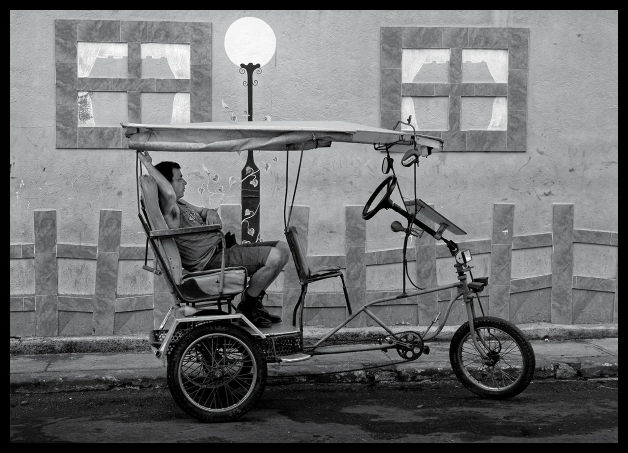
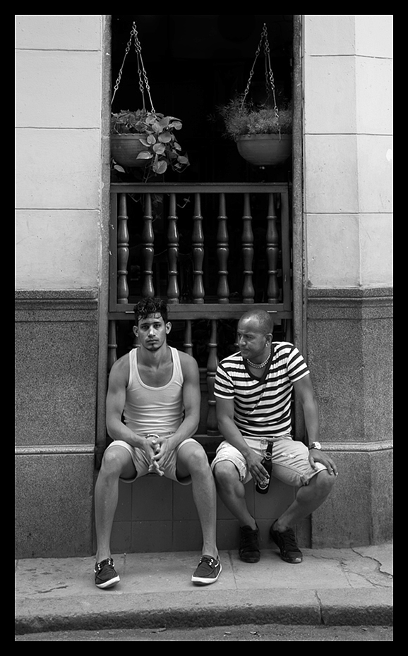
Cuban Marketing - One of my Final Images from the Havana Workshop

Cuban Marketing - One of my Final Images from the Havana Workshop

I’ve participated in many photographers’ workshops in my time, so I am no stranger to the challenges of bringing together several enthusiasts of diverse interest and skill sets, for collective study. They’re not always successful but having read Ming’s material, poured over his images and worked my way through his growing library of video tutorials, I felt that his April, Havana based, Masterclass would likely be photographically very challenging and would help me refine and extend my capabilities and also reinvigorate my own life-long passion for the art. That guess was spot on, and precisely what the Masterclass turned out to be; challenging and richly rewarding.

high standards - help and encouragement

Ming sets himself very high standards at this level, and he expects you to deliver to that very same standard. He has a quick and incisive eye for any weakness in photographic vision, choice of subject, interpretation and treatment, technique, shot discipline, composition, unequivocal and decisive image curation (only show your very best work, dump the rest), post processing and presentation. All images must stand on their own - without title , caption or long winded explanation - and he’s not interested in the one’s that got away! However, most importantly, he is passionately interested in helping you improve your skills, personal vision and style. This was no run of the mill workshop.

Havana Classic Car

Havana Classic Car

The Havana Masterclass began with each participant presenting ten of their very best images, which were sensitively reviewed and criticised, in a positive sense, in order to give Ming a clear understanding of what the individual should concentrate on during the week. He gave us all plenty of time to present our work and discuss our objectives, particular interests, strengths and weaknesses, ending up with three main objectives for each participant to focus on for the week. Each participant would then spend time, on their own, working on these objectives during the day, bring the fruits of their labours to an evening one-to-one review session, for appraisal and guidance, before joining together for dinner and group discussions.

Two's Company

Two's Company

Throughout the week Ming took every opportunity to offer personal guidance to each student, on any element of photographic effort and, in his one-to-one sessions, to help with any particular aspect that was of concern to the individual. In my case I was very interested in his approach to post processing monochrome images and how he manages to retain smooth tonal gradations, deep blacks, sparkling whites and just the right level of global and local contrast to give an image real impact without muddying the overall effect or losing the original ‘energy’ of the image. He delivered.

Under Suspicion?

Under Suspicion?

As the week progressed he also spent time out in the street with each individual, working with them to develop their vision, selection of potential images, potential treatments and interpretations all of which Havana provides in overwhelming profusion.

final selection reviews

The week culminated in a full day of reviews of each participant’s best efforts and a further session of Ming processing selected images from those portfolios to demonstrate alternative treatments and how they could be achieved. The very last session involved Ming curating and critically reviewing his own work in front of the group - warts and all; which we all very much appreciated. We watched him curate some four hundred images, from a pool of 6000 or so he shot in the week, down to his eleven final images! Ironically, he couldn’t bring himself to cut the eleventh. Needless to say, amid a cacophony of good-natured banter, we were all quite clear on which one he should dump. Justice was seen to be done - even for Ming. All of us thought that was brave of him, but it also shows how ruthlessly he drives himself to constantly push the boundaries and achieve the very best images possible.

Buenos Dias!

Buenos Dias!

His striving for new levels of excellence rubbed off on all of us. I highly recommend you sign up for one of his Masterclasses - you will not be disappointed. For those that are interested in gear, all my images shown here were shot during the Havana Masterclass on a Sony A7 with various Sony lenses. I have since moved on from the Sony range.


First Year With A Leica M9

ashmolean museum

Having missed the grand reopening of Oxford's superbly refurbished Ashmolean Museum, I wanted to visit it to see what sixty million pounds of resources had produced. Rick Mather, the project architect, has created a wonderfully light and airy space with an eighty foot high, glass roofed, central atrium that floods the exhibition space with natural light. It gave me a superb opportunity to put my Leica M9 to work and see how it would cope with Museum conditions i.e. available light, quiet / silent shutter, minimal use of a tripod etc.

It's on The Left, Sir

It's on The Left, Sir

This was almost my first image with the M9. It was 'snatched' in the museum lobby while I was actually thinking about the 'geometry' of the new space. I used a Leica Summilux-M 24mm f/1.4 ASPH lens set wide open at f/1.4, hand-held at 1/350 sec; set at ISO 320 and shot RAW. The image is pretty much straight off the camera, having just been re-sized and cropped with a very slight wide angle geometry edge distortion correction in ACR. No contrast or sharpening was applied. Given it was a first outing with this combination, I think the pairing has produced a superbly smooth and sharp result.

Following directly on from that I lurked in one of the exhibition rooms to see if I could get anyone absent-mindedly looking at this bronze:

Bronze Envy

Bronze Envy

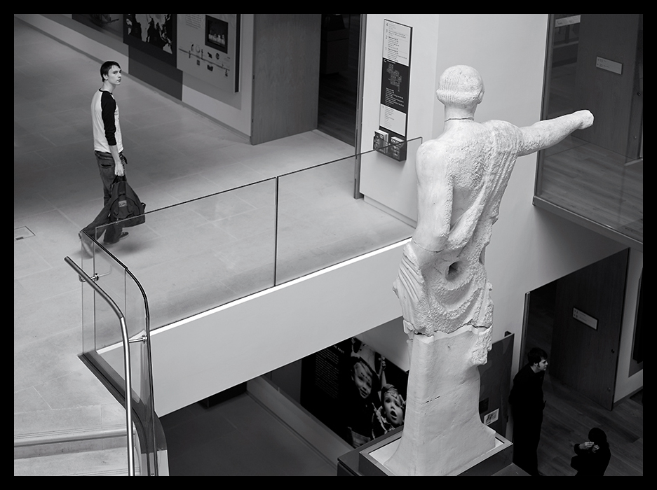
I just love that lady's expression. Not sure about his reaction! Anyway, on my way out I decided to re-shoot the statue in the lobby but this time from the other side. Surprising how the potential interpretation changes when you do that!

No, It's That Way!

No, It's That Way!

venetian streets

Later in the year I spent some time in Venice and while I guess everyone has one of these shots, I couldn't resist this one because it just smacked of story. Gallantry and Indifference, wouldn't you say?

Gallantry and Indifference

Gallantry and Indifference

Of course Venice has its many attractions but I found a little corner that had some quite wonderful displays of masks hanging in the street. The tones in this image just shout Leica!

The Mask

The Mask

festivals, steam trains and boats

You could say it was just a 'boy thing', but, back in the UK, I spent some time shooting Folk Festivals and the Towersey Festival that year yielded many wonderful images, among which is this one of three Morris Dancers hanging in the air, mid-leap! Shooting this kind of event with an M9 Rangefinder is definitely not for the faint hearted and focussing is a real challenge with moving subjects - you have to be quick!

Leap of Faith

Leap of Faith

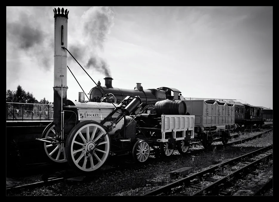
Towards the end of the Summer I decided to visit the Rail Museum at York and I was handsomely rewarded by catching these two engines together - sort of first generation, second generation thing:

The Rocket

The Rocket

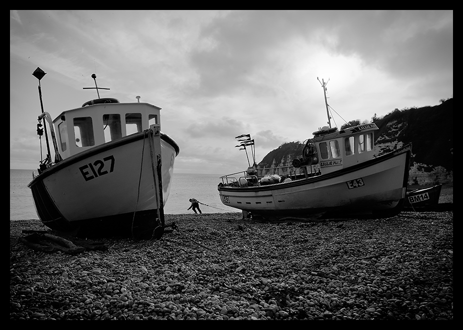
Finally that year I took a short break in Devon and would you guess it, I arrived on the beach just as one fisherman was haulin' his boats out - what luck!

Heavy Haul

Heavy Haul

All in all, it was a great year and I thoroughly enjoyed exploring what the Leica M9 Rangefinder could do under different shooting conditions on a wide range of subjects. It's not the easiest camera to live with and if your eyesight is suffering, focussing would be the greatest challenge, especially with longer focal length lenses, but, perseverance pays - in the end, right?


London At Night with a Nikon Df

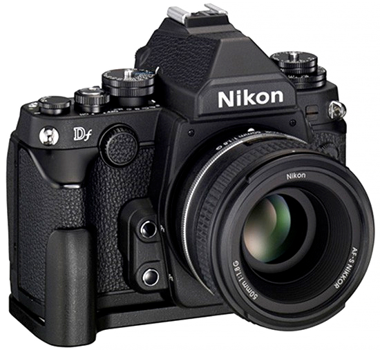
a new, 'old' nikon Df

Nikon Df

Last year, like many photographers, I'd been reviewing the most recent crop of cameras. I'd been using the Leica M9 for three years, on and off, and loved it for what it is, but the fact remains that, while I loved the images I can create with it, the sensor is now somewhat out of date.

So, I had looked at, invested in, experimented with and disposed of the Sony A7 and the Sony A7s, not the A7R, as Sony have still not fixed its shutter vibration issues. I also looked at Nikon's latest product at the time, the much heralded, retro-styled Nikon Df.

For several months after its announcement, the Nikon Df had been splitting opinion. OK, it's an odd combination of marketing inspired nonsense and some genuine qualities, among which is a super smooth image quality. I agree. I could happily see through all the hype though, so that didn't concern me. Is it a good camera? Yes - no doubt!

I like, for example, some of the 'retro' controls, but hate the front rotation button with a passion - what numbskull thought of that one!? Under pressure, in aperture priority mode, concentrating on focusing, that front button is practically useless for all intents and purposes. Aperture control has to be reassigned to the command rotator on the rear of the camera - of course it would - and so the problem is solved.

After a couple of weeks of using it that was about the only thing that really managed to frustrate me. Everything else about the Nikon Df seems pretty much, well, OK. Any other 'niggles' are really fairly easy to adjust to and I've been genuinely impressed by what I think is the Df's best feature of all - the full frame, 16 megapixel D4 sensor. It's just, well, superb - there's no other word for it!

There are lots of reviews, both technical and real world on the internet to dig into. You can drive yourself crazy with all the detail, but my principal interest is in using the camera in real project situations. In particular, I was very, very interested in a Df and Zeiss prime lens combination. Now, if you are only interested in auto-focus lenses and 'P mode' auto-almost everything, then the Nikon Df is probably not your best choice, but, in keeping with their 'back to basics' theme, I felt the camera might just make a good medium sized working combination with highly reputed Zeiss glass. For that recommendation I'm obliged to Lloyd Chambers, who has done a serious amount of testing on these lenses.

China Town Lights

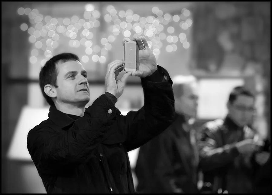
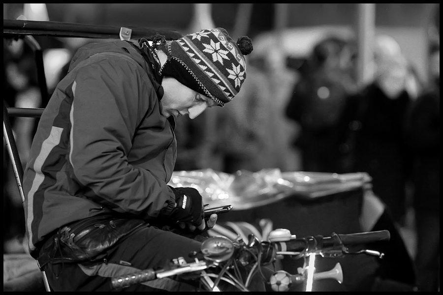
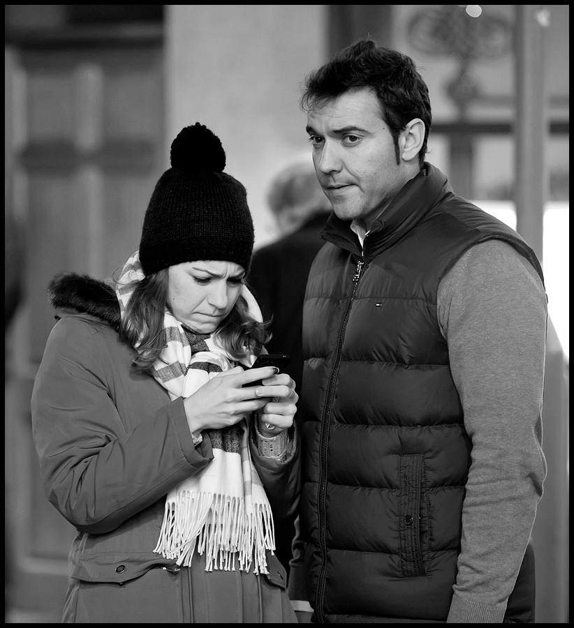
So, I followed his recommendations and recently tried both a Zeiss 21mm f2.8 ZF.2 Distagon Lens and their superb Zeiss 135mm f2 ZF.2 APO Sonnar lenses on a couple of projects. The image set here is from a visit to London, at night, mostly shot around Chinatown behind Leicester Square. My imagination was caught by just how many people, in each situation I found myself in, were intently focused on their phones and in particular with taking snaps - wherever they were!

The shot below is one of my favourites. Considering the ISO was so high the tonal ramge in this image is very nice. The sensor in this camera is undoubtedly its best asset. The Zeiss 21mm has done a great job with this scene, taken at the entrance to Burlington Arcade. It just shows that a 16Mp camera can still produce wonderful images with enough resolution to meet most printing needs and the rendering of this combination is well, just, beautiful.

Burlington Arcade

Anyway, it's an example of what might be done with a Nikon Df and the two Zeiss prime, manual focus lenses - shot deliberately at very high ISOs - some at ISO 6400 and the rest at 12800; all hand-held, straight 'out of the box'. Mostly all taken with the lenses wide open. Also all but two are heavily cropped, for compositional reasons. So this Df does great work - in any light and shows you can deal with night street work with huge dynamic range challenges and get a very useable result.

Of course, as we all know, dynamic range for any sensor reduces as ISO increases. I guess because the signal data is being amplified at low levels to give increased apparent sensitivity but at the same time the top end filled capacity of the pixel's 'light wells' is fixed, so inevitably shadows get amplified but highlights can't get any brighter so the range of levels between shadows and highlights decreases with increasing ISO and hence you get decreased dynamic range available. You can see this in the images in this post but, frankly, the result is still very useable. You lose some of the 'depth' in the rendering, which you can see in the people's clothing and skin tones but think about what we are doing here - we are working in the dark in 'natural light'!

Short Break

I was honestly surprised at the image quality, given the ISO settings, the untreated noise in the RAW files was very film-like and reminded me so much of pushed Tri-X grain from the 'old days'. Very photogenic. Each image was processed from RAW in Nikon Capture NX2, this time. To give some smoothing, Noiseware Professional was used to tone down the noise levels a little with a touch of output sharpening as the final step. Given it was my first outing with the camera and lens combination, as a night 'street' / candid shoot, I was pretty impressed with the outcome. Practice makes perfect, of course - or just 'better' in my case.


Traditional Dancers at Wallingford Festival

Taeppas Tump at Wallingford

Ladies Morris teams are a common site in the villages around Oxfordshire. In fact, it is said in some corners that Morris dancing traditions might have been lost had it not been for may dances and tunes being preserved by enthusiastic women archivists work over the past hundred years or more. This is a shot from a series on Taeppas Tump Ladies Morris side dancing at Wallingford festival this past September. The image was shot with a Leica M9 fitted with a Leica 50mm f1.4 Summilux Lens.

Out of Puff

Here's a Plum Jerkum dancer having a puff after running out of puff dancing at Wallingford Bunkfest in early September. Plum Jerkum hails from Warwickshire, their name being derived from a cider made from the local Drooper plum. Apparently it has the local reputation of 'leaving the head crystal clear while paralysing the legs'!

Threes A Crowd

Here’s another image from the same set. This shot was also taken with a Leica M9 with a Leica 50mm f1.4 Summilux lens. It seems the ‘Out of Puff’ image, above, has also been accepted by the Leica Fotographie International Master Shots Gallery for the Leica M9. I feel honoured and very fortunate to have another piece of work selected.