Ming Thein's Havana Photography Masterclass Reviewed

photography and philosophy

Ming Thein is something of a recent photographic phenomenon, although he wouldn’t thank me for saying that. Those that have discovered Ming’s particular brand of photography and who follow his blog regularly, will readily acknowledge that he is a breathtakingly prolific author. A passionate, enthusiastic, one might even say highly opinionated exponent of Master Grade imagery, he has seemingly forged his newly won prominence out of the web's photographic firmament in just two short years. That's quite an achievement for one so young - approximately 1000 extensive posts, of obviously serious and deep discourse, on all aspects of the subject ranging from in-depth product reviews, through entertaining and thought provoking missives on the technique, craft , and above all, the philosophy of the art form. For that’s what it is, as he sees it. To say he takes it all very seriously is something of an understatement. And, that is where he scores so heavily in the cut-throat competition for our attention.

Ming hails from Kuala Lumpur, but he has a very broad world view, as is evident from his extensive Flickr portfolio. Looking critically at his photography and its impressive scope, there can be no doubt that he knows his stuff, and that he can produce very, very attractive work. His more recent fascination with high-resolution 'UltraPrint' printing, and his even more recent Hasselblad Ambassadorship is an example of how he is keen not only to preserve the best of traditional methods, but also to push the boundaries of what’s possible with current technology.

ming's materials

If you search his blog you will find an extraordinarily large compendium of useful and practical help on how to improve your photography. He also offers many instructional videos and even an email-based course tailored to your specific needs.

It was this rich source of well though out content that drew me to his site in the first place. Having bought others’ materials on this subject I have to say my expectations were not high, but Ming has put a great deal of thought and effort into his productions and I have to say that to get the most out of them you need to give his full length articles and videos plenty of time and several readings / viewings to catch all the nuances. They really are packed full of rich pickings for those wiling to learn, and for that matter unlearn old habits and build new, more successful ones. It was in this spirit that I looked at the workshops Ming offers. It was time to break some old habits!

workshops for the aspiring photographer

Ming provides various levels of workshop. Some cover relatively basic material which is otherwise provided in his beginner / intermediate level videos, but of course you have the benefit of his one-on-one help, in person. Others, like the Making Outstanding Images workshop take you on a journey beyond technique into style and interpretation - very helpful if you’ve mastered the technique but want to move onto the next level as a photographer.

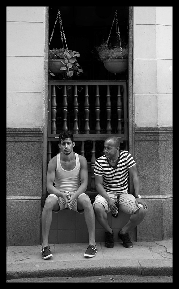
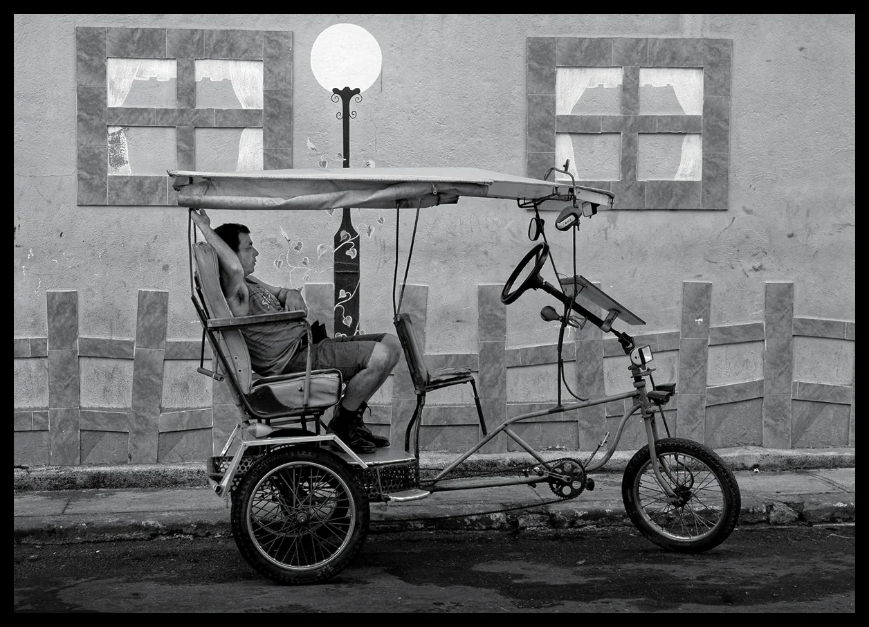
Cuban Marketing - One of my Final Images from the Havana Workshop

Cuban Marketing - One of my Final Images from the Havana Workshop

I’ve participated in many photographers’ workshops in my time, so I am no stranger to the challenges of bringing together several enthusiasts of diverse interest and skill sets, for collective study. They’re not always successful but having read Ming’s material, poured over his images and worked my way through his growing library of video tutorials, I felt that his April, Havana based, Masterclass would likely be photographically very challenging and would help me refine and extend my capabilities and also reinvigorate my own life-long passion for the art. That guess was spot on, and precisely what the Masterclass turned out to be; challenging and richly rewarding.

high standards - help and encouragement

Ming sets himself very high standards at this level, and he expects you to deliver to that very same standard. He has a quick and incisive eye for any weakness in photographic vision, choice of subject, interpretation and treatment, technique, shot discipline, composition, unequivocal and decisive image curation (only show your very best work, dump the rest), post processing and presentation. All images must stand on their own - without title , caption or long winded explanation - and he’s not interested in the one’s that got away! However, most importantly, he is passionately interested in helping you improve your skills, personal vision and style. This was no run of the mill workshop.

Havana Classic Car

Havana Classic Car

The Havana Masterclass began with each participant presenting ten of their very best images, which were sensitively reviewed and criticised, in a positive sense, in order to give Ming a clear understanding of what the individual should concentrate on during the week. He gave us all plenty of time to present our work and discuss our objectives, particular interests, strengths and weaknesses, ending up with three main objectives for each participant to focus on for the week. Each participant would then spend time, on their own, working on these objectives during the day, bring the fruits of their labours to an evening one-to-one review session, for appraisal and guidance, before joining together for dinner and group discussions.

Two's Company

Two's Company

Throughout the week Ming took every opportunity to offer personal guidance to each student, on any element of photographic effort and, in his one-to-one sessions, to help with any particular aspect that was of concern to the individual. In my case I was very interested in his approach to post processing monochrome images and how he manages to retain smooth tonal gradations, deep blacks, sparkling whites and just the right level of global and local contrast to give an image real impact without muddying the overall effect or losing the original ‘energy’ of the image. He delivered.

Under Suspicion?

Under Suspicion?

As the week progressed he also spent time out in the street with each individual, working with them to develop their vision, selection of potential images, potential treatments and interpretations all of which Havana provides in overwhelming profusion.

final selection reviews

The week culminated in a full day of reviews of each participant’s best efforts and a further session of Ming processing selected images from those portfolios to demonstrate alternative treatments and how they could be achieved. The very last session involved Ming curating and critically reviewing his own work in front of the group - warts and all; which we all very much appreciated. We watched him curate some four hundred images, from a pool of 6000 or so he shot in the week, down to his eleven final images! Ironically, he couldn’t bring himself to cut the eleventh. Needless to say, amid a cacophony of good-natured banter, we were all quite clear on which one he should dump. Justice was seen to be done - even for Ming. All of us thought that was brave of him, but it also shows how ruthlessly he drives himself to constantly push the boundaries and achieve the very best images possible.

Buenos Dias!

Buenos Dias!

His striving for new levels of excellence rubbed off on all of us. I highly recommend you sign up for one of his Masterclasses - you will not be disappointed. For those that are interested in gear, all my images shown here were shot during the Havana Masterclass on a Sony A7 with various Sony lenses. I have since moved on from the Sony range.
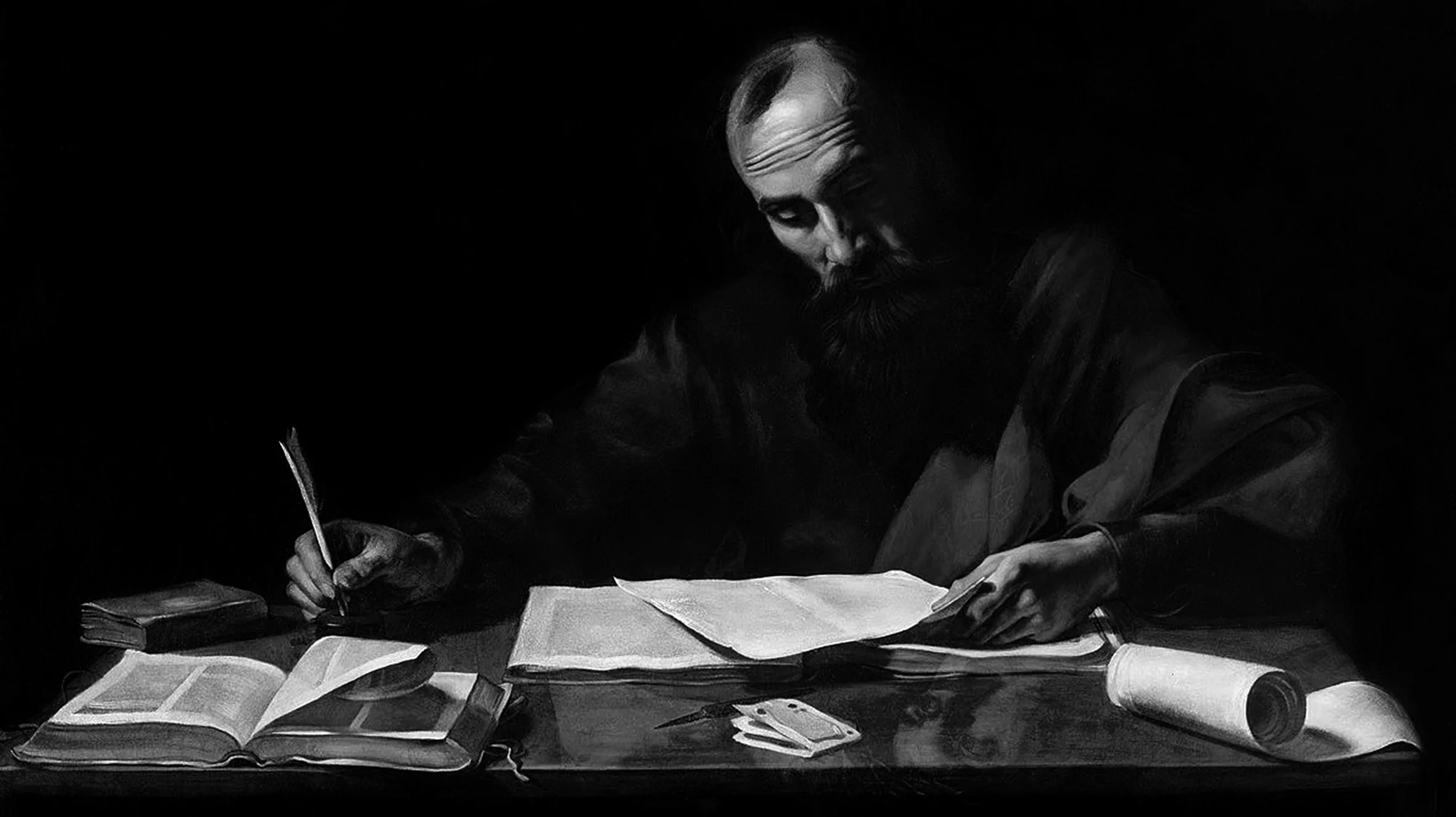
First Year With A Leica M9

ashmolean museum

Having missed the grand reopening of Oxford's superbly refurbished Ashmolean Museum, I wanted to visit it to see what sixty million pounds of resources had produced. Rick Mather, the project architect, has created a wonderfully light and airy space with an eighty foot high, glass roofed, central atrium that floods the exhibition space with natural light. It gave me a superb opportunity to put my Leica M9 to work and see how it would cope with Museum conditions i.e. available light, quiet / silent shutter, minimal use of a tripod etc.

It's on The Left, Sir

It's on The Left, Sir

This was almost my first image with the M9. It was 'snatched' in the museum lobby while I was actually thinking about the 'geometry' of the new space. I used a Leica Summilux-M 24mm f/1.4 ASPH lens set wide open at f/1.4, hand-held at 1/350 sec; set at ISO 320 and shot RAW. The image is pretty much straight off the camera, having just been re-sized and cropped with a very slight wide angle geometry edge distortion correction in ACR. No contrast or sharpening was applied. Given it was a first outing with this combination, I think the pairing has produced a superbly smooth and sharp result.

Following directly on from that I lurked in one of the exhibition rooms to see if I could get anyone absent-mindedly looking at this bronze:

Bronze Envy

Bronze Envy

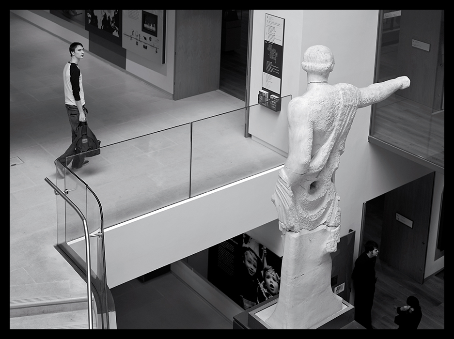
I just love that lady's expression. Not sure about his reaction! Anyway, on my way out I decided to re-shoot the statue in the lobby but this time from the other side. Surprising how the potential interpretation changes when you do that!

No, It's That Way!

No, It's That Way!

venetian streets

Later in the year I spent some time in Venice and while I guess everyone has one of these shots, I couldn't resist this one because it just smacked of story. Gallantry and Indifference, wouldn't you say?

Gallantry and Indifference

Gallantry and Indifference

Of course Venice has its many attractions but I found a little corner that had some quite wonderful displays of masks hanging in the street. The tones in this image just shout Leica!

The Mask

The Mask

festivals, steam trains and boats

You could say it was just a 'boy thing', but, back in the UK, I spent some time shooting Folk Festivals and the Towersey Festival that year yielded many wonderful images, among which is this one of three Morris Dancers hanging in the air, mid-leap! Shooting this kind of event with an M9 Rangefinder is definitely not for the faint hearted and focussing is a real challenge with moving subjects - you have to be quick!

Leap of Faith

Leap of Faith

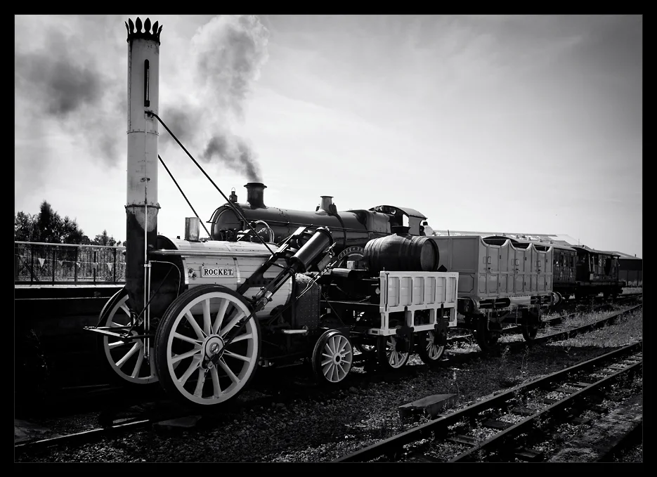
Towards the end of the Summer I decided to visit the Rail Museum at York and I was handsomely rewarded by catching these two engines together - sort of first generation, second generation thing:

The Rocket

The Rocket

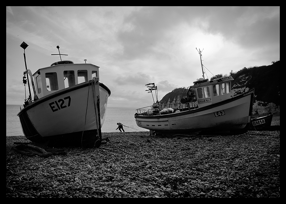
Finally that year I took a short break in Devon and would you guess it, I arrived on the beach just as one fisherman was haulin' his boats out - what luck!

Heavy Haul

Heavy Haul

All in all, it was a great year and I thoroughly enjoyed exploring what the Leica M9 Rangefinder could do under different shooting conditions on a wide range of subjects. It's not the easiest camera to live with and if your eyesight is suffering, focussing would be the greatest challenge, especially with longer focal length lenses, but, perseverance pays - in the end, right?


Pursuing a Passion via a Bourgeois OM Custom Guitar

Bourgeios OM Guitar

Finding myself on a project in Fayetteville, Arkansas, a few years back and having decided to visit all the local music stores on a guitar hunt, I stumbled across Blue Moon Music. It's an unassuming place from the outside, but once you step inside you find a veritable treasure house of vintage tube amplifiers, double basses, mandolins, violins and of course, acoustic guitars. Having spent many uninspiring hours playing Martin, Taylor and Alvarez acoustics in the other, more premium local stores, I was not expecting to find anything special at Blue Moon. I could not have been more surprised.

I think I played my way along the whole length of the guitar racks until I found the Bourgeios. As soon as I picked it up I knew it was a 'special' instrument and I suppose it took me all of ten seconds to recognise how alive it felt. I must have lost the next hour just playing it and getting a feel for its special qualities. The owner of the store told me its background. It had been sitting in a collection, unused, until very recently and was underplayed and he thought that it would 'open up' when fully played in. He told me that it was hand made in 2002 by a luthier called Dana Bourgeios from Lewiston, Maine who makes about five hundred guitars a year from carefully selected tonewoods.

Bourgeios OM in Bubinga Tonewood

This guitar has an Adirondack (Appalachain) Spruce top and Bubinga (African Rosewood) back and sides. It resonates beautifully, with a full bass, a superbly balanced, sweet, singing treble with choir like overtones and outstanding sustain. In the store, it was one of those 'decisive moments', when you just know that something was meant to happen. So, of course, I made an offer and, after a fair bit of haggling, bought it. After we came to terms, we talked for a long time about the various tonewoods used on the instrument and I learned a great deal from the store owner, who was also a professional musician and guitar technician. When I got back to the UK, I contacted Bourgeios, and they told me that it was the only one they'd built with that exact combination of tonewoods - and it turns out - it's a real winner. Lucky me!

Here is what Dana Bourgeios has to say about some of his tonewoods:-

Eastern red spruce, also known as Adirondack or Appalachian spruce, was the primary topwood used by American manufacturers before World War II. Its use was all but discontinued due to over-harvesting of the resource but has recently been reintroduced thanks to 50 years of regeneration and to the legendary status that this traditional tonewood has attained. The small size of most logs and a shortage of wood conforming to market preference for even color and regularity of grain conspire to keep the price of red spruce extremely high.

Red spruce is relatively heavy, has a high velocity of sound, and has the highest stiffness across and along the grain of all the topwoods. Like Sitka, it has strong fundamentals, but it also exhibits a more complex overtone content. Tops made out of red spruce have the highest volume ceiling of any species, yet they also have a rich fullness of tone that retains clarity at all dynamic levels. In short, red spruce may very well be the Holy Grail of topwoods for the steel-string guitar.
— Dana Bourgeios

Rick Micheletti, a Californian Luthier says of Bubinga tonewood  ....."Bubinga or African Rosewood is another fine tonewood that is harder and heavier than either Brazilian or Indian Rosewood. It produces a brilliant and distinctive tone. If it wasn't such a pain to work with there would probably be a lot more guitars made out of this material (It's difficult to bend, difficult to cut, difficult to sand or scrape...I think you get the idea). It's interlocking grain when lacquered gives the most amazing visual effect. The mottled "Bees Wing" figure produces a kind of holographic look when the instrument is slightly rotated.  The beautiful mauve color ages into a gorgeous brownish-red. Despite our "love-hate" relationship with this wood, we do offer it as standard equipment because of its tonal quality and beauty.

And, it plays so beautifully, it inspires you pick it up and try harder!

Folk Music Roots - From Bluegrass to Acoustic Blues

It's been a while since I picked up and seriously played any of my very small collection of guitars. They're instruments I've acquired through my on-and-off love affair with the guitar, which began when I was sixteen. Like many teenagers back then I was a member of a 'rock' band (The Blue Diamonds) playing covers of Chuck Berry, Rolling Stones and Beatles numbers, until I went back to folk music.

In my mid-teens I had one of those 'Decisive Moments' when I was fortunate enough to join up with a couple of musicians from my local folk club who were into American 'old timey music', New Lost City Ramblers style. We seemed to get on well and one of them suggested forming a Bluegrass band, with yours truly playing simple back up guitar - I was a beginner then, and needed a good deal of help from the Mandolin player to reach a basic standard.

We spent most of our time practising and studying the banjo player's extensive collection of Library of Congress records and old songs on imported Folkways recordings, practising intensely and performing covers of Flatt and Scruggs, Stanley Brothers, BIll Monroe and The Country Gentlemen standards until we fell out and I went on to 'concentrate on earning a decent living'. Listen to the Country Gentlemen's 'Happy, Sunny Side of Life', Earl's Breakdown and the sad 'Bringing Mary Home' to get a flavour of this driving style of banjo, mandolin, bass and guitar music from Appalachia.

Bluegrass Band in 1967

I found this photo recently while clearing out the loft. It made me smile. It was taken by our local press, who published an article on our Essex based Bluegrass band in 1967 - quite a novelty in those parts. I'm the skinny one in the middle with what, in colour, would be bright traffic light red hair, attempting to play the double bass.

Having eventually fallen out with the Mandolin player and, after suffering withdrawal symptoms from not being an active musician for a couple of years, I settled down to study 'fingerstyle' guitar more seriously and immersed myself in developing a more ambitious playing style modelled on such greats as John Renbourn, Bert Jansch, Davy Graham, Rev Gary Davis, Big BIll Broonzy, Martin Carthy and Nic Jones, all of whom strongly influenced my playing and ultimate return to British folk music. I made a lot of progress and eventually I put the new skills to work earning extra money teaching at the South East Essex Music College, until I found myself needing a new musical challenge.
In the end I decided that English Traditional Folk was my real love and formed an Acapella Band with two friends from the College. We modelled ourselves on The Young Tradition (Peter Bellamy and Royston and Heather Wood) whose material was a blend of sea shanties, from Cyril Tawney's recordings, farm workers' songs from the traditional music of the Copper Family from Sussex, as well as songs recovered from Medieval times interspersed with instrumentals drawn from Martin Carthy and Dave Swarbrick. That was a fascinating time. We worked tirelessly for two years to get a repertoire to the right standard, but made only half a dozen performances at local folk clubs before work and study pressures forced us to stop, and stop we did, for over fifteen years!
The next time I was seriously to pick up the instrument was when I decided to turn to Blues and play electric guitars, notably Gibson Les-Pauls and Fender Stratocasters. At that time I was inspired by Robben Ford, who is probably the best technician on the crossover between Blues and Jazz guitar playing I know. Listen to his second half solo on 'Help the Poor' and and the tone he gets on 'He Don't Play Nothin' But the Blues'. Boy that man can play!! I even bought a couple of the same type of Fenders Esprits he used to play, in case some of that 'magic' might rub off on me. Hmmmm - maybe not!

Botero Museum in Bogota, Colombia

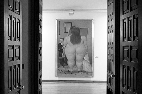
Botero - El Studio

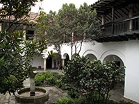
While in Bogota recently, I had the great pleasure to visit the Botero Museum and its superb collection of works by the Colombian artist Fernando Botero. The works are housed in a magnificently restored colonial mansion in the heart of Bogota’s historic La Candelaria area, where the city was founded. It is one of the world's secret treasures.

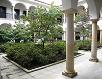
Botero Museum
Botero Museum Courtyard

The permanent exhibition includes more than 120 of Botero’s own paintings, drawings and sculptures as well as 85 original works by such artists as Renoir, Monet, Degas, Matisse, Miro, Chagall, Picasso, Toulouse-Lautrec and Dali - all donated by Botero in 2000 when the museum was opened. The Museum itself is a beautiful building in traditional style, well worth a visit in it's own right.

I found Botera's work fascinating, some highlights of which can be seen below.

The Museum is an absolutely ‘must visit’, two hour treat and should be at the very top of every visitor's list – certainly an equal first to the next on your list which should be the Gold Museum, which is in the same part of Bogota, not far from the Botero.

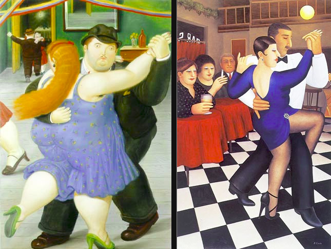
If Botero’s work is unfamiliar (that link loads very slowly), he is among Colombia’s most famous exports. He is the artist who ‘paints fat people’. His love of life and affection for Colombia and its people is revealed in every painting. In the UK, the closest we’ve ever seen to these ‘plump paragons’ is in the work of Beryl Cook from the early seventies. Her work has the very same irreverent sense of fun and 'joy of life' captured on the canvas by Botero and she has a similar preoccupation with the 'larger form' of her protagonists. Although both claim not to paint 'Fat Women'

Dancers by Fernando Botero and Beryl Cook

The painting on the left above is 'Paraja Ballando' by Botero and on the right is 'Tango' by Beryl Cook. Both artists are well worth further study, but back to the Botero Museum. There isn't the space in this article to do full justice to what the exhibition offers. I could almost say that it's worth going all the way to Bogota just to see it. All the work is presented so beautifully.

El Studio by Fernando Botero

The photo above shows how you are greeted by Botero's 'El Estudio' as you go into one of the main galleries. Botero is said to have painted himself into this particular piece (the artist on the left!).

Monalisa by Fernando Botero

My photo of Botero's 'Monalisa', above, just captures the artist's very smooth painting style, best revealed in his skin tones. Below is a shot of Salvador Dali's 'Bust - Retrospective of a Woman' which is beautifully displayed in one of the many alcove displays one comes across during a tour of the galleries.

Retrospective of a Woman - Salvador Dali

Finally, in this short review, I ought to mention the superb collection of sculptures which accompany the many paintings. The 'Hombre. Mujer y Nino', shown below, is just one example of the extraordinary work on offer.

Hombre, Mujer y Nino by Fernando Botero

Unlike the Royal Academy of Arts in London, The Botero Museum is happy for visitors to photograph the art, provided that no flash is used, so it's possible to come away with some quality images to remember the wonderful experience to be had here. There were no guide books available in English, at the time, but there is an online gallery here. Well worth a second visit whenever I'm next in Bogota!

For those who would like to understand Botero's points of view, there is an interesting TED talk:


London At Night with a Nikon Df

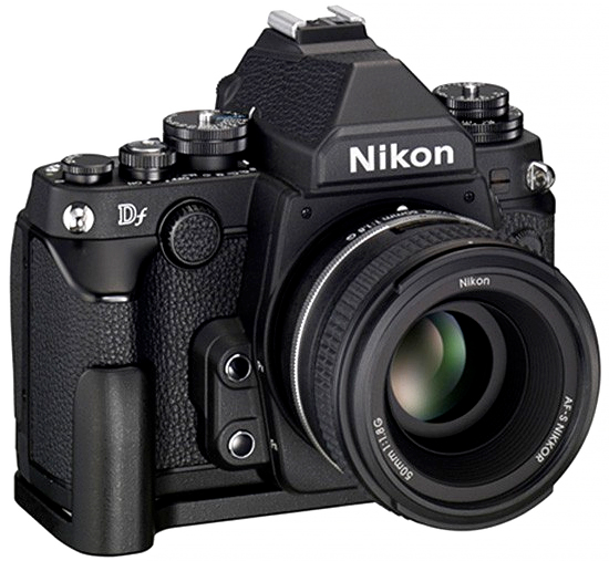
a new, 'old' nikon Df

Nikon Df

Last year, like many photographers, I'd been reviewing the most recent crop of cameras. I'd been using the Leica M9 for three years, on and off, and loved it for what it is, but the fact remains that, while I loved the images I can create with it, the sensor is now somewhat out of date.

So, I had looked at, invested in, experimented with and disposed of the Sony A7 and the Sony A7s, not the A7R, as Sony have still not fixed its shutter vibration issues. I also looked at Nikon's latest product at the time, the much heralded, retro-styled Nikon Df.

For several months after its announcement, the Nikon Df had been splitting opinion. OK, it's an odd combination of marketing inspired nonsense and some genuine qualities, among which is a super smooth image quality. I agree. I could happily see through all the hype though, so that didn't concern me. Is it a good camera? Yes - no doubt!

I like, for example, some of the 'retro' controls, but hate the front rotation button with a passion - what numbskull thought of that one!? Under pressure, in aperture priority mode, concentrating on focusing, that front button is practically useless for all intents and purposes. Aperture control has to be reassigned to the command rotator on the rear of the camera - of course it would - and so the problem is solved.

After a couple of weeks of using it that was about the only thing that really managed to frustrate me. Everything else about the Nikon Df seems pretty much, well, OK. Any other 'niggles' are really fairly easy to adjust to and I've been genuinely impressed by what I think is the Df's best feature of all - the full frame, 16 megapixel D4 sensor. It's just, well, superb - there's no other word for it!

There are lots of reviews, both technical and real world on the internet to dig into. You can drive yourself crazy with all the detail, but my principal interest is in using the camera in real project situations. In particular, I was very, very interested in a Df and Zeiss prime lens combination. Now, if you are only interested in auto-focus lenses and 'P mode' auto-almost everything, then the Nikon Df is probably not your best choice, but, in keeping with their 'back to basics' theme, I felt the camera might just make a good medium sized working combination with highly reputed Zeiss glass. For that recommendation I'm obliged to Lloyd Chambers, who has done a serious amount of testing on these lenses.

China Town Lights

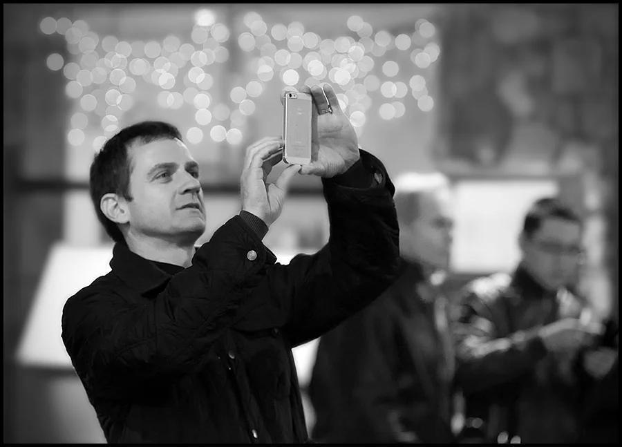
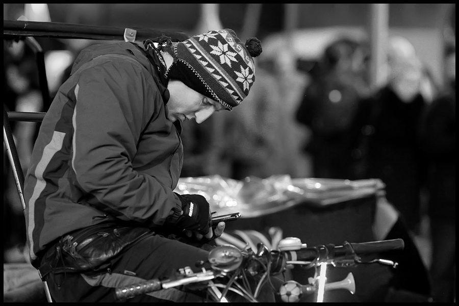
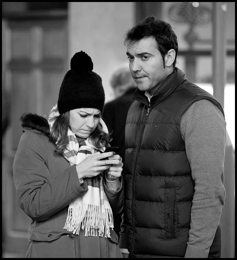
So, I followed his recommendations and recently tried both a Zeiss 21mm f2.8 ZF.2 Distagon Lens and their superb Zeiss 135mm f2 ZF.2 APO Sonnar lenses on a couple of projects. The image set here is from a visit to London, at night, mostly shot around Chinatown behind Leicester Square. My imagination was caught by just how many people, in each situation I found myself in, were intently focused on their phones and in particular with taking snaps - wherever they were!

The shot below is one of my favourites. Considering the ISO was so high the tonal ramge in this image is very nice. The sensor in this camera is undoubtedly its best asset. The Zeiss 21mm has done a great job with this scene, taken at the entrance to Burlington Arcade. It just shows that a 16Mp camera can still produce wonderful images with enough resolution to meet most printing needs and the rendering of this combination is well, just, beautiful.

Burlington Arcade

Anyway, it's an example of what might be done with a Nikon Df and the two Zeiss prime, manual focus lenses - shot deliberately at very high ISOs - some at ISO 6400 and the rest at 12800; all hand-held, straight 'out of the box'. Mostly all taken with the lenses wide open. Also all but two are heavily cropped, for compositional reasons. So this Df does great work - in any light and shows you can deal with night street work with huge dynamic range challenges and get a very useable result.

Of course, as we all know, dynamic range for any sensor reduces as ISO increases. I guess because the signal data is being amplified at low levels to give increased apparent sensitivity but at the same time the top end filled capacity of the pixel's 'light wells' is fixed, so inevitably shadows get amplified but highlights can't get any brighter so the range of levels between shadows and highlights decreases with increasing ISO and hence you get decreased dynamic range available. You can see this in the images in this post but, frankly, the result is still very useable. You lose some of the 'depth' in the rendering, which you can see in the people's clothing and skin tones but think about what we are doing here - we are working in the dark in 'natural light'!

Short Break

I was honestly surprised at the image quality, given the ISO settings, the untreated noise in the RAW files was very film-like and reminded me so much of pushed Tri-X grain from the 'old days'. Very photogenic. Each image was processed from RAW in Nikon Capture NX2, this time. To give some smoothing, Noiseware Professional was used to tone down the noise levels a little with a touch of output sharpening as the final step. Given it was my first outing with the camera and lens combination, as a night 'street' / candid shoot, I was pretty impressed with the outcome. Practice makes perfect, of course - or just 'better' in my case.


Zeiss Sonnar 85mm f2 ZM Lens Review with Leica M9

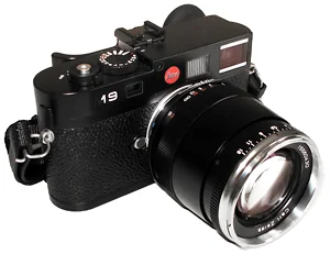
M9-with-Zeiss-85mm-ZM-Sonnar

This is a revised and extended version of my Zeiss 85mm Sonnar lens review article which was originally published on Steve Huff's very popular photography blog in December 2010. I've included more images and new technical content gained from further research on the lens and also added some full size image download options for those who would like to review selected images at full size.

Over the past few months I've transitioned from Nikon DSLRs to the Leica M9 for almost all of my ‘candid’ photography, reserving my Nikon D3 and long telephoto lenses for the sport and racing photography I still do in the summer. Even after three months, I am still somewhat surprised by what can be achieved with the Leica M9. There is just something very special about the images it can produce together with Leica's superb optics. In these early months I've been working predominantly with Leica's superb 24mm and 50mm Summilux ASPH lenses and also with some wonderful Zeiss 35mm and 50mm optics.

More recently, I've been adding lenses, and I'd read that, due to it's narrow angle range-finding system, a rangefinder camera has technical limitations on the longest focal length lens it can accurately focus. Despite Leica and others offering 135mm lenses, several writers suggest the practical limit to be 90mm, and having got very used to my Nikon telephoto lenses in the past, I felt I needed a longer throw lens for those ‘can’t quite get close enough’ shots or for more effectively isolating subjects from their background and foreground.

I did quite a lot of homework on the choices from 75mm to 90mm, reading whatever I could find on the usual forums and websites, but was still not entirely sure what I should go for. There is a very insightful debate on this very question in this Leica forum post. Then, my excellent local Leica dealer Robert White’s Stuart Culley, while apologising for the generally poor availability of Leica 90mm lens stock, suggested a Zeiss f/2.0 85mm Sonnar as another option; particularly good, he thought, for portraits and full length people shots. That resonated, particularly because of some excellent images I'd seen at the end of Steve Huff’s article on the Leica 75mm Summicron, shot on the Zeiss, in a comparison to the Leica.

This suggestion set me off on another search for comparative reviews. I found Erwin Puts' review of a selection of short telephoto lenses, including the Zeiss 85mm Sonnar, here; but, alas, supported by very few images. However, Sean Reid's subscription site, Reid Reviews, also has excellent, illustrated reviews on all relevant Voigtlander, Zeiss and Leica choices.

For those enthusiasts interested in the development of the Sonnar lens design there is an excellent, though brief, article on it's historical evolution by Frank Mechelhoff here, and a little on Wikipedia, here.

Steve Huff and other writers have been impressed with the Zeiss and so, when I needed to make a final decision for a forthcoming trip, I decided on the Zeiss. When it finally arrived, I made some quick test shots to get to know it and was quietly impressed with the way it draws, its colour and just the overall quality of the imagery. Then I took it with me to Venice for a couple of days and these are my first impressions of the combination. First, the initial test shots.

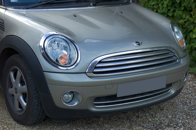
L1000740-Mini-Zeiss-85mm-Sonnar.jpg

Yes, I know - is this a boring shot or what? Well, this was the very first image from the lens and I kept it in because of the superb, subtle tones in the car's hood and bright metalwork. This colour is difficult to capture, but the full size non-jpeg version, processed, is stunning. It's a simple, nondescript image but it signposts the lens's capabilities. I was encouraged.

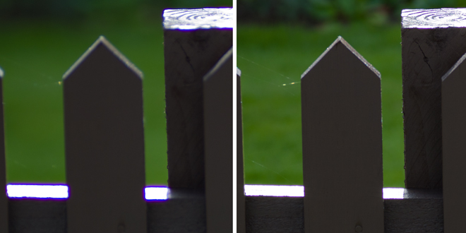
leica-m9-zeiss-zm-85mm-sonnar-lens-review-fence-contra-jour

However, when I took some contra-jour images to see how it would cope with flare, I was somewhat surprised by the colour fringing on the burnt out highlights in some of the test images. Here you can see, on the left above, a 100 percent centre crop from an image taken at f/2.8 versus that on the right at f5.6. You can see purple fringing around the very high contrast edges until the lens is stopped down past f2.8, as it is on the right. Hmmm.

contra-jour-example-zeiss-85mm-zm-sonnar-test

As you can see above, this fringing is more exaggerated when you inadvertently overexpose the image at very wide apertures, as I did above, while experimenting with the bracketing of exposures. Ooops. Well, after this first test shoot, and even though I had contributed to the effect myself by overexposing some images, I was keen to understand more about it, so I revisited the articles I'd previously read to see if others had found the same. Yup, in his 90mm RF Lenses test on the M8, Sean Reid noted the same issue on his pre-production sample, finding more Chromatic Aberration than he expected at apertures greater than f4. Also, in his test on the ZF version of the same design his test shots show similar aberration levels on images from wide open to f4. For those interested, there is a great article on Chromatic Aberration at Paul van Walree's site here.

After doing more research on this issue, with a wide range of sources, I learned that lateral Chromatic Aberration is more common than you would think, and it's often seen on relatively fast lenses when used at or near their maximum apertures at very high contrast edges. Witness the same purple fringing on even the fabulous $11,000 Leica 50mm Noctilux-M ASPH lens in Thorsten Overgaard's review here, which also needs to be stopped down to avoid the same effects in very contrasty lighting. This post at the Leica Forum also contains an extensive discussion and images on this whole issue. In another Leica forum post here there is a very extensive discussion on the issue in relation to the Leica 50mm f/0.95 Noctilux which explores its causes, the practical remedies and the realities and compromises in very fast lens design and Erwin Puts' article here illustrates it in context with further explanation.

From these and other sources it also seems that sensor 'bloom' effects may exacerbate purple fringing where the highlight boundary is very overexposed and out of sharp focus, which is what I did. The remedy is, if you detect the fringing in a preview, stop down slightly so that the various wavelengths of light come to focus within the depth of field and thus reduce the artifact. Capture One, the RAW converter, is said to be able to remove the artifact in the conversion workflow. However, a simple Cardinal Rule is - I know, it's the obvious one - don't overexpose at very high contrast edges.

Somewhat refreshed by all this background research, I finally ended up re-reading Sean's closing remarks in his much later comparative test of 90mm Leica. Zeiss and Voigtlander lenses, where he also re-tests a production Sonnar, he concludes;... 'it's really impossible to ignore the exceptional performance of the Zeiss 85/2.0 Sonnar. This is a first rate optic.... (it) may, in terms of technical performance, be the best telephoto lens I have yet tested.'. CA was still visible with the production sample, but not excessive. Phew!

When you look at the technical details from Zeiss on this lens you can see some remarkable claims. For instance, the MTF charts for the lens are outstanding:-

zeiss-85mm-f2-zm-sonnar-lens-mtf-charts

On the right hand chart above you can see that the MTF for the 40 line pairs/mm (the lowest pair of solid and dashed lines representing high frequency data, micro contrast and apparent sharpness) are up at the 80% level for much of the field - this represents potentially excellent sharpness and an excellent ability to accurately record fine detail by the time the lens is stopped down to f/4.0. The highest pair of lines for 10 line pairs/mm (low frequency image details and general image contrast) are at the 95% level which suggests superb contrast across the frame at f/4.0. The left hand chart is almost as good at f2/0, still excellent contrast across the frame, but with slightly less ability in fine detailing towards the corners. There are some very helpful articles on MTF by Klaus Schroiff on Photozone here and by Bob Atkins starting here. There is also a useful article by Bob Atkins on testing lens sharpness and resolution here.

So, I was comforted enough to carry on testing, and with renewed enthusiasm aided by a gorgeous sunny day, I set off into the village to get the shots below.

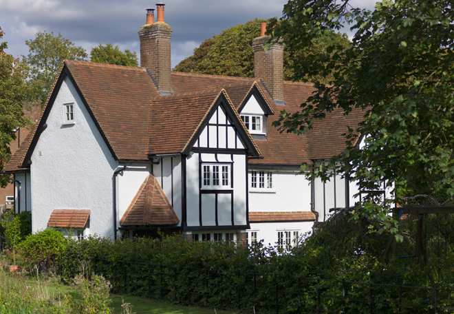
leica-m9-zeiss-zm-85mm-sonnar-lens-review-halton-cottage

Here you can see what can be achieved with the lens when the exposure is spot on. This is an old, very photogenic cottage in my village. The detail in the building and its roof makes it very useful as a test subject - particularly in bright sunlight together with some deeper shadows under the nearby trees. I just liked the way the Sonnar draws it - and those lovely colours. The image was shot in RAW and minimally converted in ACR. No contrast adjustments or sharpening were done. Click on the image above to download and view the Jpeg version at 100%, which was saved at quality 10 (5.4Mb).

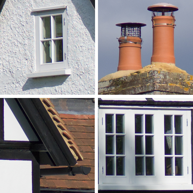
leica-m9-zeiss-zm-85mm-sonnar-lens-review-halton-cottage-100pct-details

Here are some 100 percent crops from around the centre and edges of the same image - again, all unsharpened and unprocessed except the bare minimum of conversion in ACR. Although this is reputed to be a high contrast lens, all these details are beautifully drawn and they stand out without the need for adding excessive contrast in post processing. The chimney detail crop reveals how beautifully the lens renders the subtle tones in the eathernware pots - great colours again - and if you're concerned about how it captures detail at the edges, check out the fine wire mesh at the top of the right hand chimney pot.

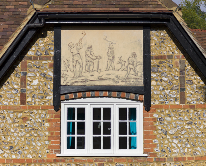
Walking a bit further down the lane, I shot the image below. It's shows an example of a dying craft called 'Pargetting'. This is done by lime plastering a section of wall, or as here a decorative panel, and then drawing into the wet plaster to illustrate a rural scene. It's a technique that was used on many village and civic buildings from the Late Tudor period (1500s to 1600s) right up to the early 1920s. Here you can see local farm workers felling and trimming a tree. Anyway, the image helps to show how the lens captures the textures without having to emphasize them with contrast adjustments.

There is also no trace of the aberrations I detected earlier. The high contrast edges around the windows in the shot below show that all is well when you get the exposure right. No sharpening has been applied to the image.

leica-m9-zeiss-zm-85mm-sonnar-lens-review-cottage-pargetting

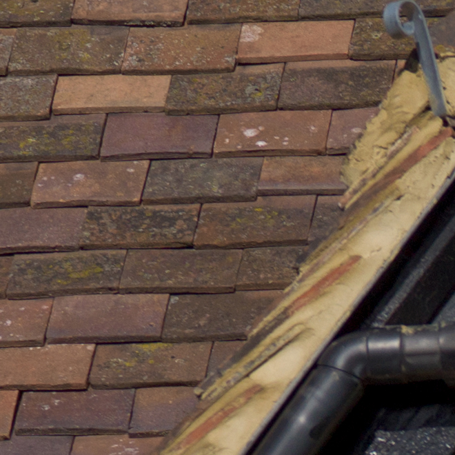
Here is a 100 percent crop detail from the upper left of the image. No contrast adjustments or sharpening were added. Great colours in the roof tiles.

leica-m9-zeiss-zm-85mm-sonnar-lens-review-roof-100pct-detail

Below is a 100 percent crop detail straight from the RAW file from the centre of the image. No contrast adjustments or sharpening were added. Great rendition of the flint wall details too, and again, no trace of chromatic aberrations on the high contrast edges.

leica-m9-zeiss-zm-85mm-sonnar-lens-review-pargetting-centre-100pct-detail

So, with that modest, but successful test behind me, I was ready for the real trip - an all too brief, two day vacation in Venice!

venice - a leica and zeiss paradise

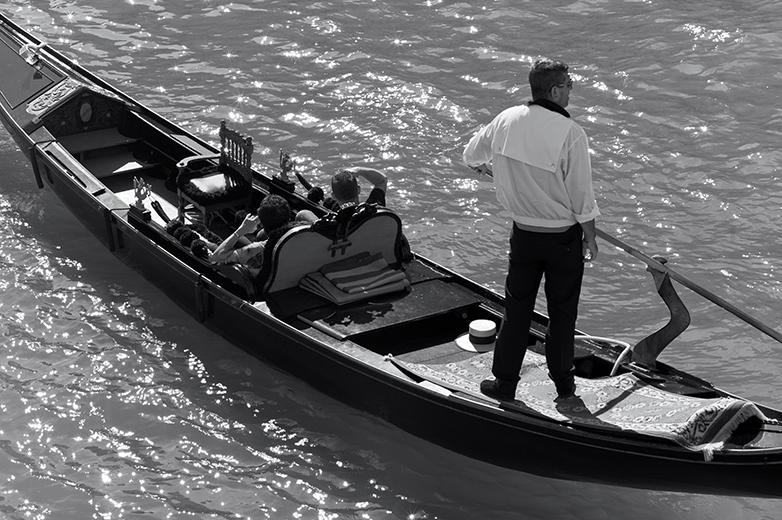
This image (below) was my first shot from the balcony of our hotel. It's only about a third of the frame, from the centre - 85mm focal length doesn't really isolate everything at this distance. It was shot at f4.0 at 1/1000th sec at ISO 160 - handheld. I was just trying to get used to the framing at this sort of distance, and framing your shot is a bit of a challenge with this lens. If composition is critical, to use as much of the frame as possible, then you're going to have to practice quite a bit before you get what you were hoping for first time. Even if you dial in an appropriate lens code, you still get the 90mm framelines and they are different enough from the real view that critical composition is quite tricky. I need to practice more, obviously.

If you look closely, you can still see some chromatic aberration on the left shoulder of the gondolier and you can just detect the purple fringing on the near horizontal surface of his shirt, but it's not too bad.

leica-m9-zeiss-zm-85mm-sonnar-lens-review-first-shot

Look at the detail though - even at this modest sized picture you can still see the potential of this lens - finely drawn lines, nice colour and wonderfully subtle tonal gradations. Very nice, and the way it picks up the variety of tones and the translucency of the water, under the gondola and by the oar in the bottom left corner, is also excellent. Again, minimal processing and no sharpening.

Focus was quite tricky - I'm still getting used to it, but I really don't see why Ken Rockwell had quite so much trouble focusing this lens, as he claims, in his otherwise very positive review.

Lots of people have commented on this lens being an ideal portrait lens, including Zeiss themselves. I think I'm right in remembering that they say that, because of deliberately uncorrected spherical aberrations inherent in their design, the lens gives beautiful renderings of slightly soft portraits and so lends itself directly to that kind of work. Well, actually, I was hoping that it might be capable of a greater range of subject matter than that. I think these shots suggest that's very possible. Well then, how about some group shots?

leica-m9-zeiss-zm-85mm-sonnar-lens-review-taking-a-punt

This one is also only half the frame, from the left edge to the centre, so the standing gondolier is imaged on the extreme edge of the lens coverage - beautiful. The lower gondola is at the extreme bottom of the frame - check out the detail in the girl's hair and the beautiful skin tones in her arms. The red haired chap in the bottom right hand corner has a printed T shirt on that is nicely rendered too. The gondola decoration, bottom left, and the water droplets are finely captured as well. Click on the image above to download and view a jpeg version at 100%.

Unexpectedly, I really like this shot because of the 'X' composition of the people, the 'chaos' of detail and its overall sense of humour. Wherever you start looking at the picture, your eye is constantly drawn back in by the many lines of interest in the image. They really look like they were having such great fun! Shot at f/8.0 at 1/350th at ISO 160, handheld.

While I was busy concentrating on the shot above, I could hear someone below me, out of frame, singing the 'Just One Cornetto' Walls advertising campaign song to the tune of 'O Solo Mio'. When I glanced down from the balcony there was this crazy guy singing his head off, in mock Italian, with his arms flung wildly apart at the crescendo of the song. A quick refocus and, pop, I got him. Of course my composition was off, so this crop is from one corner of the frame but, I like it. Not exactly posed, but he got my attention! I like the way all the heads lined up and the way the others are trying to ignore the noisy one; the guy in the grey T shirt is, I think, wishing he were somewhere else. Shot at f/5.6, 1/350th at ISO 160.

leica-m9-zeiss-zm-85mm-sonnar-lens-review-just-one-cornetto

Next up was a walk around the Fish and Vegetable Market and here are a couple of shots using the lens at close up range, handheld, in very poor artificial light. Here are some red and green chillies shot at f/11.0, 1/45th at ISO 160. I made no contrast adjustments, nor did I add any sharpening.

leica-m9-zeiss-zm-85mm-sonnar-lens-review-chillies

This shot, is disgusting. These are some kind of eel, no idea which, but skinned the way they are and such an awkward and subtle colour to capture in the crazy lighting, I think it's a creditable result from the lens. Again shot at close quarters at f/4.0, 1/45th at ISO 160. No sharpening or contrast adjustments - straight off the camera with minimum work in ACR.

leica-m9-zeiss-zm-85mm-sonnar-lens-review-palomes

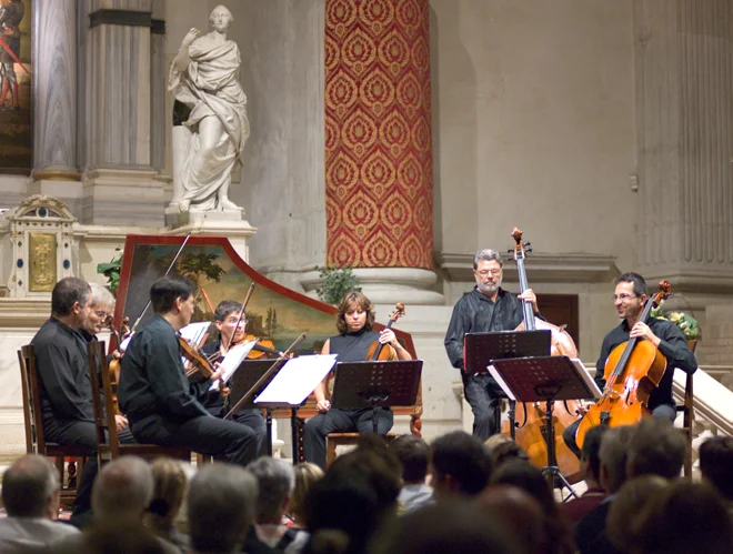
Having been exhausted by trudging around a crowded Venice all day, I thought to catch some culture. So my wife and I took in a Vivaldi chamber music concert at a local Chapel that evening. Naturally, I made myself a bit of a nuisance in the interval by periodically popping up and down out of my seat, like a Jack-in-a-Box, to try a get a shot of the artists before they began the second part of the evening. As they were retuning their instruments, I managed this shot at f/2.0, 1/60th at ISO 1250 - handheld. Not a bad result at ISO 1250! The keen eyed among you will notice the aberrations again at the edge of the music's maxed out highlight in the centre of the image. Ah well. Check out the lovely colours in the marble in the background upper left and the rendering of the Cellos on the right.

leica-m9-zeiss-zm-85mm-sonnar-lens-review-venice-concert

The following day, I tried again, and while my wife was trying out her new LX5, I experimented with some extreme backlit shots. This is one of my favourites. I can tell you that the upper 25% of this scene was completely washed out in the camera's default jpeg. I kept it in, with the minimum of work in ACR to recover the highlights, to show you just what this lens is capable of in such conditions. The shot has its own grace and atmosphere, capturing the very spirit of the Venitian moment. Once again, check out the details in the distance and the way the scene is drawn - very, very nice stuff. Taken at f/5.6, 1/500th at ISO 160; no sharpening etc.

leica-m9-zeiss-zm-85mm-sonnar-lens-review-canal-bridge

Just to make the point a little more obviously, here are some 100 percent crops from the same image - straight from the camera.

leica-m9-zeiss-zm-85mm-sonnar-lens-review-canal-bridge-100pct-details

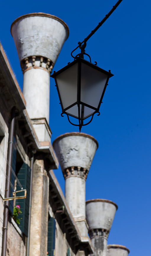
A little further along, I came across one of those surprise juxtapositions which catches your eye and you then spend the next ten minutes working out how to lay on the ground to get just the right angle to compose everything into the best geometric relationship while passers by step nervously over your prone body; hence this shot. I like the way the chimneys are out of focus but recognisable and the overhanging lamp is tack sharp in contrast. Image shot at f/5.6, 1/1000th at ISO 160 - handheld, on my belly in the dirt! Fabulous blue sky gradations.

leica-m9-zeiss-zm-85mm-sonnar-lens-review-chimneys

As we returned to the hotel, looking across the Grand Canal, I noticed a beautiful, almost completely grey building facade with wonderful detailing caught in acute lighting, greatly emphasizing the texture of its stonework. Hence this shot. Taken at f/5.6, 1/3000th at ISO 160 (loads of light), handheld, with no sharpening or contrast adjustments, its shows what this lens can do right across the frame - it's even caught a flying gull mid-flight on the upward wing beat - perfectly! If you can't see it in the main image take a look at the 100 percent crops below. All straight from the camera.

leica-m9-zeiss-zm-85mm-sonnar-lens-review-fabulous-facade
leica-m9-zeiss-zm-85mm-sonnar-lens-review-facade-100pct-details

And now for the humorous moment! This is a hilarious example of exasperated Italian temperament. The gate sign, so my wife tells me, which we just happened to walk past, says - ENOUGH! Stop with the Dog Shit! We are Furious! I'm not sure what the Arabic says below it, but I can guess. Couldn't resist the image, and you can see how the lens has made a first class job of rendering it at close quarters. Taken at f/5.6, 1/180th at ISO 160 - handheld. This shot supports Erwin Puts' conclusion that the Sonnar excels at close distances.

leica-m9-zeiss-zm-85mm-sonnar-lens-review-basta-furiosi

And here is a 100 percent crop from the centre of the image, again, straight from the camera.

leica-m9-zeiss-zm-85mm-sonnar-lens-review-furiosi-100pct-detail

So as not to concentrate my efforts entirely on buildings and group shots, I took a few people images. Here is an example from quite a distance, handheld, in mostly shaded lighting. It's only twenty percent of the frame, but the man is very nicely rendered - pity about the dog's head being overexposed. Shot at f/6.7, 1/180th, ISO 160, no sharpening, but white balance and exposure adjusted.

zeiss-85mm-zm-sonnar-leica-m9-test-all-aboard

I also managed to catch this lady, with her very swish sun brolly, while she was posing for her friend. This was shot at f8.0, 1/125th at ISO 160 and is only 25% of the frame. The white balance and exposure was corrected, but no sharpening was added. Very smooth subtle colours and the umbrella is just beautifully drawn.

zeiss-85mm-sonnar-leica-m9-test-brolly-up

Finally, some monochrome images, the first of which is a contra-jour shot of four gondoliers edging down a narrow canal towards the light. Since most of my work is expressed in monochrome these days, I thought I ought to just put a couple in among this unfamiliar orgy of colour. I just love the way these images are drawn - simple as that. Maybe it's just me, but those subtle tones translate through to monochrome exceptionally well.

leica-m9-zeiss-zm-85mm-sonnar-lens-review-four-gondoliers

Here is another contra-jour shot, again from my balcony, taken at f4, 1/1500th at ISO 160, PP'd in ACR, CS5 and Silver Efex Pro. Click on the image below to download and view a Jpeg version at 100% (5Mb).

zeiss-85mm-zm-sonnar-leica-m9-test-venice-single-gondolier

conclusions

The comparative size and weight of this lens is substantial. On the camera, however, it feels good with a reassuring balance. Some writers have commented on its unusual conical shape, but if you look through the viewfinder you can see that its shape very effectively reduces the lens's intrusion into the frame (without the hood) when composing - a good thing. Fortunately, because it employs internal focusing, the lens does not extend much when focusing between its closest working distance and infinity, which helps the handling. Colours from the lens are very good, sometimes subtle and muted and at other times pleasingly warm and 'forward'. Resolution and micro contrast is high. The rendering of tonal gradations is superb.

I think, without a shadow of doubt, that this lens is a genuine winner. Although my work is almost exclusively monochrome these days, this lens has a habit of reminding you that colour has it's own intrinsic photographic value and that it can seduce the eye with its own subtle rendering of scenes where colour is a major pictorial element of the overall image. It has a 'personality' - softer rendering when completely wide open, but rapidly rendering pin sharp, contrasty images as you stop down past F/2.8 and is wonderful at F/5.6. Couple this with beautifully subtle colour when it's appropriate and it's ability to record very fine details and I don't think you could be disappointed with this lens.

Of course, it's not a budget lens alternative to a comparable Leica lens and so it has to stand in that company as an equal performer but with a different 'character'. I think it achieves that with plenty to spare.

Incidentally, you'll of course have noticed that I deliberately didn't shoot any portraits. Ha! I hear you say - it's a portrait lens. Well, that's because I'm now working on the next step, which is how to use the lens as creatively as I can. Having satisfied myself that the Sonnar is a keeper, my challenge now is to see what can be achieved creatively - and I shall begin with a portrait or two. Hmmm.


Traditional Dancers at Wallingford Festival

Taeppas Tump at Wallingford

Ladies Morris teams are a common site in the villages around Oxfordshire. In fact, it is said in some corners that Morris dancing traditions might have been lost had it not been for may dances and tunes being preserved by enthusiastic women archivists work over the past hundred years or more. This is a shot from a series on Taeppas Tump Ladies Morris side dancing at Wallingford festival this past September. The image was shot with a Leica M9 fitted with a Leica 50mm f1.4 Summilux Lens.

Out of Puff

Here's a Plum Jerkum dancer having a puff after running out of puff dancing at Wallingford Bunkfest in early September. Plum Jerkum hails from Warwickshire, their name being derived from a cider made from the local Drooper plum. Apparently it has the local reputation of 'leaving the head crystal clear while paralysing the legs'!

Threes A Crowd

Here’s another image from the same set. This shot was also taken with a Leica M9 with a Leica 50mm f1.4 Summilux lens. It seems the ‘Out of Puff’ image, above, has also been accepted by the Leica Fotographie International Master Shots Gallery for the Leica M9. I feel honoured and very fortunate to have another piece of work selected.


Nikon D300 Goes Racing

This is an update on a article I originally published in 2010 on the original The Intuitive Lens blog.

Having just invested in the Nikon D500 (2016), I can tell you it's been a very, very long wait for the replacement of themuch earlier and very successful Nikon D300. I've yet to take the D500 out on its first motor-sport shoot, but I know what the benchmark will be against which I will be assessing its image quality and usability. The D300 and its update the D300s is well loved, and for good reason. Here are some images from a shoot at the Snetterton track to set the pace.

Nikon D300 Image Snetterton 1

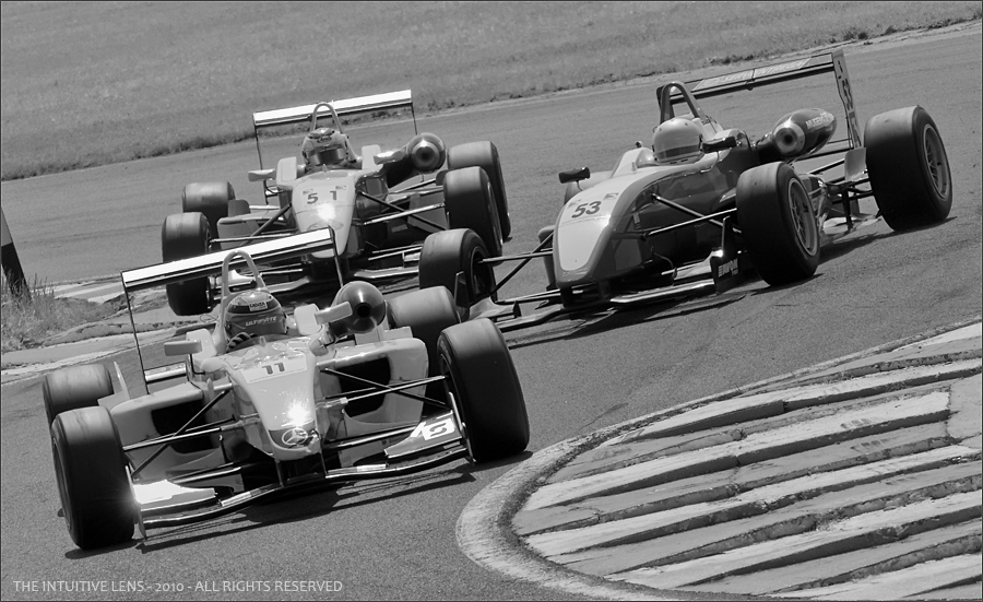
This shot is part of a set of images taken at a Formula 3 Single Seat Racing and British GT Car Championship meeting which took place at Snetterton in Norfolk a while back. All of these images were shot on a Nikon D300 DSLR (with the DX sensor), fitted with a Nikon 70-200mm f2.8 VR telephoto zoom lens.

It's just over three years since Nikon announced, in 2007, what was then a major step forward in their DSLR offerings - the Nikon D300. 12.3 MP DX format CMOS sensor, ISO 200 to 3200, fast and accurate 51 point Auto Focus sensor, 3.0" 922,000 pixel LCD monitor with Live View, 6 to 8 frames per second continuous shooting and super fast power up to ready status. At the time, a huge step forward.

Here is what dpreview said about it:-

My biggest problem writing this conclusion has been picking out the D300’s weak points. The usefulness of Live View would certainly be improved with an articulating LCD monitor (although I’m sure Nikon would argue that this could compromise the integrity of the body), auto white-balance is poor in artificial light (although this isn’t anything unique to the D300) and there’s still no true mirror lock-up feature. But really, these few niggles are really the only things we could pick out as criticism..............
............... There is price, but sometimes the best products demand a premium and the D300 is no exception. Nikon’s biggest problem now will be bettering the D300; it raises the bar to a new high, and represents the state of the art despite strong competition from the likes of Canon, Sony and Olympus. There’s simply no better semi-professional digital SLR on the market.

Praise indeed; and, as I was to find out in practical application, very well deserved. The full dpreview article is still well worth a read, if only to contrast the capabilities of the D300 against it replacement. It has a lot to live up to.

Nikon D300

At the time, I took the dpreview advice, including taking into account the hot debates on the dpreview forums, which were not entirely positive, and purchased the D300 from the very knowledgeable and experienced Stuart Culley at Robert White, my long time supplier of all the Nikon, Leica, Zeiss ad Voigtlander kit.

The D300's first assignment was a Formula 3 and GT race day at Snetterton in Norfolk. The light that day was very, very strong, contrasty and, to make it more difficult, the vantage point I chose was the famous Russel complex, which meant shooting straight into the light for most of the session. The compensation though was some great action shots, and a very red face from excessive sunburn - I forgot to take a hat!

One of the advantages (I would say) of the DX format is its 'problematic' 1.5x crop factor, which, of course, results in an increase in the effective focal length of all your lenses. For wide angle, close in work that's maybe a problem, but for photographing racing cars it's a big win. So, on the day, I coupled the D300 with the longest lens I had available which was the Nikon 70-200mm f2.8 VR Telephoto Zoom lens. The combination gave me an effective focal length of 140mm to 300mm to work with and, shooting from the Russel complex, that gives you quite an opportunity to get in close to the action.

F3 Mayhem at Russel Corner

This image was taken at f/11.0, 1/1250th sec, ISO 800 with the lens set at 175mm and is cropped from about thirty percent of the DX frame. What typically happens on this corner is that competitors come in too hot to the first right hander, sometimes in a last minute overtaking maneuver, clip the kerb, which almost always lifts their car into the air, then they try to make the immediate hard left over the vicious, serrated kerb on the other side. Ouch.

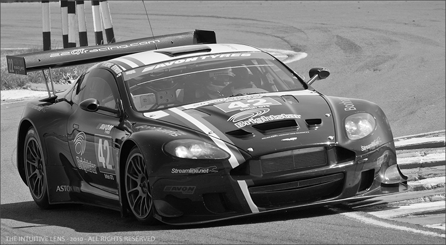
Aston Martin DBR9

The Aston Martin DBR9 image was shot at f/8.0, 1/1250th sec, ISO 400 with the lens at its maximum focal length of 200mm and is also a thirty percent crop. All this rapid change of direction and shifting G-forces throw some cars into great poses - perfect for the camera! Talking of 'perfect for the camera' - how about this treat for sore eyes? It was sitting in the private car park all on its own - aaah.

Jaguar XK140

I think this is a Jaguar XK140. The front grill, amber indicator lights and the bigger front and rear bumpers with larger overriders seems to confirm it's a 140; unless I've got that wrong? Sold in the UK from 1955 to 1957 with a 3.5 litre XK engine, the 140 could pull in the region of 120-125 mph; and it could drive round corners like it was stuck to the road! What a superb example of Jaguar's finest.

Jaguar XK140 100pct Crop

This image is an almost 'straight from the D300' shot; just minimal processing in Camera Raw and simple Neutral conversion to monochrome in Silver Efex Pro and no further editing except a resize. Below is an unsharpened, 100 percent crop from the centre of the image, roughly where I think I focused the lens.

You can see the sensor noise on the front wing just where it curves down to the wheel arch. Not unpleasant, quite film-like, but noticeable and, in any case, easily removed with Noiseware Professional or similar. The image was shot on the D300 fitted with the Nikon 70-200mm zoom lens, set at 70mm, taken handheld at f/8.0, 1/1250th sec, ISO 400. A beautiful composition of sensuous curves, don't you think?

Jaguar XK140 Sepia

Finally, if you want to put an image like this more into context with its time, a little post processing in Camera Raw, Noiseware Professional, Silver Efex Pro and Photoshop CS5, with the slightest hint of Sepia thrown into the mix, you could create a rather more sumptuous, timeless image more suited to the subject. It reminds me of the sort of photos I used to drool over in my Dad's old Autocar magazines that I discovered in the loft as a child but which are now, sadly, long gone. Mmmmm.

If you're already using a Nikon D300 then you already know it's a winner. I see absolutely no reason to ditch mine. In the right circumstances, it's the best body for the job! But, now, there is finally a much lauded replacement, the D500. It will be very interesting to see how they compare under working conditions - never mind the specs!


Billingham Hadley Pro Camera Bag Review

Billingham Hadley Pro Camera Bag

Having made the decision to add a Leica M9 Rangefinder camera to my options when travelling, I spent a great deal of time looking for a camera bag that would allow me to carry my gear comfortably and safely. One of the issues I face when on the move is the amount of technology I have to carry in connection with my work. It includes two laptops and several disk drives, chargers and cables, so my Tumi roller laptop case is packed to the hilt already. This means that I carry another hold-all kind of bag with my other stuff in it, so I cannot add a separate camera bag and get through check-in without having to consolidate all this into two carry-ons.

I needed something that would hold my rangefinder and two or three lenses that would collapse into nothing when necessary, or which could consolidate itself into my other bags until I arrived at my destination, when it would become a purpose made camera bag again. Yes, I know it's complicated, but it's no joke when you are trying to get so much gear from one place to another on airplanes without breaking it or your own back carrying it all. I looked at several options from Lowepro and Crumpler, but without success.

Then I remembered that I had a couple of very old Billingham bags that I'd bought many years ago which carried my 35mm SLR Film bodies and lenses onto field trips before the days of purpose designed photographic backpacks. I pressed one into service, but soon found that its design was not going to do what I needed. It was too bulky, front to back, which meant that the heavy gear was being carried further away from my body and 'pulling' outwards to make things very uncomfortable after only a short time. Wearing the bag while attempting to take shots was very awkward; so that wasn't the answer. It did remind me to check out Billingham's site though and follow up at a local camera store, where I found just the thing! A Hadley Pro bag.

The video review shows how well it meets my needs. It's thin - only about four inches thick. It's long enough to take a camera and four lenses. It's light enough to sit on the shoulder without 'pulling' itself off while shooting images in the street. Everything can easily be reached and its inner padded compartment can be pulled out and quickly popped into another bag while going through airports until you can put it back into the outer bag. Brilliant. Highly Recommended and four and a half out of five for value and design.

The only improvement I could think of was that a non-slip shoulder pad should have been included in the price, but these 'accessories' are obtainable from Billingham directly, at extra cost.